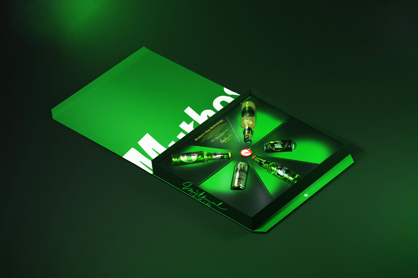
We redesigned the new brand identity of Mythos, one of the major Greek beer brands. Our design was based on the idea of visualizing the brand motto “There’s a Myth everywhere”, giving the brand the opportunity to narrate their story through its logo and packaging.
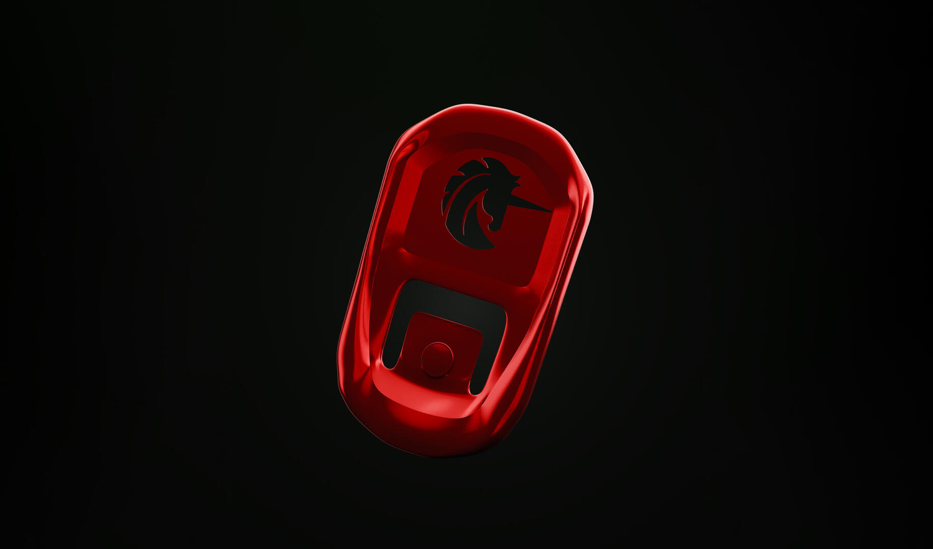
The key element in the communication is the brand’s logotype. Our goal was to redesign the unicorn symbol in a way that conveys the brand values. The new design consists of clean lines and shapes, achieving a braver, more confident approach. In a closer look, its mane resembles sun rays, while the design on its top resembles sea waves as a reference to the liquid element and Greek spirit found in the tagline “Hellenic Premium Beer”.
We also aimed to create a bold and unique wordmark, connecting it to the brand narrative.
Echoing the notion of constant movement that governs the myth of the unicorn, the italic typography gives a sense of motion, confirming that you can’t catch a unicorn no matter how hard you try. We also gave a fresh and fun mood to our design references, by incorporating morphological features of the unicorn into it.
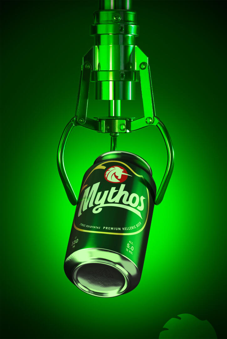
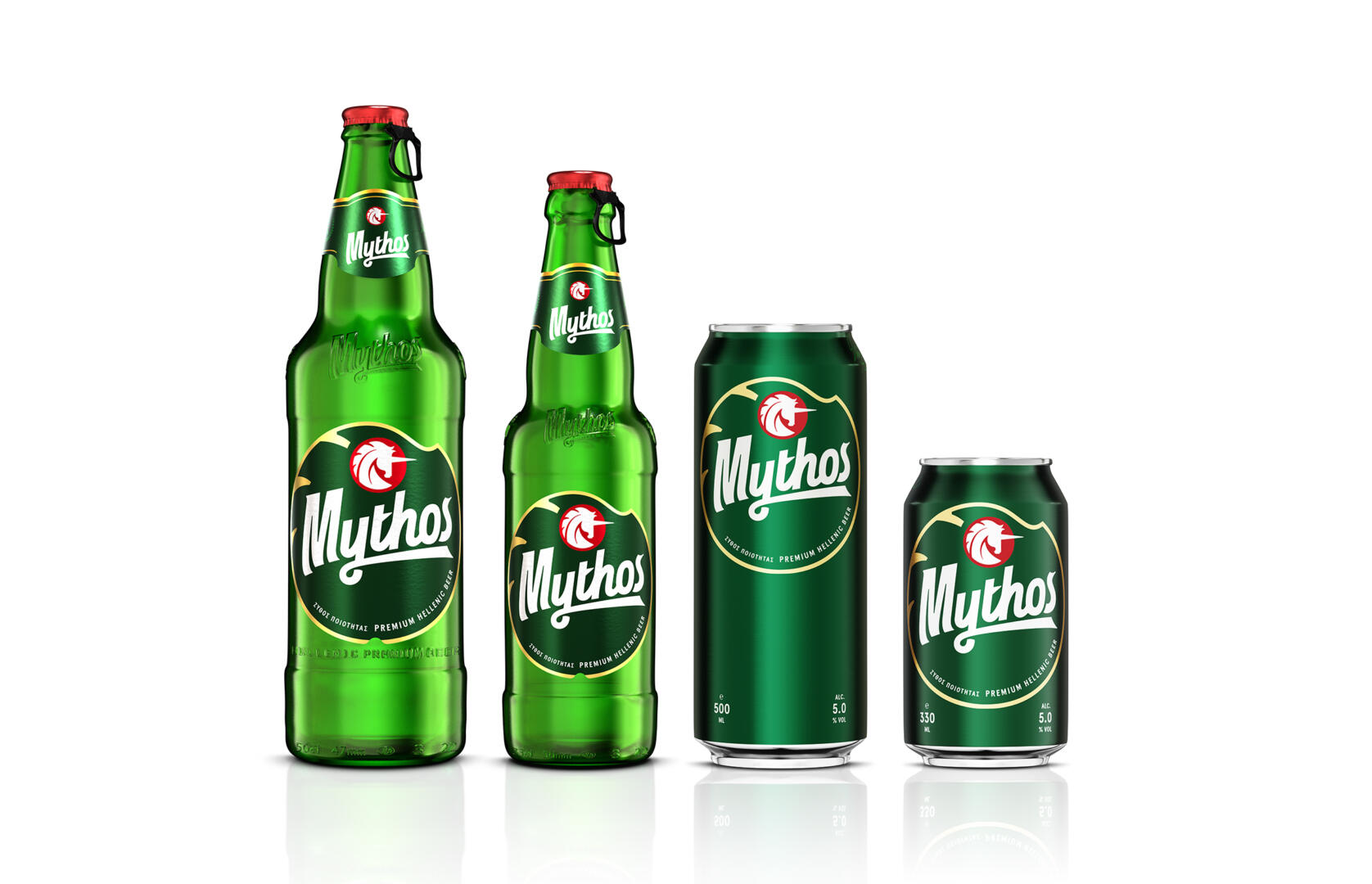
Adapting the new brand identity of Mythos beer into the packaging, aiming to achieve consistency and coherence in its image, we created an optical system that adapts to the communication needs per container. The logo size on the containers remains constant, while all the informative texts acquire an organized structure, occupying a specific place, therefore helping the dialogue with the consumers.
The creation of a unique label die-cut which can also be applied to the cans as a graphic element was deemed necessary. The uniqueness of the identity was enhanced, while unnecessary information and talkative design elements were dropped, achieving a refreshed image, and supporting the brand’s storytelling.