Developing a Cream Resort
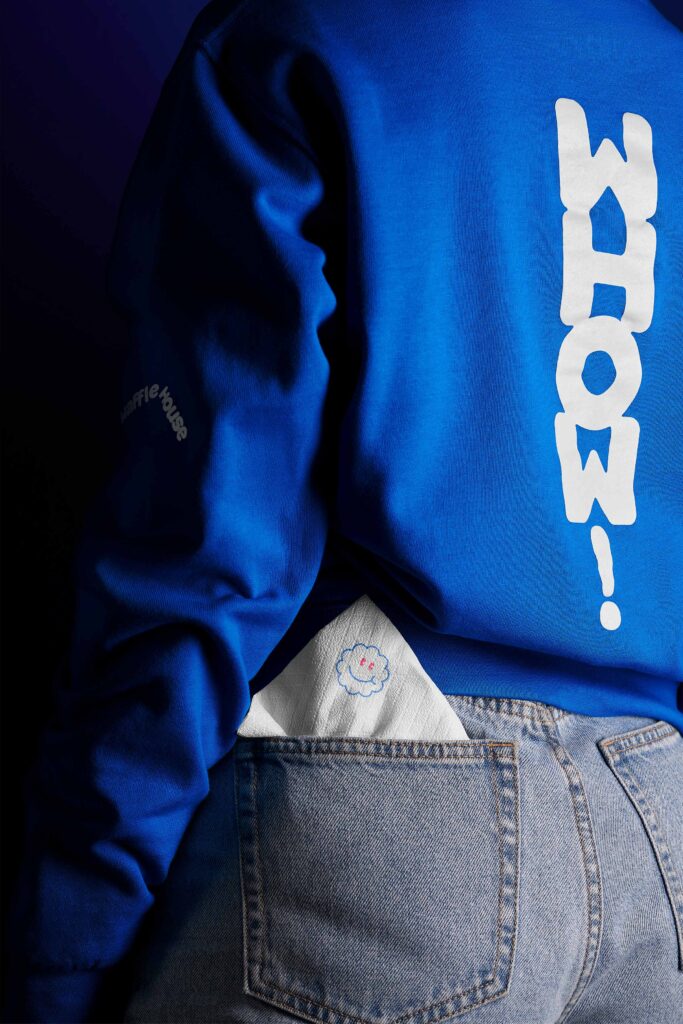
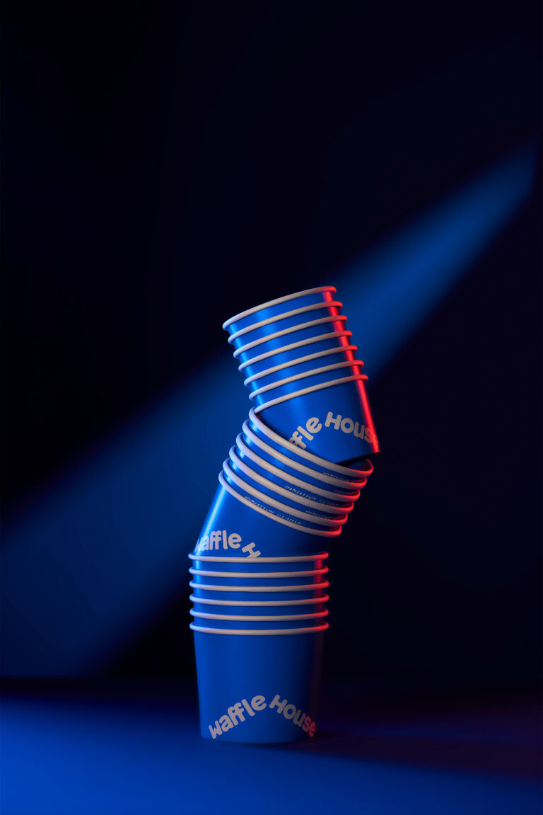
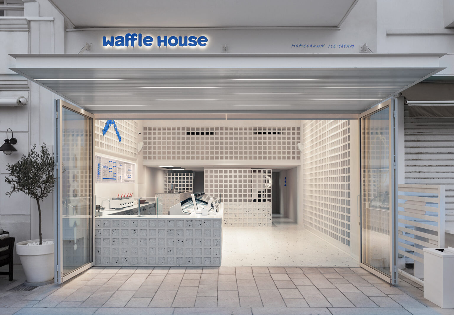
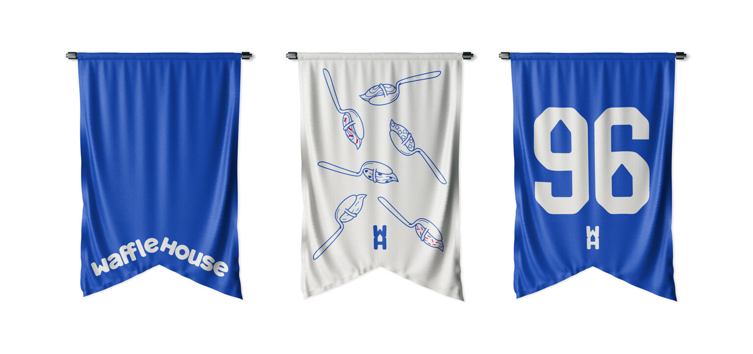
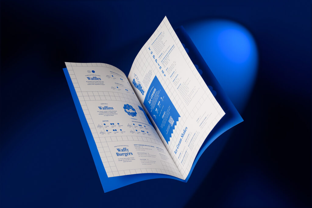
Waffle House, the brand with the most famous freshly baked waffles in Greece and the daily made ice cream, putting the concept of freshness into practice, trusted us to develop its new visual identity. Over time, Waffle House stores have evolved into meeting points for ice cream lovers, offering an authentic, taste-like-home experience. For its lovers, ice cream is much more than a frozen treat. It has its own ritual and its enjoyment brings fulfillment, joy, and excitement. And it is certainly has to be treated not as just a summer dessert. That’s why when we were tasked with the rebranding, we thought of ourselves as true lovers of homemade ice cream. The new logo and custom typography express values found in the brand’s personality such as freshness and bravery, while the predominance of blue in the color palette reflects the vibrancy expressed by the brand’s audience while giving it the consistency and recognition it was lacking.
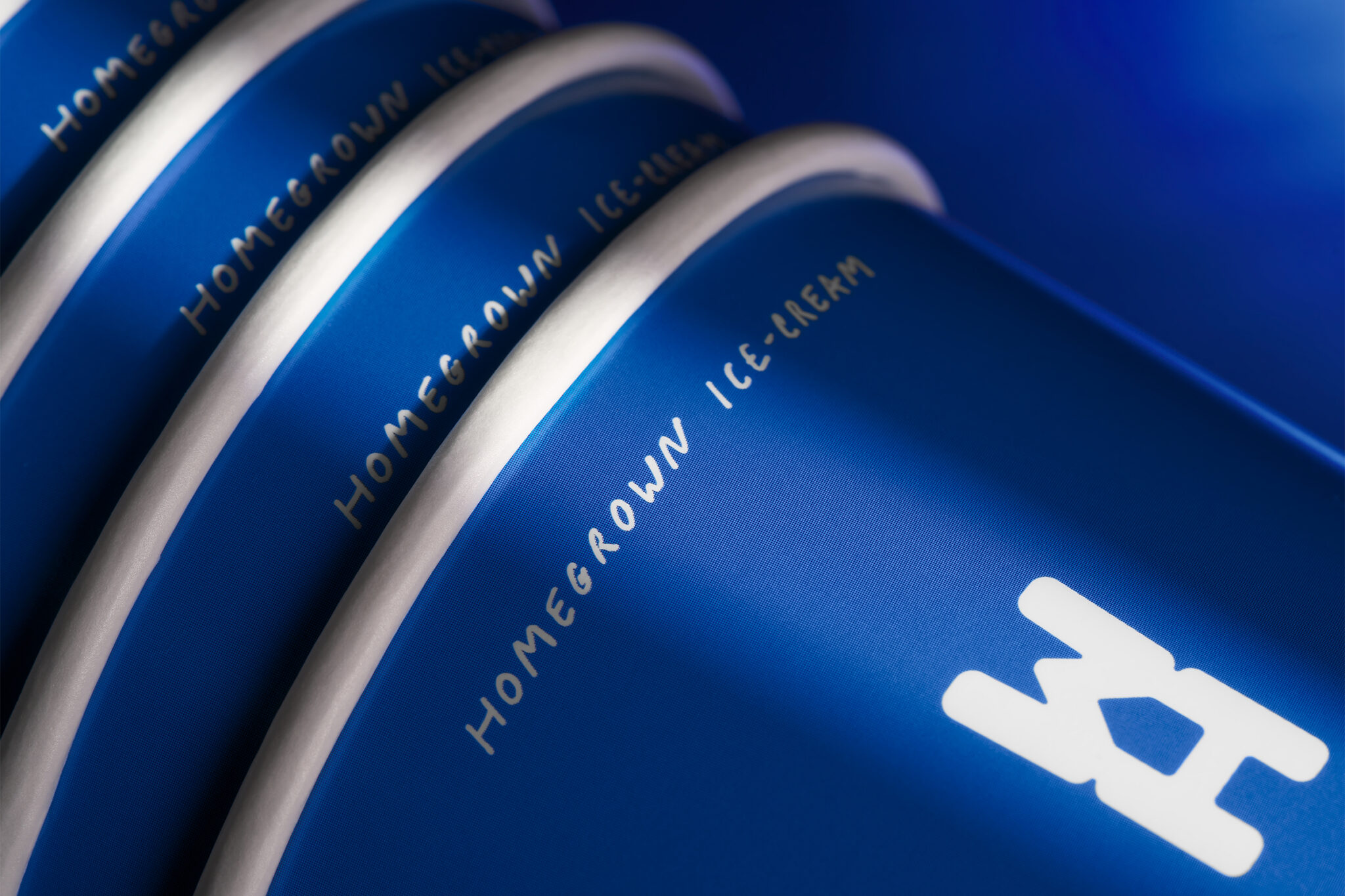
Among other things in the system we developed, the brand’s initials create a second, hidden reading in the idea of homemade ice cream expressed by Waffle House. We also transformed the brand motto from Homemade ice cream to Homegrown ice cream, suggesting not just a method, but an entire philosophy of making pure, homemade ice-cream. For the brand applications, the system of illustrations, design elements, and verbal elements we created emphasize storytelling related to the production process and practices such as tasting, which is practiced as a point-of-sale practice. By creating a whole world that appeals to ice cream lovers our approach expresses values such as care and enjoyment, welcoming the audience to the new era of Waffle House.
