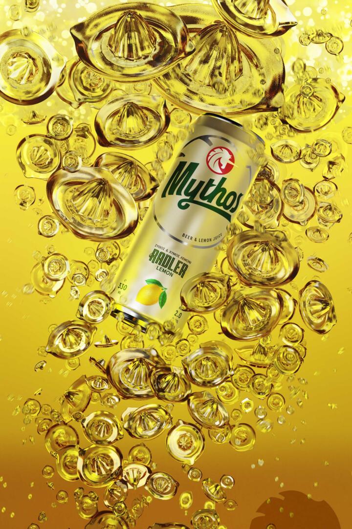
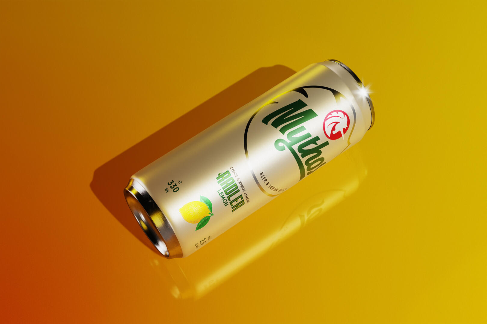
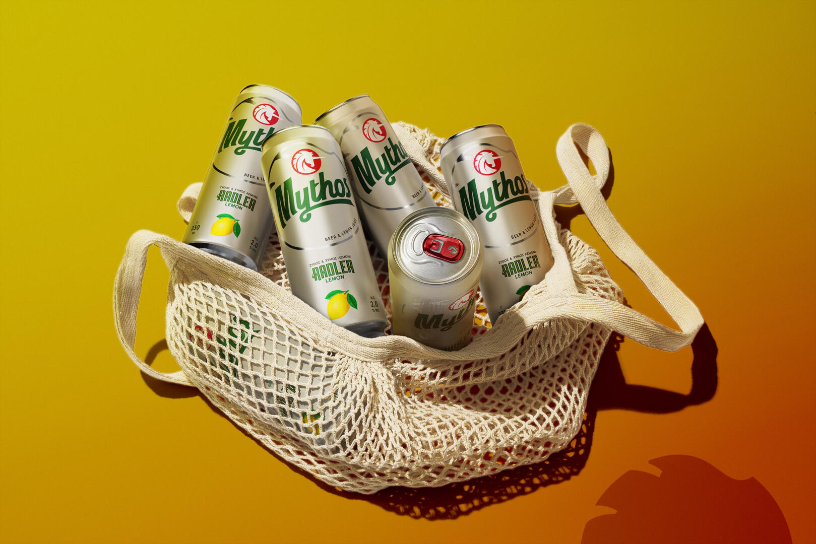
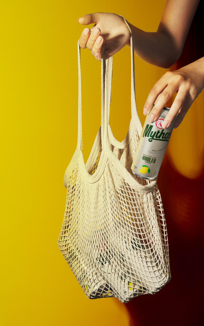
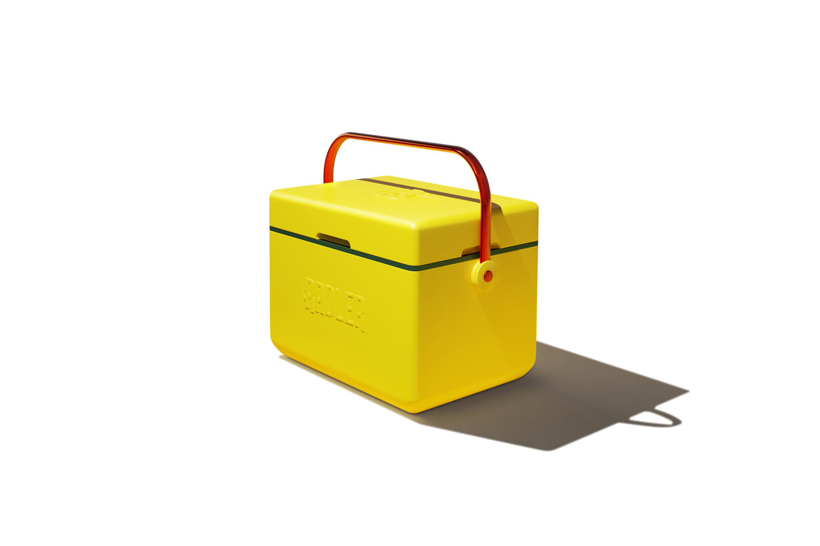
Following our rebranding for Mythos, we designed the Mythos Radler packaging. During our study, we created a visual system which adapts according to the communication needs of each container, while keeping the constants that allowed us to create a consistent visual identity. Unnecessary information and busy design elements were discarded, strengthening the brand elements and achieving a new image with coherence and consistency. The color code draws inspiration from the craft paper bags of fruit shops, while the design of the “Radler” sub-logo with the handmade details and the lemon illustration, evoke images of homemade, freshly squeezed lemonades.