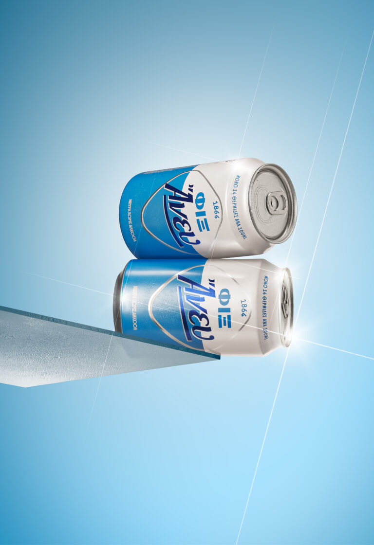
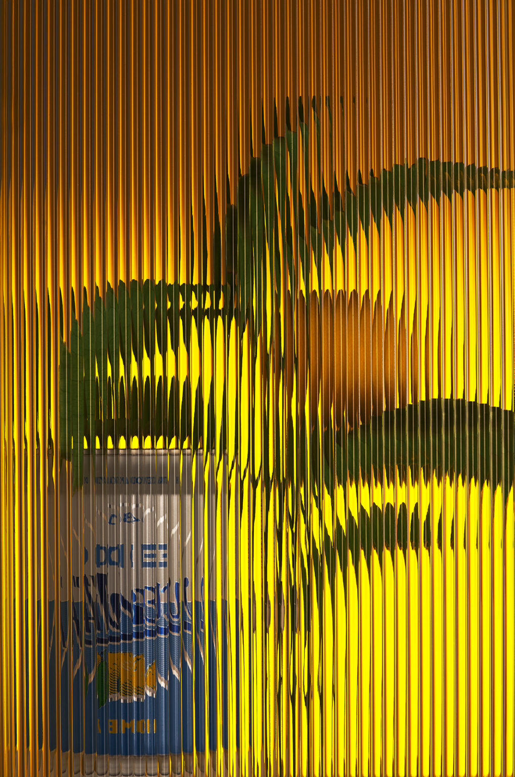
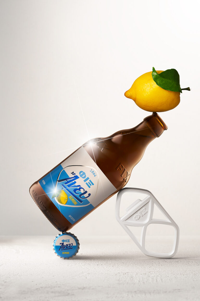
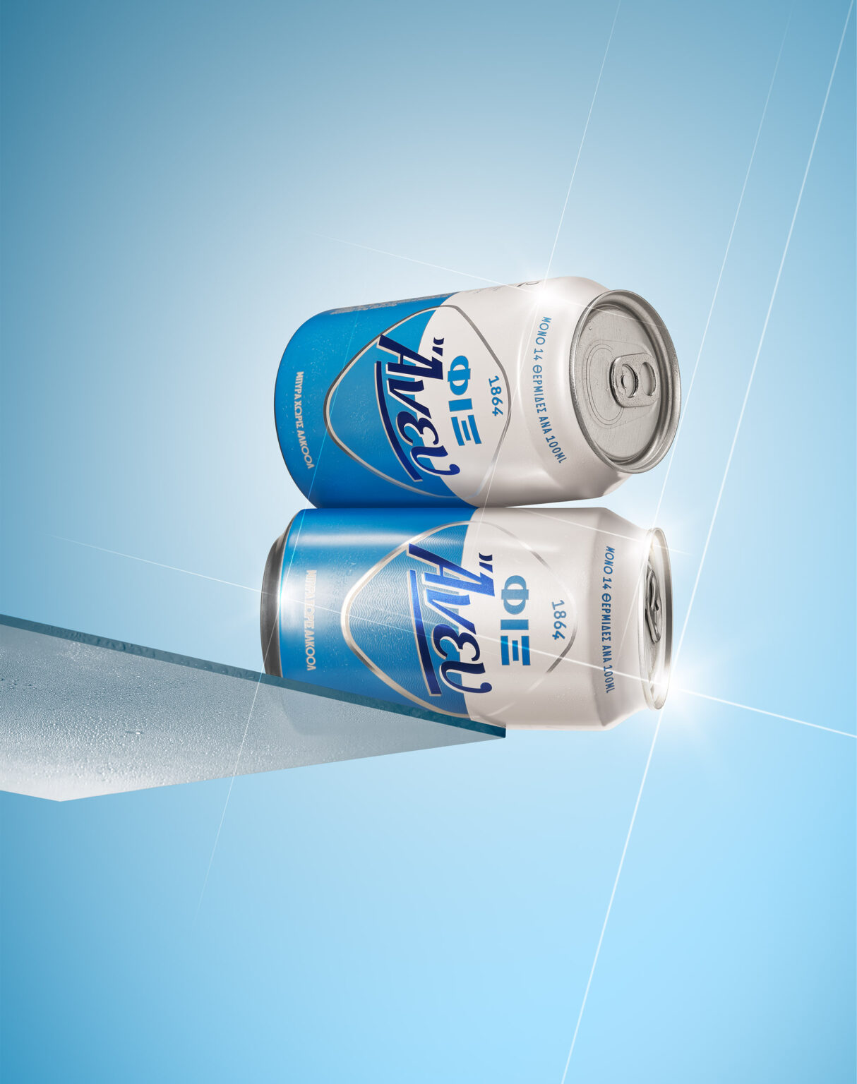
The market for non-alcoholic beers is becoming increasingly popular. So, when we were tasked with redesigning the FIX Anef (Anef, meaning “Without” in Greek) by Olympic Brewery, we were looking for a design that exudes freshness and a sense of nostalgia that would help its integration into the rest of the FIX range.
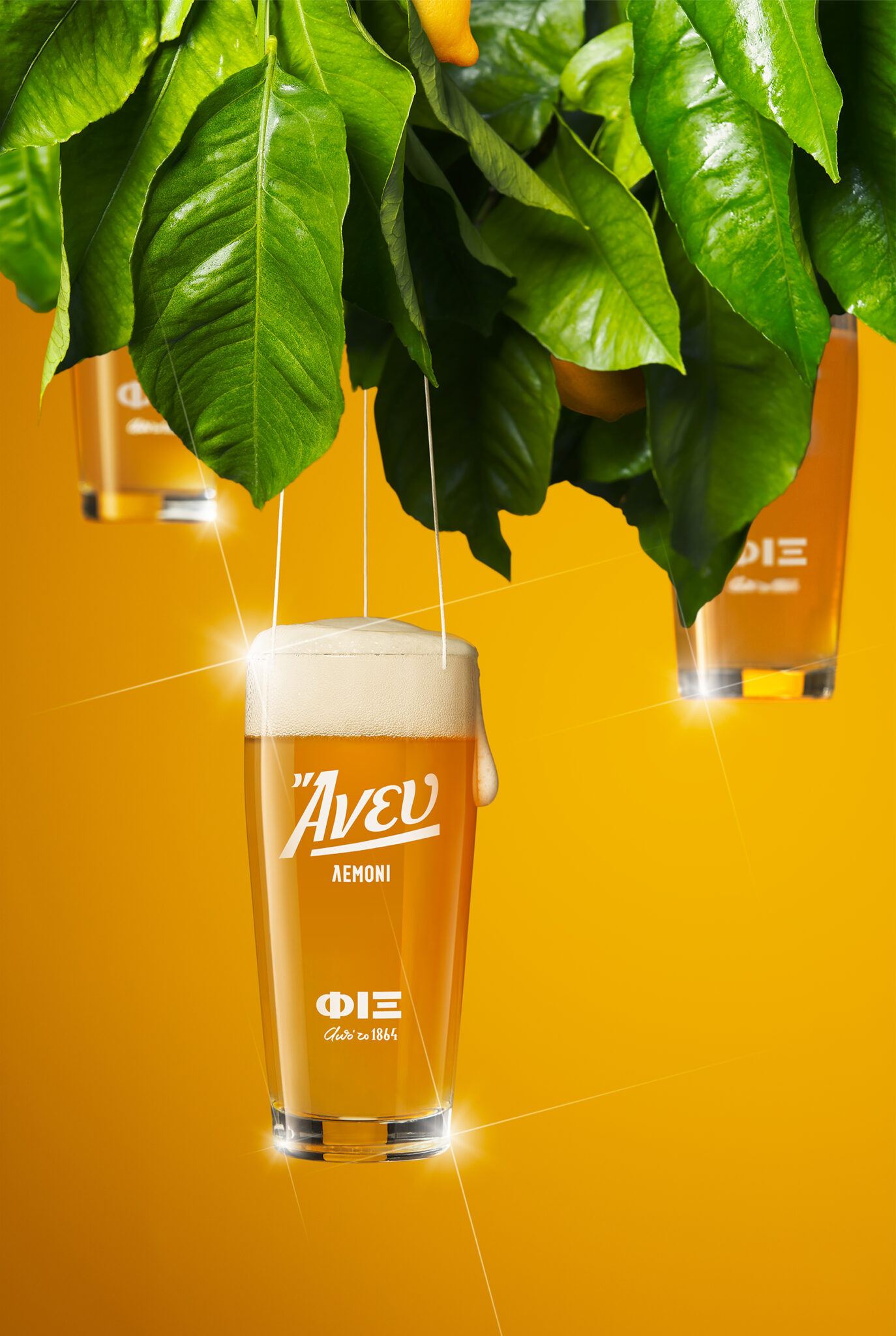
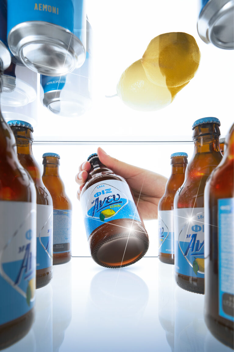
At the same time, it was the perfect timing for launching FIX Lemon-flavored Anef, a new product that balances the lemon flavor with the beer’s subtle bitterness.
As with the rest of the range, the new logo keeps the brand’s DNA while balancing aesthetics with functionality. The redesign has allowed both the iconic rhombus and the brand name to grow while occupying the exact same space as before, while the addition of the brewery’s establishing date highlights the brand’s historic origins.
Regarding typography, the design approach of the word “FIX” refers to the brand’s past, while the retrophilia that characterizes the brand is reinforced through the design approach of the word “Άνευ” (anef).
While we kept the color palette of FIX Anef, we added a subtle wave pattern inside rhombus’ lower part, a reference to the Greek sea, an element found in the brand’s narrative. Similarly, our approach to the lemon-flavored FIX Anef is characterized by the attractive illustration of a fresh lemon that reflects the longing for a carefree era of past decades.
The result is as contemporary as it is classic, creating bonds with an audience that appreciates authenticity.
