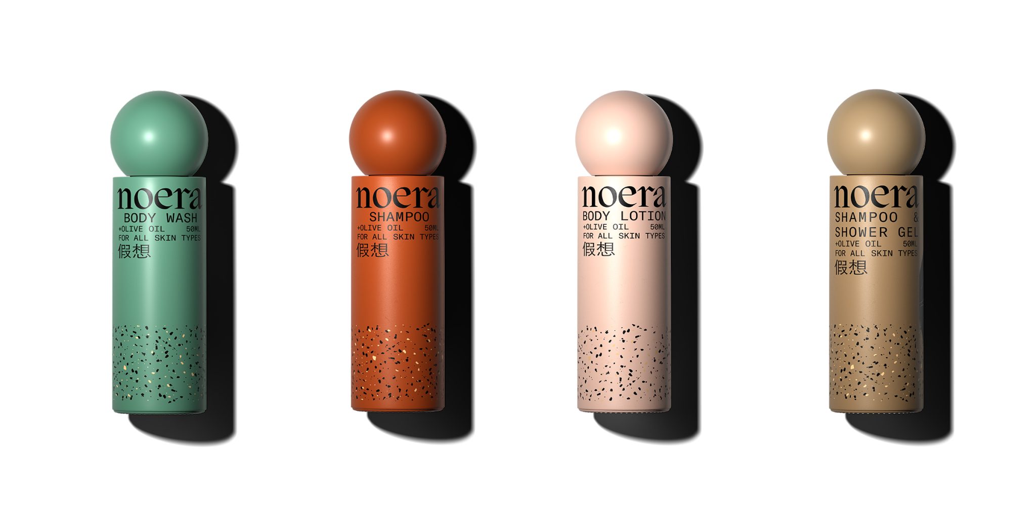
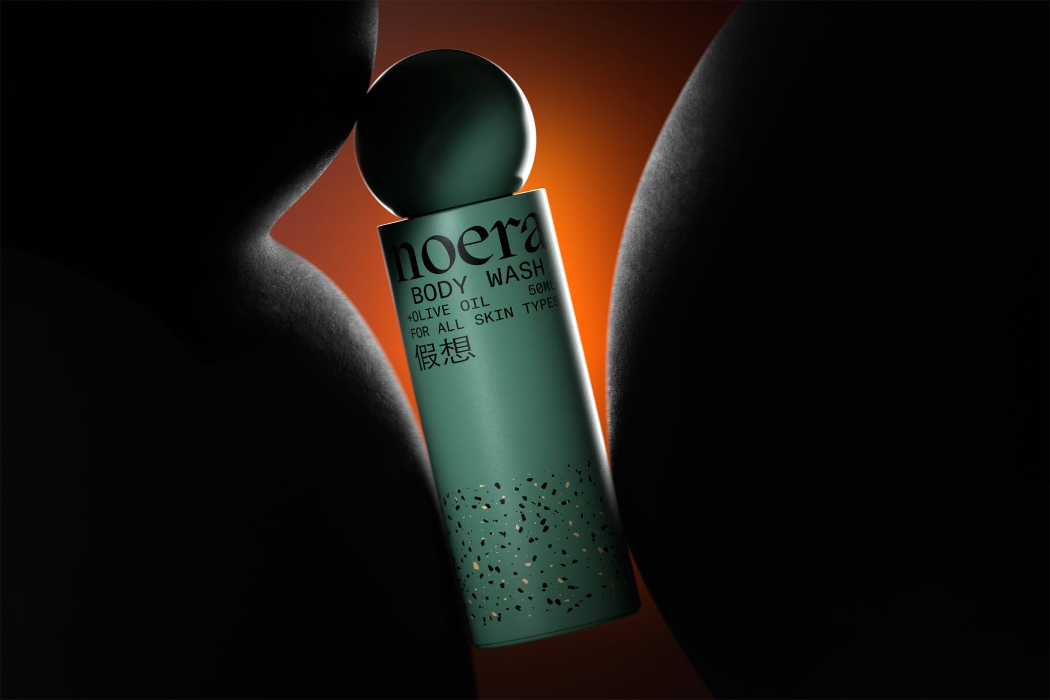
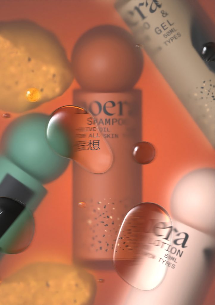
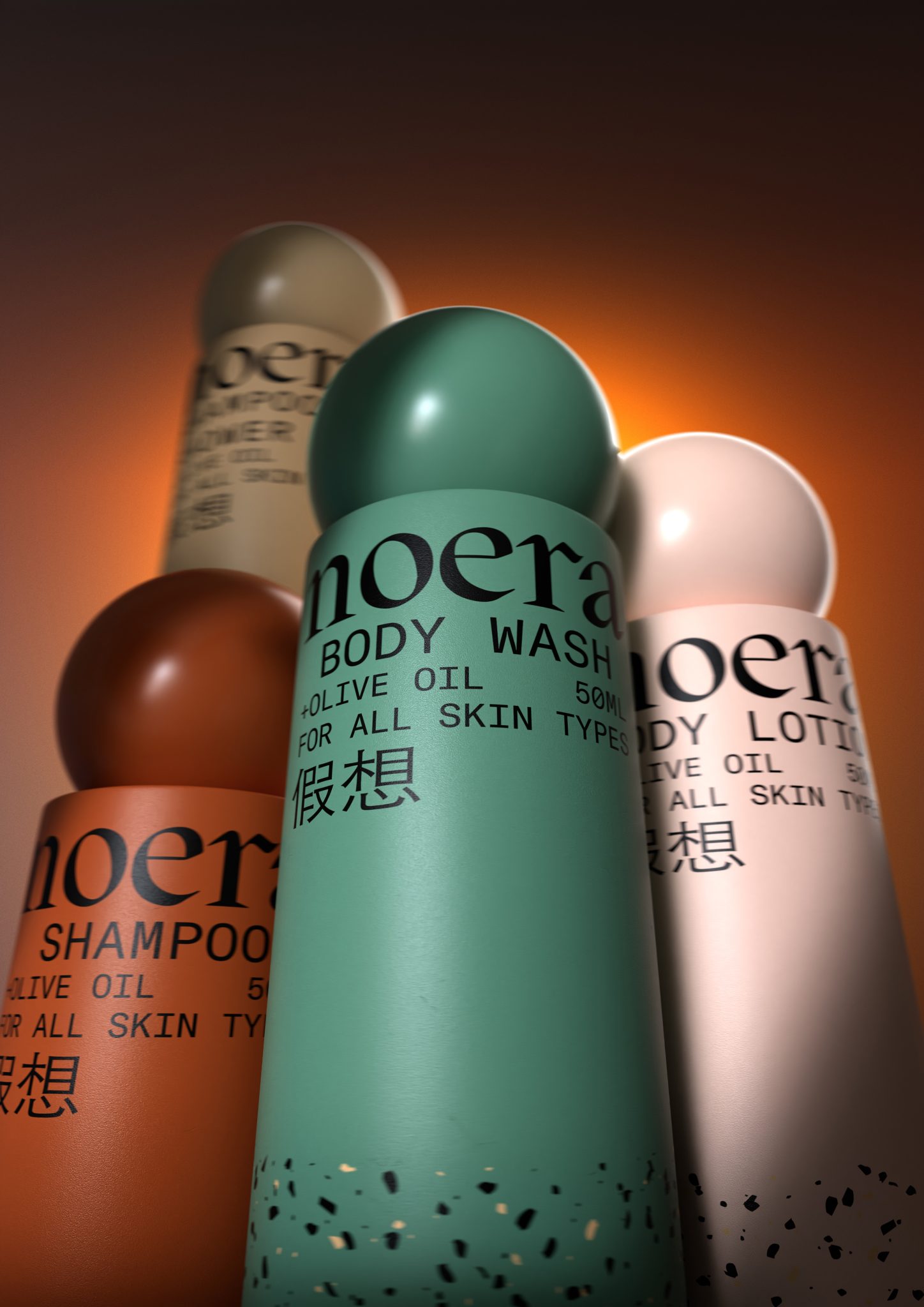
We created the visual identity for the Noera hotel amenities range, covering aspects such as naming, logotype and packaging design as well as the industrial design of the containers.
Initially we worked on naming and developed Noera (pronounced noerá) a Greek word derived from the word νους (nous), which means mind, denoting something mental or intellectual.
This aligns with a wellness approach that emphasizes holistic beauty routines and mental well-being, creating a deeper connection with consumers who seek more meaningful personal care experiences.
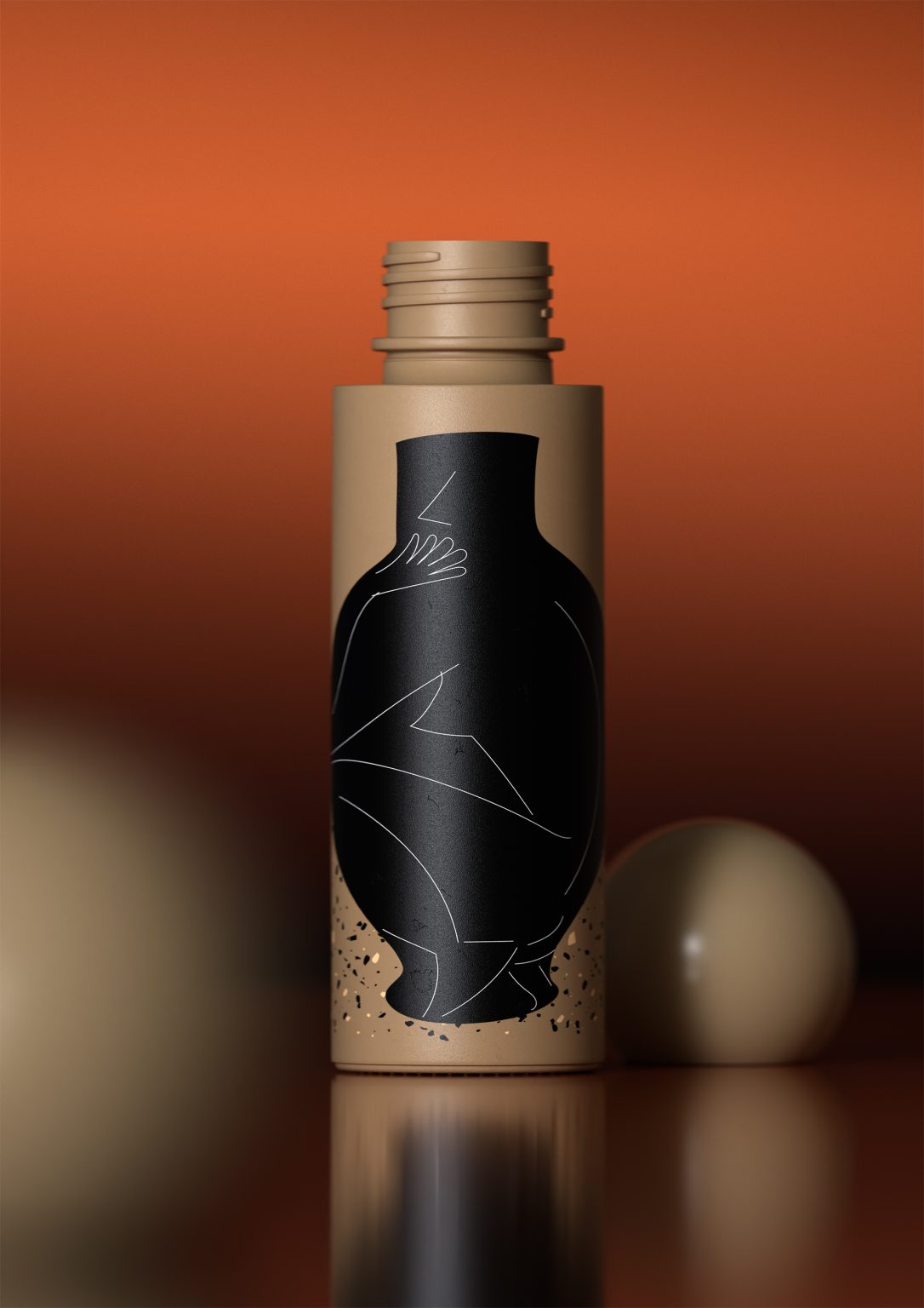
The positioning of a sphere over a cylinder as these two volumes form the container, clearly suggests a harmonious connection and interdependence between mind and body.
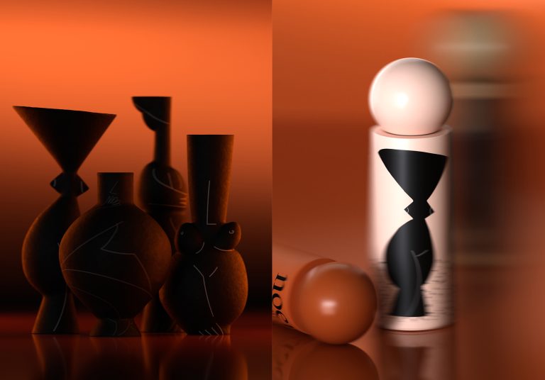
The abstract figures we created for the packaging straddle the human form and the container, reflecting a celebration of the human experience and connecting the user to themes of self-care and personal pleasure.
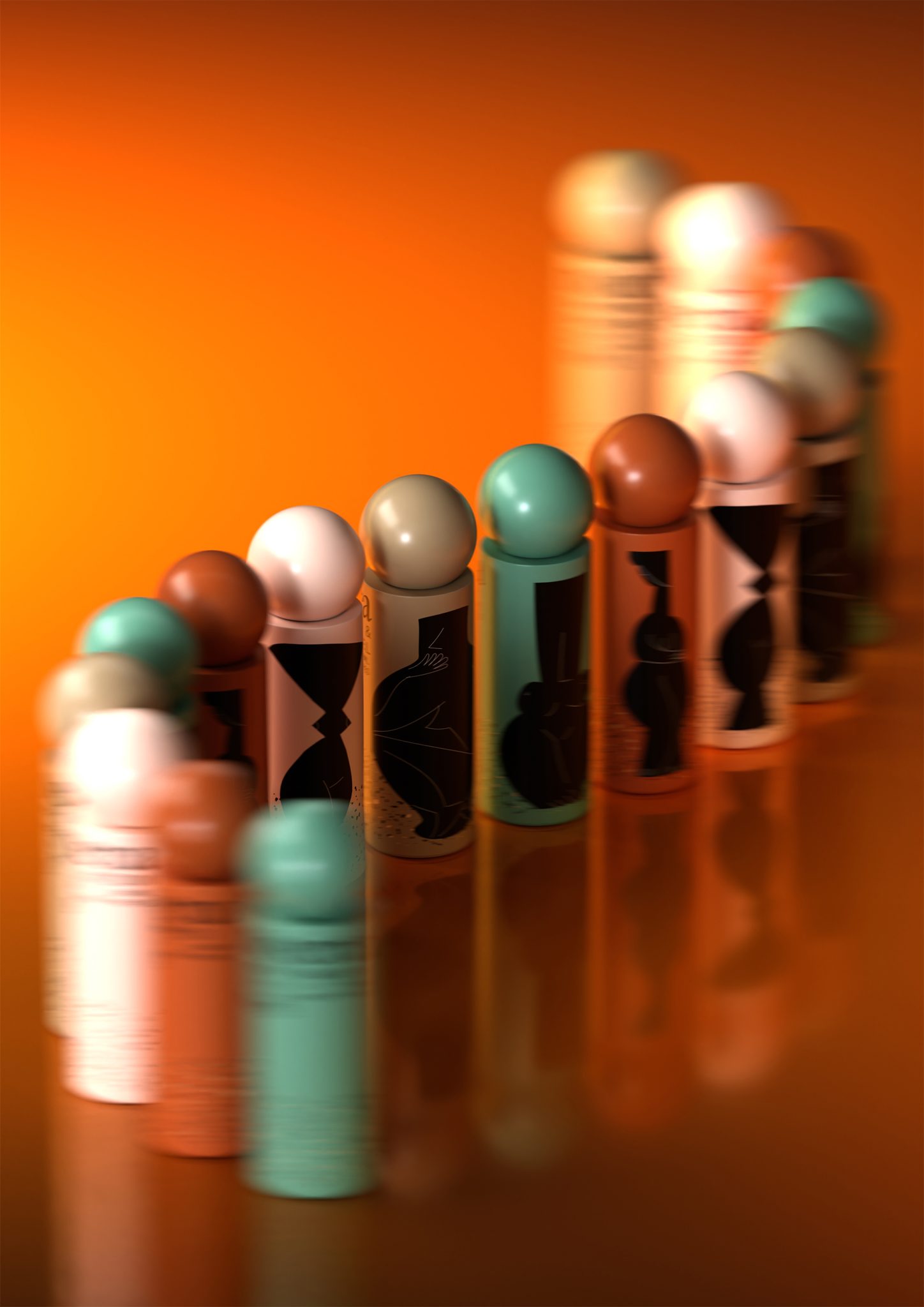
The choice of muted colors juxtaposed with a bold black typographic block creates a sophisticated visual appeal while the consistent design language across the containers fosters a cohesive visual identity.
