OBJECTIVE
Despite a plethora of remedial skincare products in the Indian marketplace, there aren’t any that go to the root of it all…i.e. address the skin’s inherent ability to act as a catalyst in identifying the causes of unhealthy skin. Our objective was to reinforce the brand’s proposition, ‘Unleash the power of your skin.
ASK
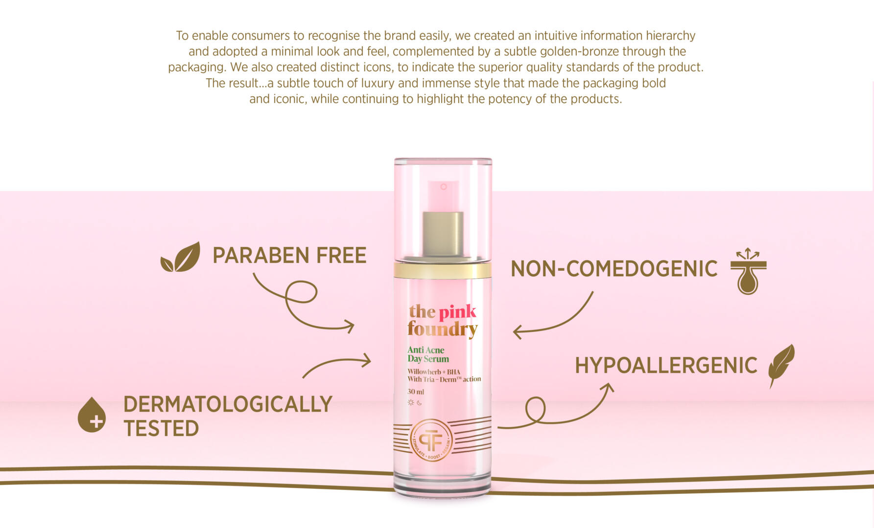
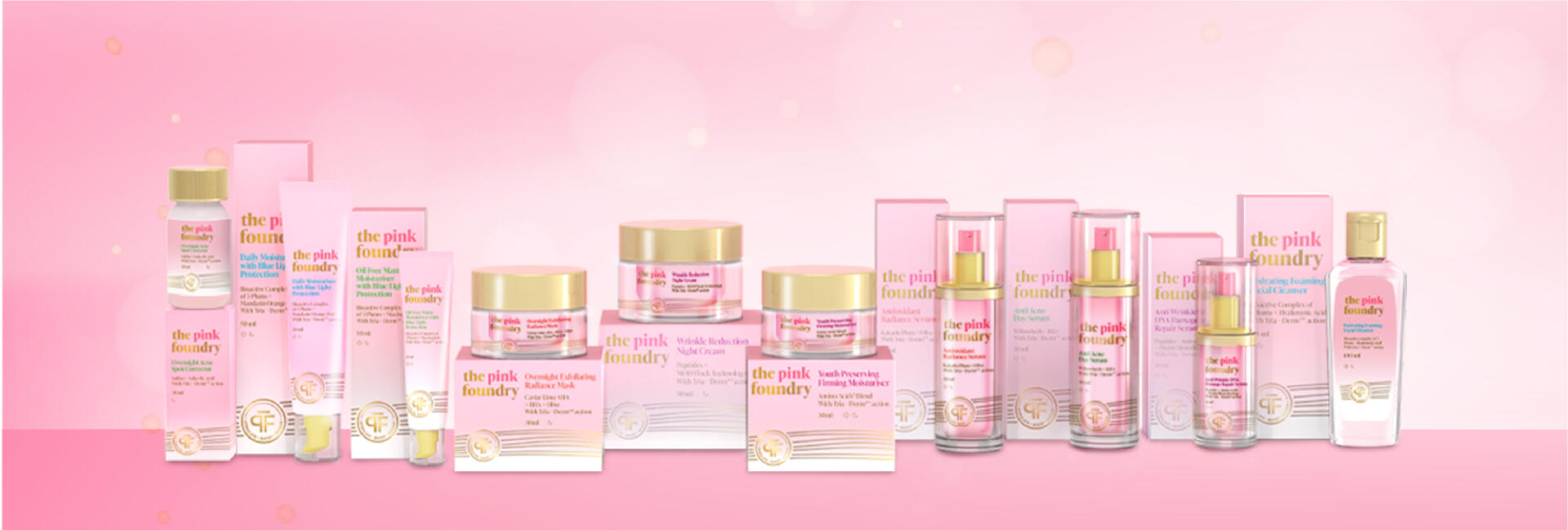
Design packaging for The Pink Foundry’s range of products that looks and feels premium, while highlighting the brand’s root strengths and coming across as a dependable ‘skin coach’.
Ambitious and informed, modern-day women aged 25 to 45 from Tier I & II cities, who are driven by their passions and dreams. These are women who regularly shop online, follow basic skincare routines (CTM), and are keen to educate themselves on caring for their skin.
SOLUTION
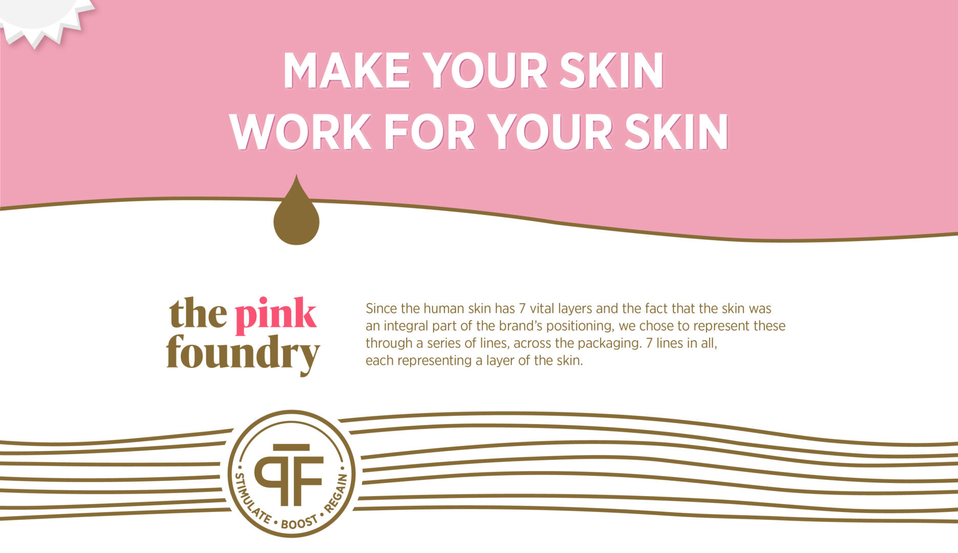
The name, ‘The Pink Foundry’ reflects the brand’s core beliefs, i.e. the need for skin to always be in the PINK of health. The FOUNDRY, on the other hand, is where, 22 years of industry expertise, ideas and solutions culminate, in the form of efficacious and long-lasting skincare solutions that help ‘Unleash the True Power of the Skin’. Through our packaging, we emphasised this, and also the fact that the ‘skin is stronger than we think it is’. Without compromising on the feminine appeal of the brand, we emphasised that The Pink Foundry is a resourceful, dependable and efficient skin coach that brings out the best from within! The result… packaging that is bold, individualistic and relatable.