Project Background
Founded in 1913 by German businessmen who saw an opportunity to capitalize on an exploding lager market, Mission Brewery was originally placed in an iconic facility off of Interstate 5 in San Diego. But an impending push for prohibition (paired with post war anti-German sentiment) caused the original Mission to shutter just five years later.
While other breweries would eventually make use of this original facility, the Mission brand name would sit dormant for nearly 90 years, until 2007 when the brewery was resurrected by a local home brewer. The brewery’s new location next to Petco Park led to raucous crowds of beer-loving tailgaters lining the bar with sales peaking in 2018. But hyper-aggressive local competition and no real long term vision sent the company into a downturn.
With new leadership in place, there was an opportunity get the brewery back to sustainable growth.
—
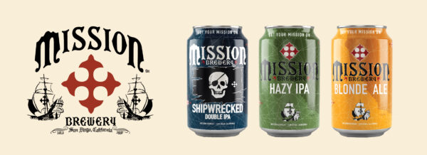
Named after the Spanish missions constructed along the coasts of California, the name “Mission” evokes an inherent aspect of California history and its cultural fabric. The 2007 reboot logo, associated artwork and brand image for Mission Brewery revolved around a vaguely nautical, historic, swashbuckling aesthetic.
This iconography can be really fun—I mean, pirates!—but at the same time, everyone involved with the project admitted that it was starting to feel dated and dusty in context. For one, not much thought had been put into consistency of the identity itself, resulting in a proliferation of confusing logo files and packaging that was a little busy, a little dull and easily overlooked in a cold box.
Brand Strategy
But at a higher level: What did this salty, hard-nosed aesthetic say about Mission’s beer and the company’s overall positioning? Does it make sense to cleave to such an aggro, quasi-sinister (somewhat problematic) colonial look and feel? In a world of seltzers and RTDs and better-for-you beverages, does the dark-and-surly aesthetic of the early craft beer boom make sense in today’s market?
Through our brand audit and brand strategy work, we determined that for the most part: no, it does not.
Ultimately, our team decided that it would be a much stronger fit to associate the brand with the local community itself. Our task was to lift Mission out of the old world and into the new, evoking the color and energy and vibrancy of the San Diego scene as it is today while sprinkling in just enough of that charming vintage aesthetic to let you know that this brand has been around for a while.
This thinking informed our brand refresh from top to bottom.
Brand Identity Refresh
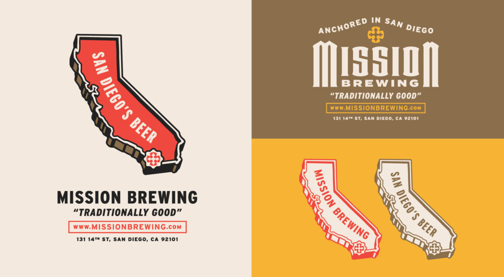
A refreshed brand mark emerged from this process, which allowed us to preserve the iconic red Spanish cross, albeit with a fresher and warmer presentation.
And we’re particularly proud of working in authentic Mission architecture style design cues into the typography where possible, to reinforce the history and provenance behind the brand. Mission’s historic typography was quirky and fun, but a little too decorative to accomplish our present communication goals.
Consider this phase as a balancing act achieved through hours of tweaking and comparison. Does the new typography/mark maintain that iconic “Mission” feel, while striking a fresh, relevant note at the same time?
Incidentally, we made a subtle change from “Mission Brewery” to “Mission Brewing.” Nitpicking, perhaps, but considering company goals to eventually open satellite locations, it made sense to tweak this naming convention while we were working under the hood.
Package Design
This first wave of package design is purpose-built to reintroduce Mission Brewing to the market, and to help customers become acquainted with the revived look and feel. Bold colors and a clean, minimal composition come together in a monolithic flagship template that allows new SKUs to be easily whipped up when necessary.
For long-time fans, we stayed true to some design cues from the original Shipwrecked IPA, by bringing in that original skull and red/white/black color scheme.
The rest of the flagship lineup reflects a more modern and market-aware mix of beer styles with vibrant color cues to match. The intention here is to to pique the interest of drinkers who are either new to Mission (or have forgotten about them along the way), or perhaps for those completely uninitiated to craft beer itself.
So other than Shipwrecked, the portfolio is all Mission-forward. Once this work is out in the market for a year or two and has found its sea legs (sorry), we can explore developing more individualized brands within the portfolio to support future growth (exploring a proper Shipwrecked Sub Brand family, reimagining the seasonal program, developing variety packs, etc.).
Mission’s portfolio received a revamp as well, introducing more current beer styles and formats. A few of these changes include a phenomenal hazy IPA, 16oz six-packs as well as stovepipes (19.2s) to drive single serve trial and get into sports and concert venues throughout San Diego.
Brand Guidelines
We concluded this batch of work with a suite of supporting artwork, typography and specced colors assembled in a thorough set of brand guidelines. This sets the Mission team up to go forth and build a merch program right off the bat (this can be a strong revenue stream if handled correctly).
It also gives Mission something it has arguably never had before: A focused, compelling message to rally behind and support day-to-day decision making and longterm company vision.
Mission is the official beer of your next San Diego adventure. This core piece works with the refreshed aesthetic to tell a more future-aware story, while standing tall on the legacy aspect of the brand.


