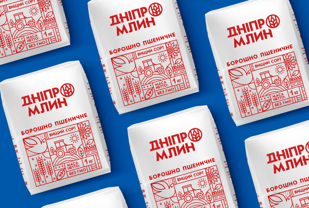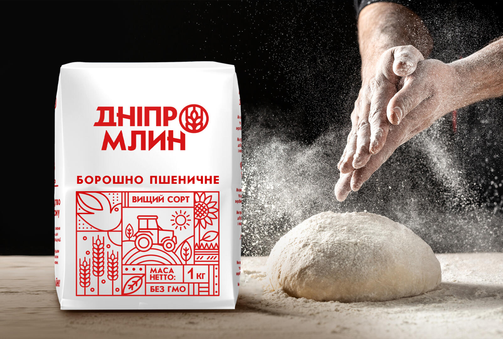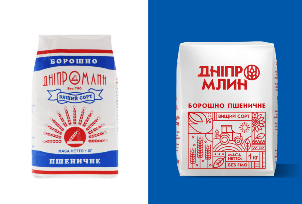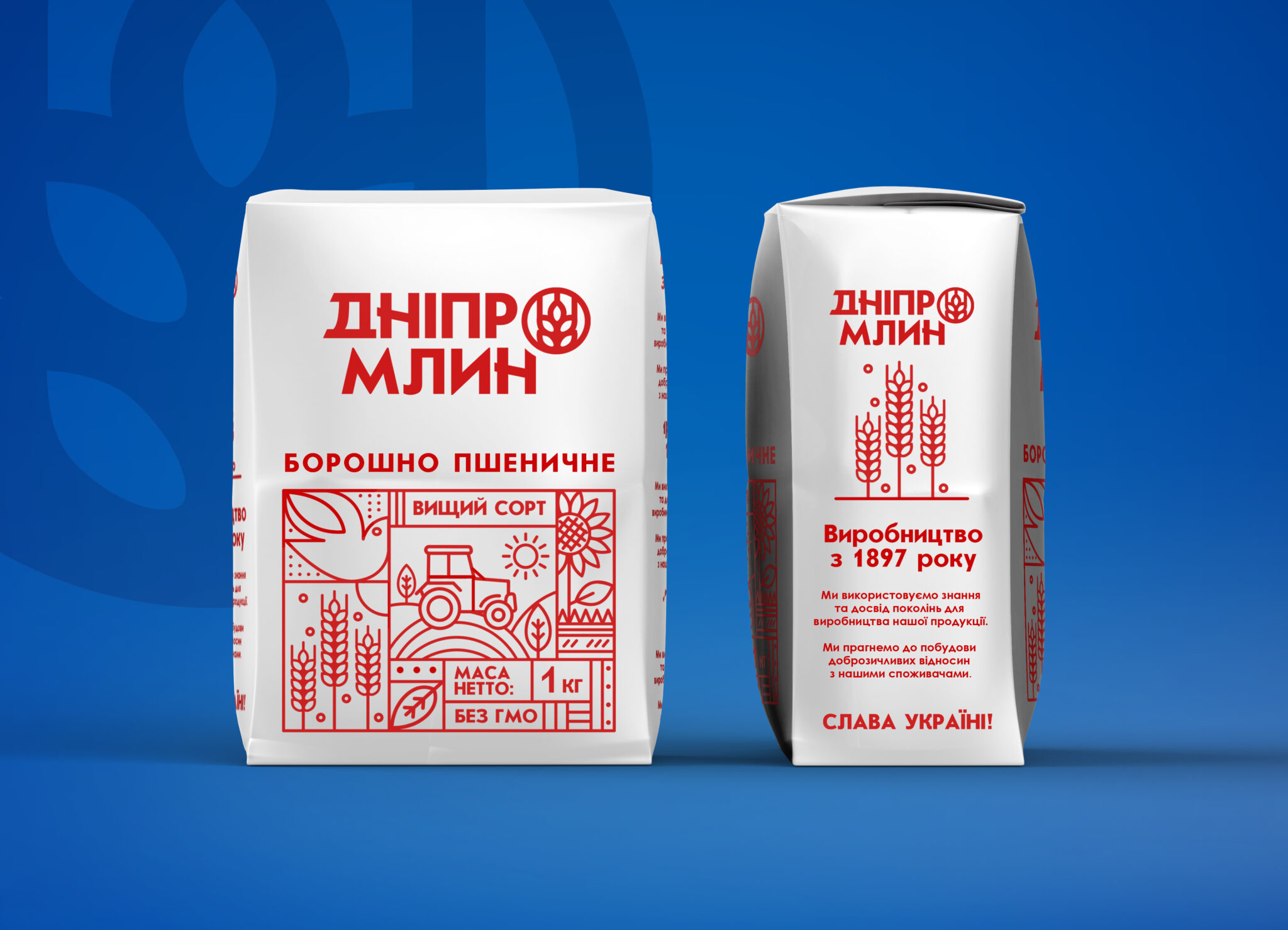
Concept
This is just my vision of a more modern design of “Dnipromlyn” flour. In my version, I decided to move away from the blue color and leave only red (from the logo) by making mono-packaging for greater contrast and drawing attention to the product on the shelf.
The graphic part consists of traditional concepts about flour, our ears of corn and sunflowers, the sun as a symbol of vitality and rebirth in nature. A bird is a symbol of purity and purification, flour is clean, bright.