Redesigning an iconic ice cream brand to reconnect with its origins and reclaim a place in people’s hearts.
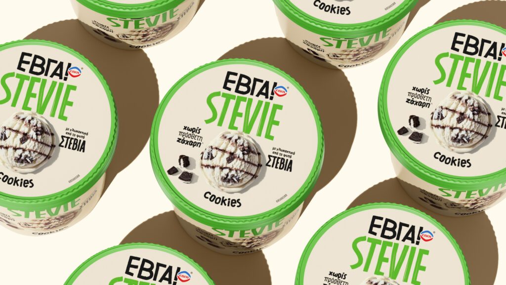
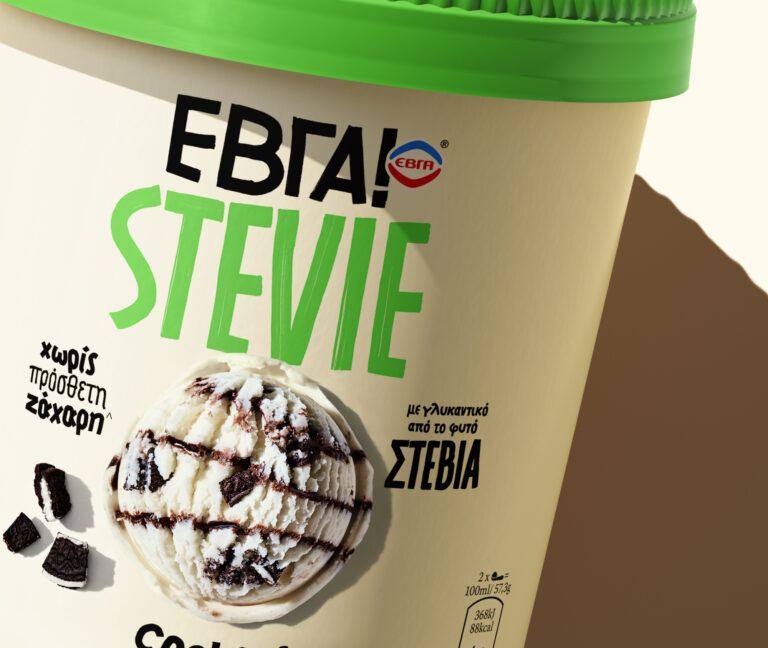
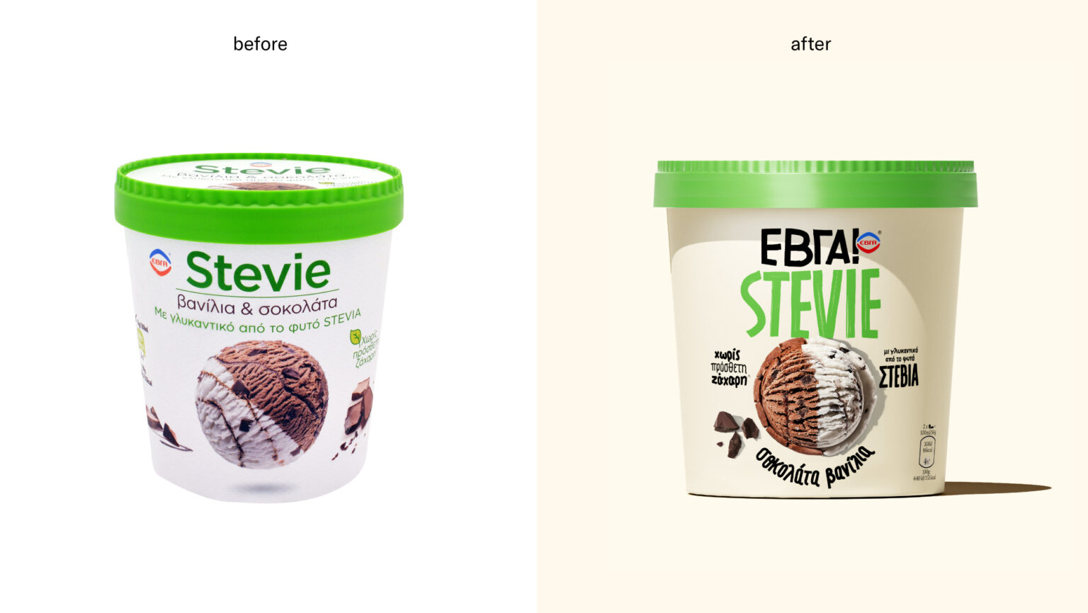
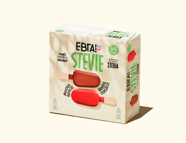
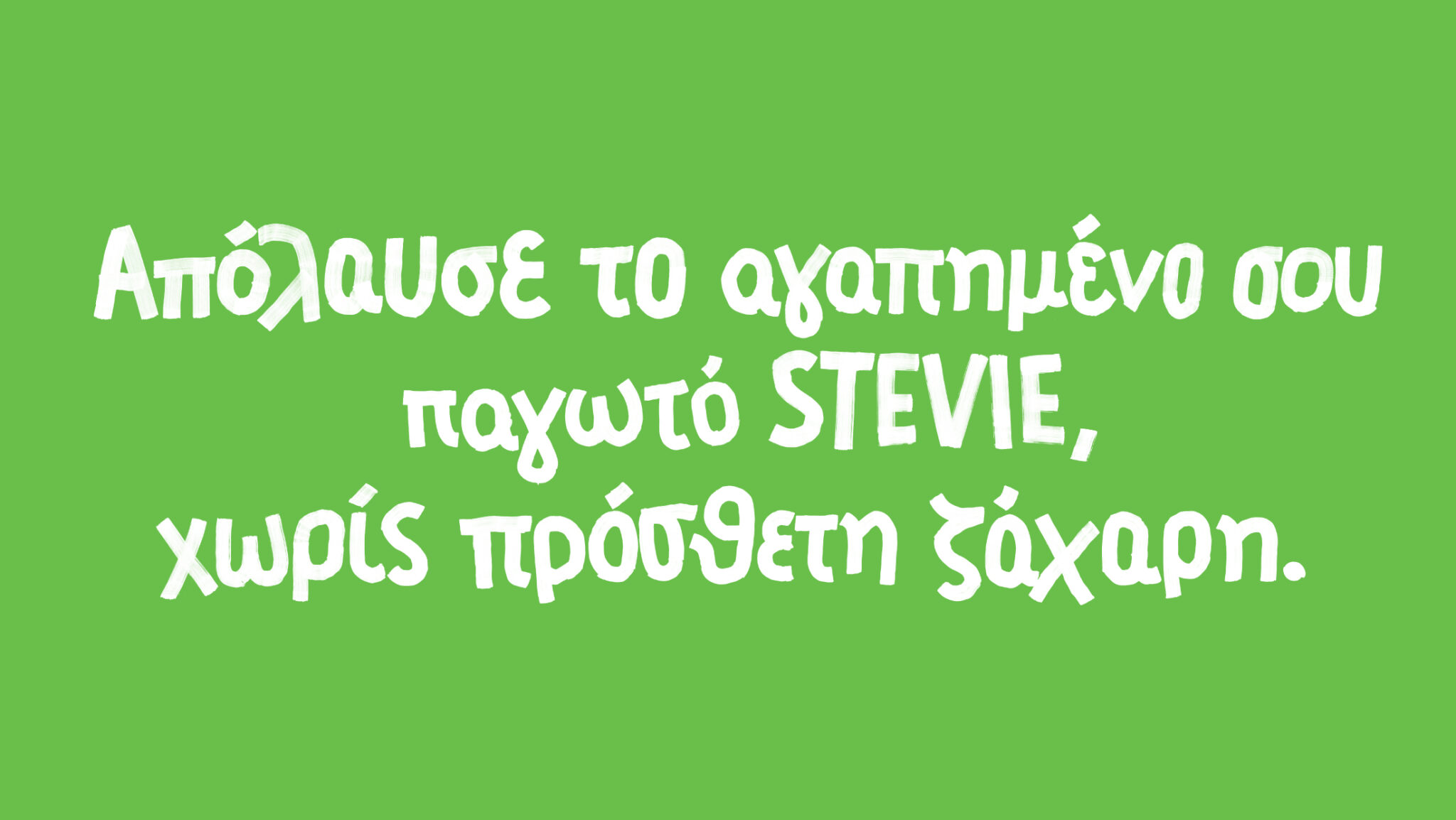
Unilever asked us to redesign the packaging of a rather technical SKU – ice cream with Stevia sweetener instead of sugar- and try to reignite the friendly and natural vibes that made people love the brand in the first place. Our design approach was to create a visual & emotional shortcut to the brand’s origins back in the 1930s and elevate its values of innocence, unpretentiousness, and craftsmanship. We kept food styling simple yet mouthwatering, giving out honest-to-goodness vibes.
We gave the previous cold white a rustic tint but decided to keep the iconic old-school green paper top as a liaison between the past and new packaging.
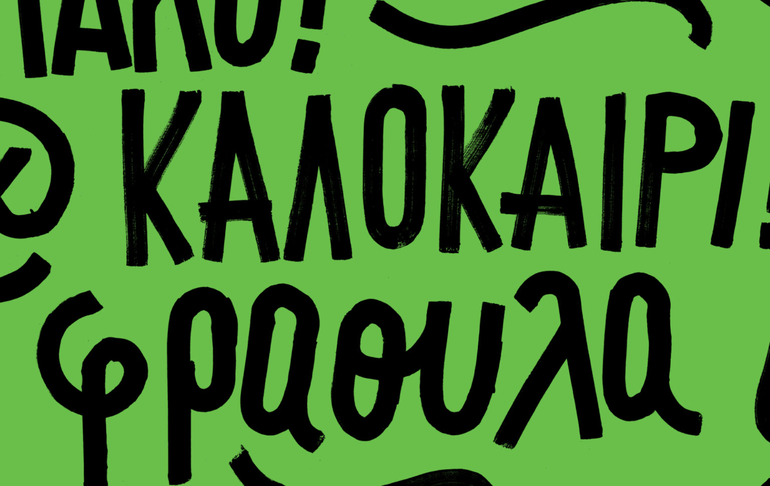
Our tailor-made fonts are inspired by the handwritten signage ice cream carts used to have back then. Thickly brushed lettering, so casual and raw that feels personal and honest.
Launch: 2021
Client: Unilever Caparo DC Amvrosios Palamidis Thalassinos Anastasiou
Aggelos Gourzis
Christos Lianopoulos
Kostas Kaparos
Partners
Theodosis Georgiadis (Food Photography)
Stavroula Foutsa (Food styling)
Evi Giouleka (Image post production)
Curator’s Insight:
The rustic white and the green paper top create a nostalgic and cozy feeling, reminding me of simpler times when ice cream was made with natural ingredients and love. The food styling is appetizing and inviting, without being too flashy or artificial. The handwritten fonts are charming and authentic, conveying a sense of personality and craftsmanship.


