Overall
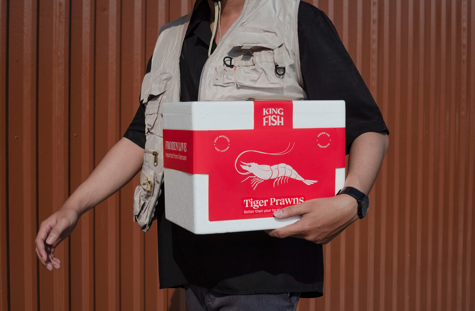
KINGFISH is a B2B brand which focuses on supplying seafood for Vietnamese and international markets. Despite their orientation of being a B2B wholesaler, KINGFISH realized how important branding is. With an effective brand identity & brand strategy, KINGFISH can strive to become a leading brand in Vietnam and other countries, and they can also develop affiliated retail brands.
Problem
As a B2B brand, KINGFISH had never seriously thought about developing its brand identity. Therefore, only a few long-term clients could hardly get to know KINGFISH. Its potential to develop and become a major national and regional brand was almost zero.
Solution
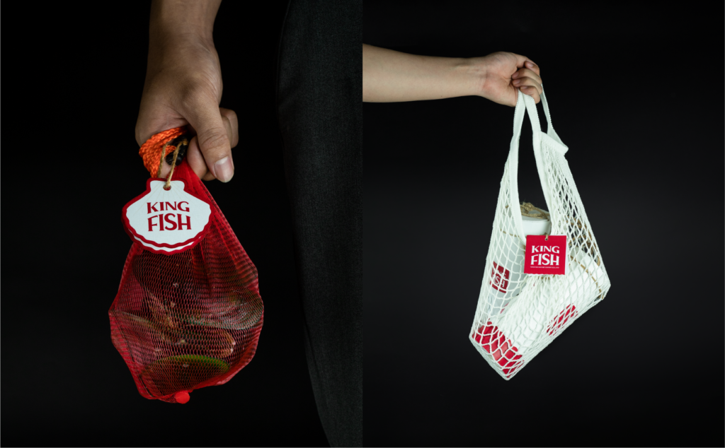
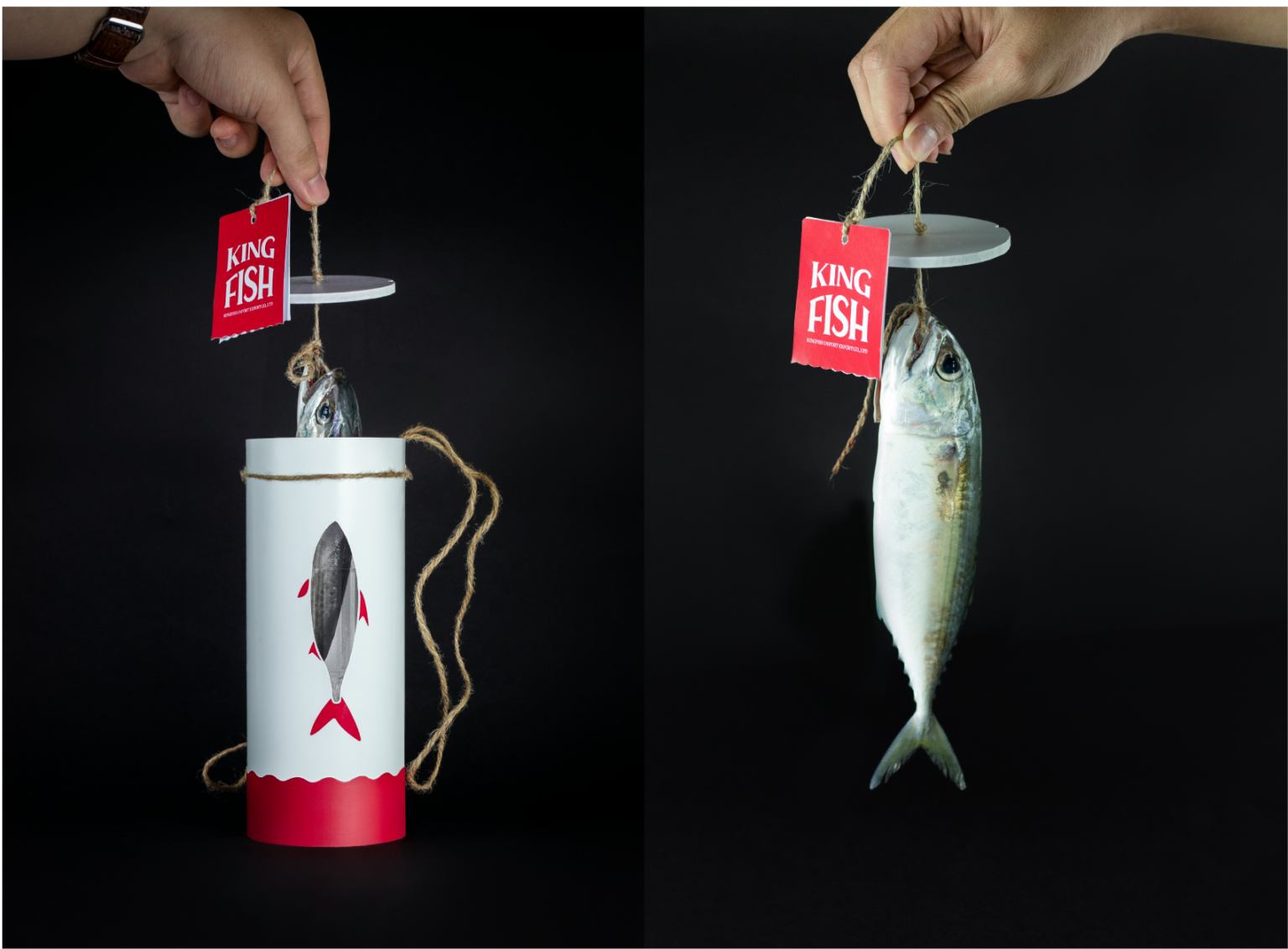
We create a completely new brand identity system for KINGFISH based on its brand essence. We strived to come up with a positive image for KINGFISH, which would orient the brand to become a symbol of Vietnam’s seafood industry. Our goal is to ensure that, when a client comes across KINGFISH’s identity elements, they would immediately associate it with the seafood industry, and vice versa, when it comes to the seafood, people would recall KINGFISH.
Inspiration
KINGFISH’s founder has a strong background in managing supply chains thanks to his previous work experiences. With the advantage of supply chain management, KINGFISH also use the RULER model as their main brand archetypes. Inspired by its essence, the Vu Digital team decided to follow the “King” concept – a strong representation of the ability to manage and control their business.
Color
We use red as our main color, which we named Sockeye. According to visual principle theories, Red is the color that stimulates our heart beat. It creates a feeling of impatience, gnawing and makes us feel hungry. That’s why many F&B brands have chosen red as their main color such as KFC, McDonald’s, Coca Cola, Heinz,… We both agreed that Red is the best option for KINGFISH.


