A Fresh Look at STM Magnit Retail Chain
Client: Magnit Retail Chain
Objective: Redesign packaging for STM Magnit Basic products
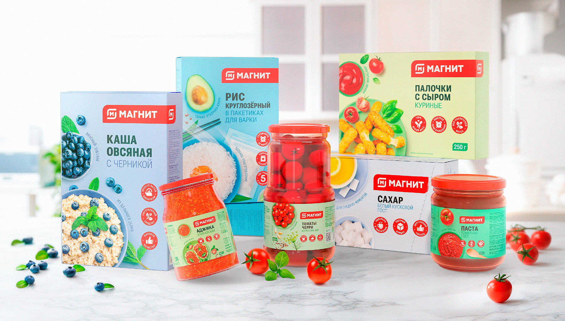
The previous design of the packaging for STM Magnit Basic products was universal and had a simple adaptation system for all products in the network’s range. Magnit Basic includes over 1200 SKUs of daily demand products, ranging from food to household chemicals. Over the years, the level of STM products has significantly increased, leading to the need for a new vibrant, open, and friendly brand image with a flexible, simple, and understandable visual identity system that emphasizes both rational and emotional benefits.
Solution:
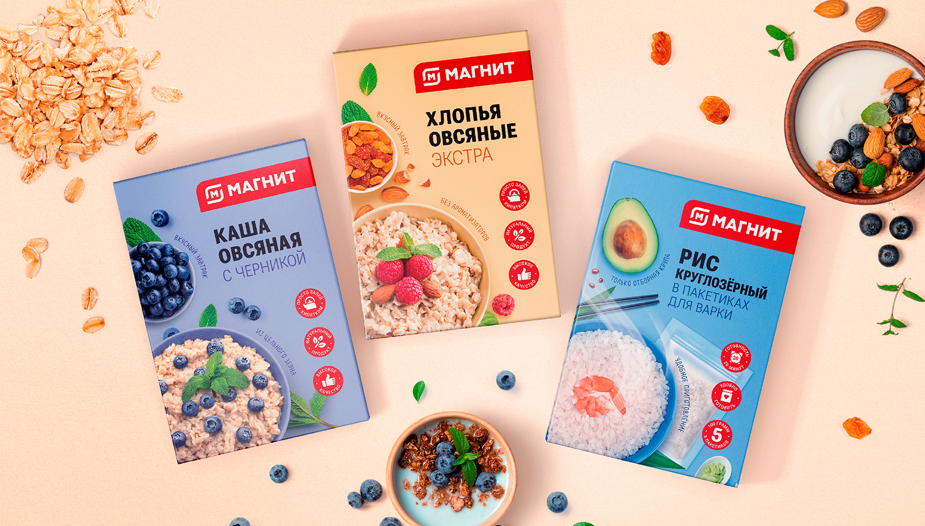
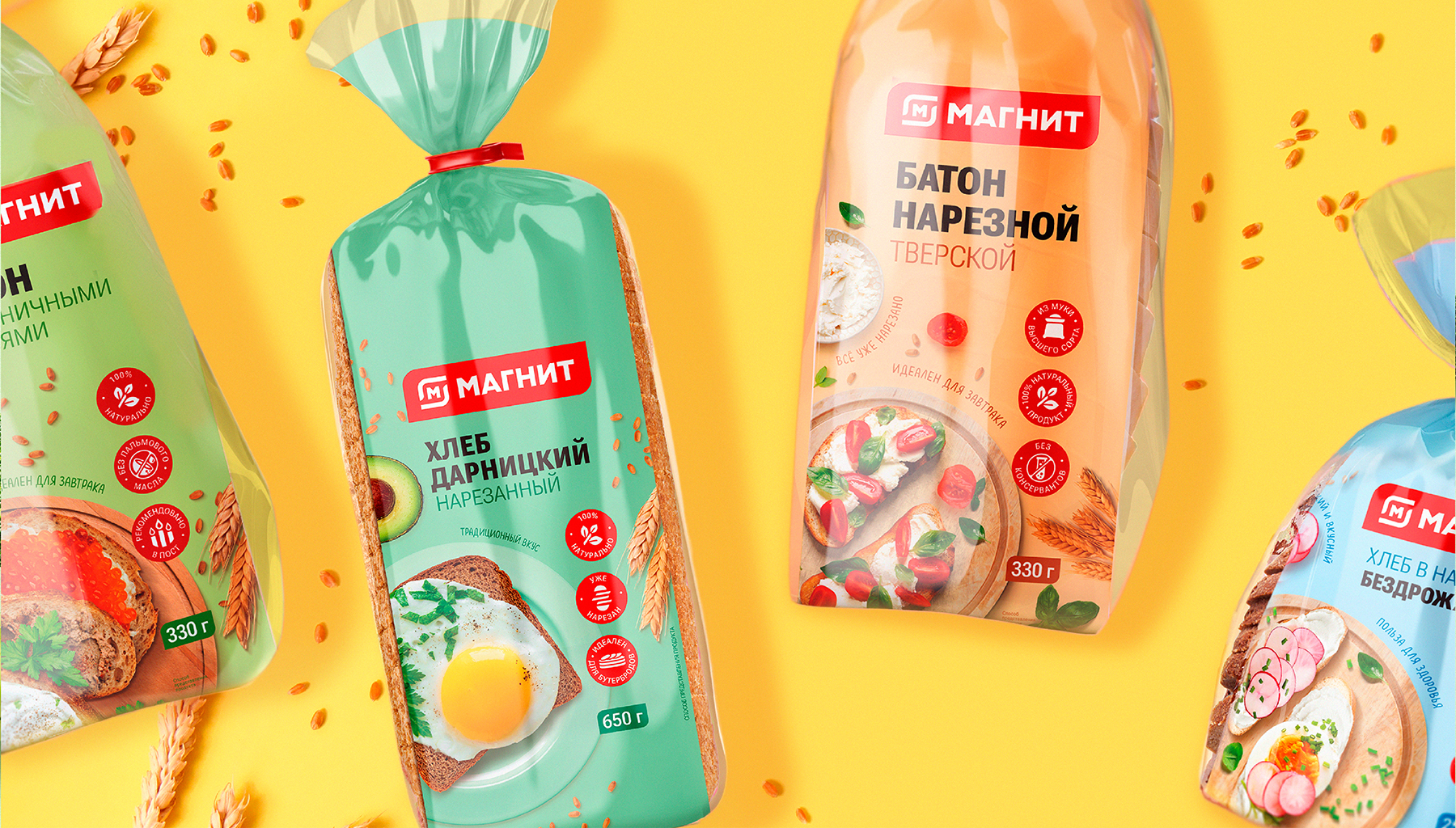
The basis of the current packaging design was the letter «M», symbolizing the parent brand «Magnit» When developing the new project, DDC.Group specialists looked at the brand from a different perspective – literally as the consumer looks at it from top to bottom. Thus, a top-view food zone became the basis of the updated brand’s photoshoot style.
Along the edge of the food zone, we placed messages that emphasize the emotional advantages of the product. And we placed the rational ones on the branded icons, developed by the designers in a quantity of over 200. On the back of the packaging, the brand continues to communicate with the consumer – sharing interesting facts about the product, useful tips, and unusual recipes.
The packaging color depends on the characteristics of the product itself and is not tied to the product category. The brand’s palette is composed of calm, soft shades that help consumers see the familiar brand in a new light.
Currently, there are about 1200 SKUs in more than 25 product categories on the store shelves. And this is just the beginning. The assortment is constantly expanding with new products, and DDC.Group specialists continuously work on the packaging design for them.