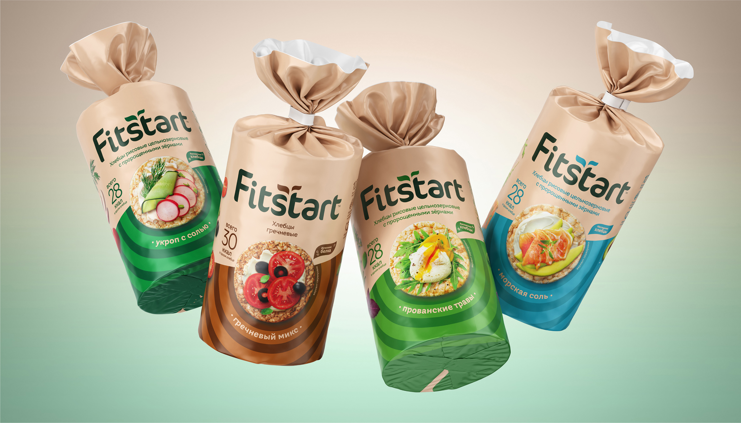
The client decided to update the packaging design for Fitstart crispbread, in line with the brand’s new positioning: “Fitstart crispbread is a healthy, yet tasty everyday snack!”
In particular, we wanted to give the packaging a more modern and minimalist look, and make the design less sports-oriented, expanding the target audience – now it’s not only for addicted for a healthy lifestyle people and athletes, but also for those who simply enjoy a tasty snack.
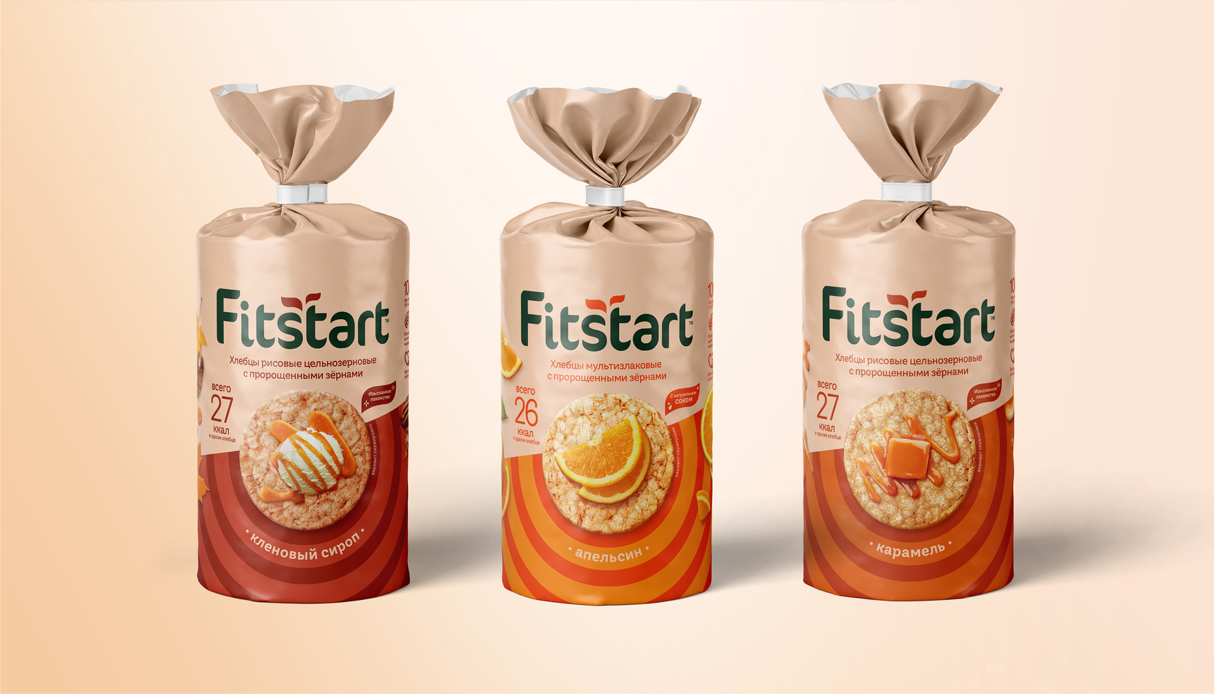
The main idea behind the new design is the balance between a healthy, active lifestyle and the desire for a quick and tasty snack. Therefore, when creating the updated design for Fitstart, we used a combination of colors with different characters.
A calm beige shade was chosen as the main color that is typical for the healthy food product category. It is uniform across the entire crispbread line and underlines the natural and beneficial ingredients of the product to the consumer. On the contrary, additional colors are expressive and energetic. It embodies the vibrancy and variety of flavors and serve to differentiate the SKUs.
At the center of the packaging, there is a neat and very tasty food zone. It not only attracts attention and arouses the desire to have a snack, but also further emphasizes the new brand positioning.
The updated Fitstart logo has become more restrained, but at the same time remains recognizable.
In order not to overload the packaging, we have gathered all the important and useful information on the back side in the form of a neat infographic. The technical text is also placed there.