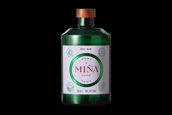
Located in the north of Spain, Galicia is one of the country’s most enchanting regions — a coastal haven embraced by mountains, where rivers trace the coastline and breathtaking colours infuse the sky with each sunset. This location serves as an inspiration for “A Miña Orixe,” Pernod Ricard’s new Galician gin.
Our core challenge was to craft a strategy, identity, and packaging design for this gin — a concept capable of conveying its roots and introducing Galicia to the world.
We kicked off by determining the gin’s flavor. Our aim was to create something unique in the market while transporting everyone to this distinctive region. So, we got innovative and created a groundbreaking distilled spirit steeped in authenticity, featuring the most outstanding local botanical: the padrón pepper.
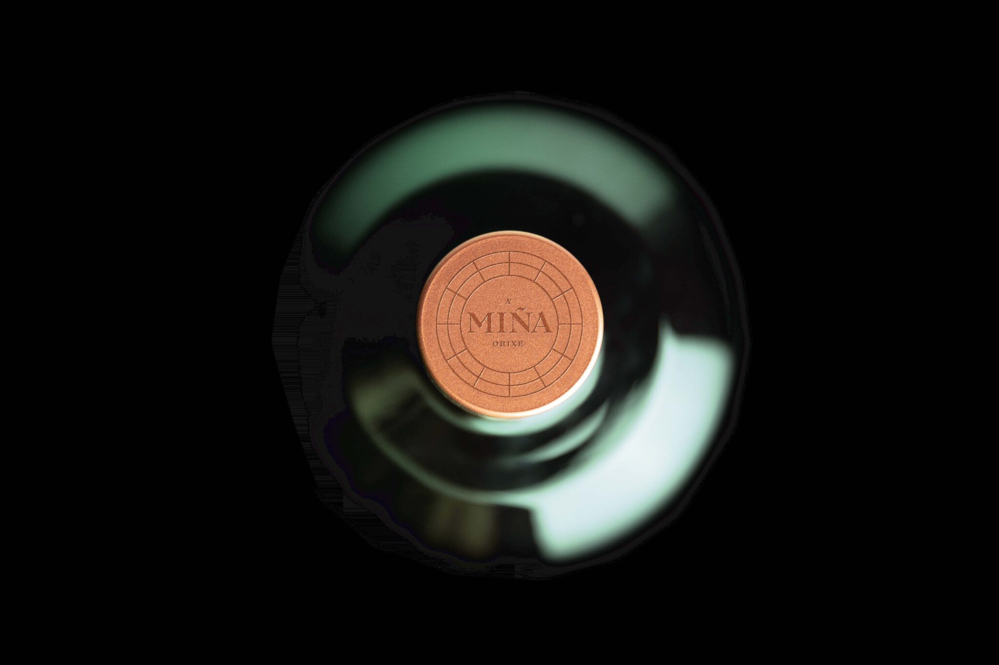
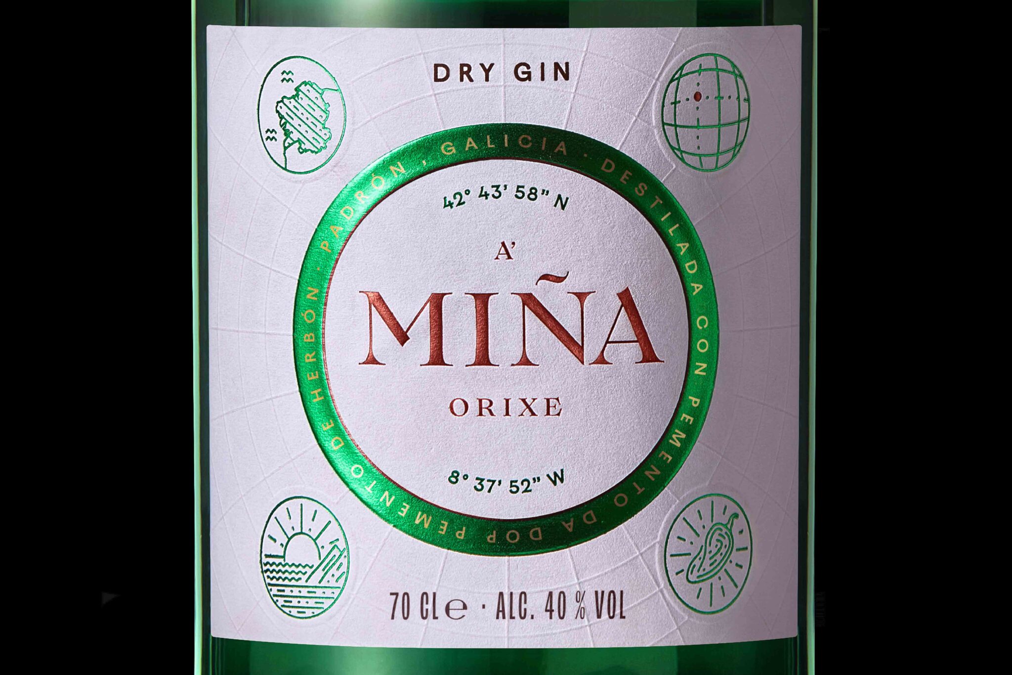
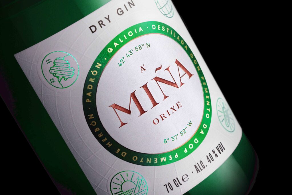
To transmit the origin to a global audience, we defined the brand’s visual identity and packaging to encapsulate the Galician essence in the design language. Drawing inspiration from map symbology, we pointed travelers from the four corners to the extraordinary geography of this region, by introducing it into the label’s background. These map lines, created through embossing, guide us to the centre of the label, where we find the brand seal – which includes the coordinates of the San Francisco convent in Herbón (where padrón peppers grow), with the logotype at its heart, using a copper colour to reflect quality and mirror the earthy tones of Galicia.
To round off, we incorporated four satellites using green stamping to evoke the gin’s origin and taste. These elements convey the beverage’s essence, through Galicia, the main ingredient, and the sunsets. A vibrant green, consistent throughout the design and packaging, embodies the main ingredient and the birthplace, inviting everyone on a flavour odyssey.
Everyone has an origin, and A’Miña summons everyone to connect with one: The Galician spirit.


