Evolution without losing the essence
Since 1937, Gallina Blanca has stood out as an iconic, homely, and trusted brand present in Spanish kitchens thanks to its ability to help families prepare homemade recipes practically and simply.
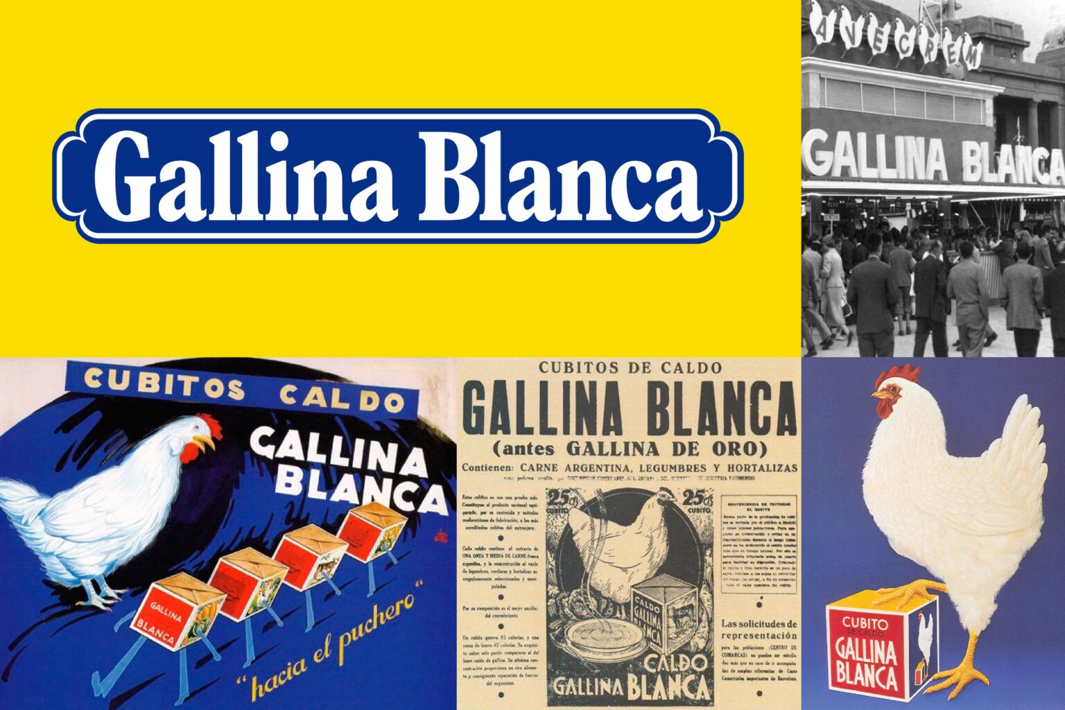
Now, after more than 80 years on the market and with very little evolution in its visual identity in recent years, Gallina Blanca needed an update that would help it to defend its leadership in the category and connect with today’s consumers. So, we brought the brand to the present day, from its brand symbol to its color palette, packaging designs and communication assets.
Our creative team redesigned the brand’s imagery based on the concept ‘Como en casa’ (‘Like at home’ in Spanish), which is inspired by its classic visual assets and typographic elements. From these, we build something that feels fresh but true to its origins.
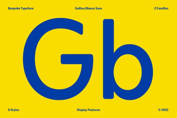
As the brand desired a fresher look and feel, they entrusted us to rethink one of its most iconic elements: its typography. Our response was Gallina Blanca Sans, an ad-hoc typography designed by Pedro Arilla exclusively for the brand, which is 100% unique, and fitting for the new brand idea of eating ́like at home’. It is inspired by an egg, which evokes home, a place to feel cared for and well-fed. It’s friendly and clearly associated with the brand’s ‘gallina’ (hen in Spanish).
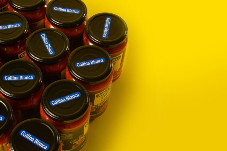
As well as redesigning the brand’s symbol and typography, the lion’s share of the project was to restyle its complete, diversified portfolio, to achieve greater consistency in its on-pack brand application.
Its visual codes are cross-cutting, with consistent information sizes and hierarchy. Gallina Blanca’s on-pack application is imprinted through a napkin-like square at the top of the pack, giving it the look and feel of a homemade product. This brand block infuses all the packaging, improving brand recognition.
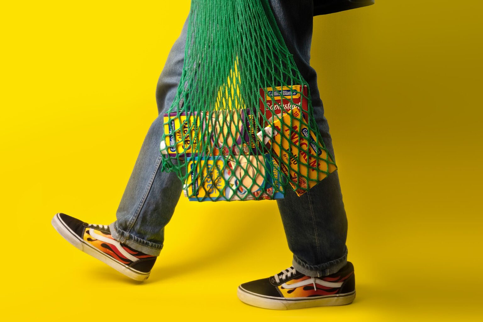
The search for brand recognition and greater perception of the quality and authenticity of the products led us to review the photographic art direction, with a cross-cutting style that included household items connecting the brand with the home environment.
A 360-degrees rebranding and restyling to develop a visual pack identity that ensures consistency and brand awareness globally without losing an iota of brand essence.


