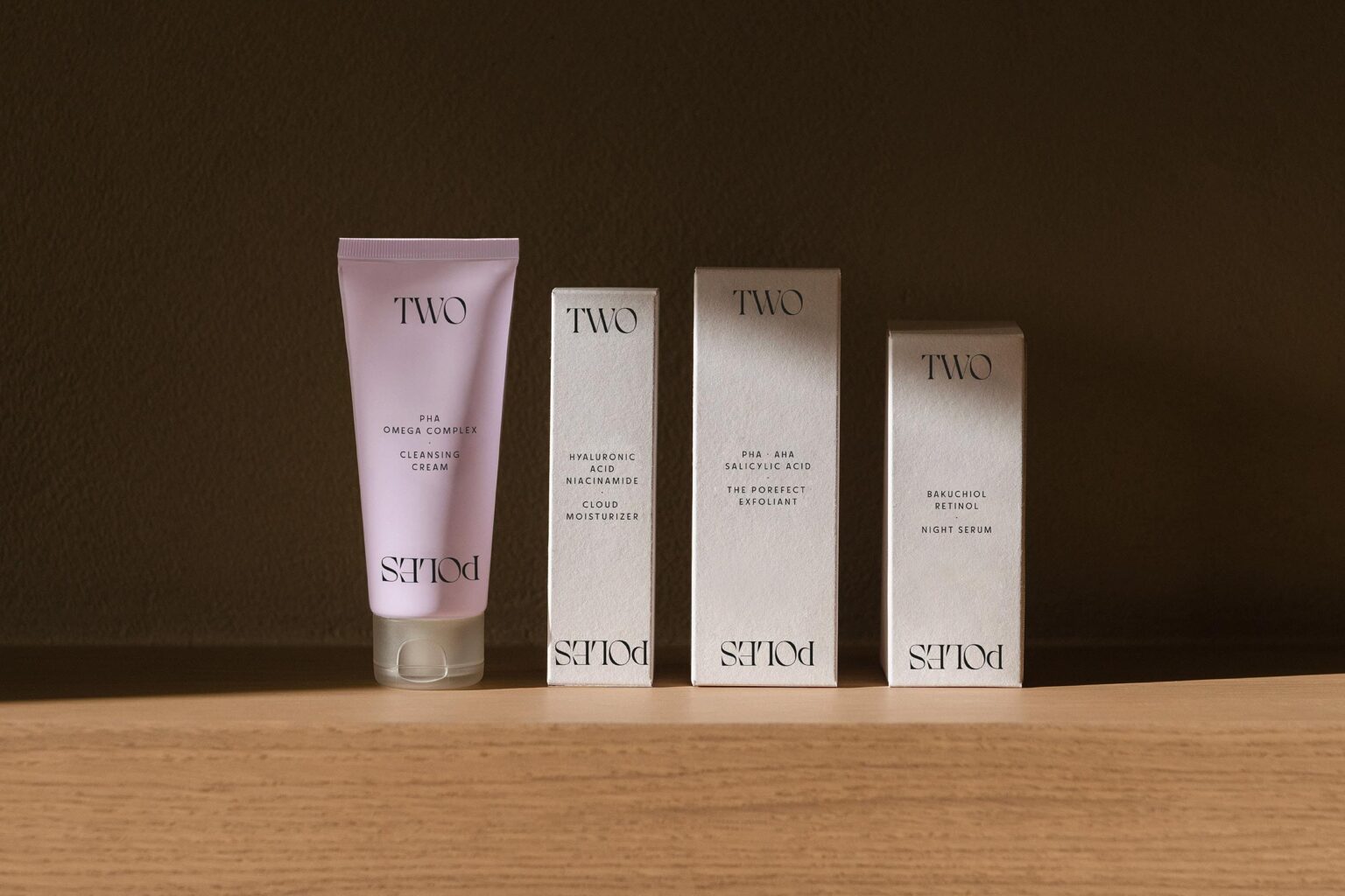
In a context in which “skintellectuals” – cosmetics consumers – are increasingly demanding, and where nature and science are understood as opposites, Two Poles was born as a new cosmetics brand that fuses plant-based and synthetic ingredients to inspire simple, sophisticated, and effective routines, which are more respectful to the skin and the environment.
Our challenge was to create a full identity capable of fusing all the elements that the consumer seeks in a unique product: naturalness, accessibility, and simplicity but also efficacy and sophistication. We had to create a brand that could transfer its promise to an attractive way through a new strategy, naming, and brand identity as well as through a dynamic visual and verbal language.
In order to shape a solid brand, capable of grounding its essence in all its assets, we created “Two Poles”; a name that represents the union of two realities, two ways of understanding cosmetics, proving that opposites attract, while generating a proposal with a constant game of contrasts.
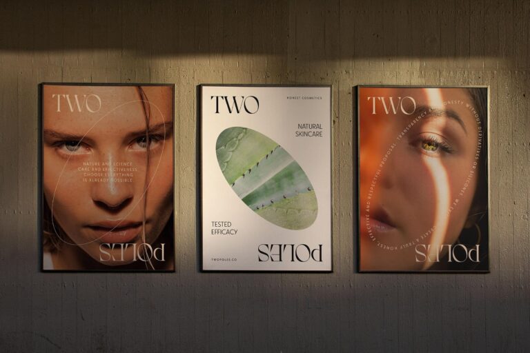
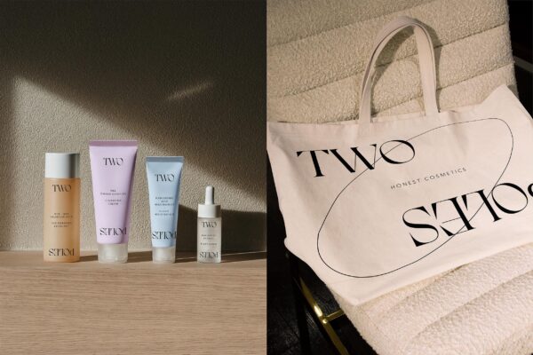
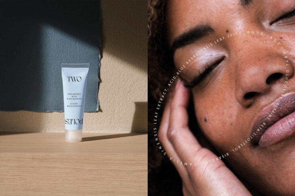
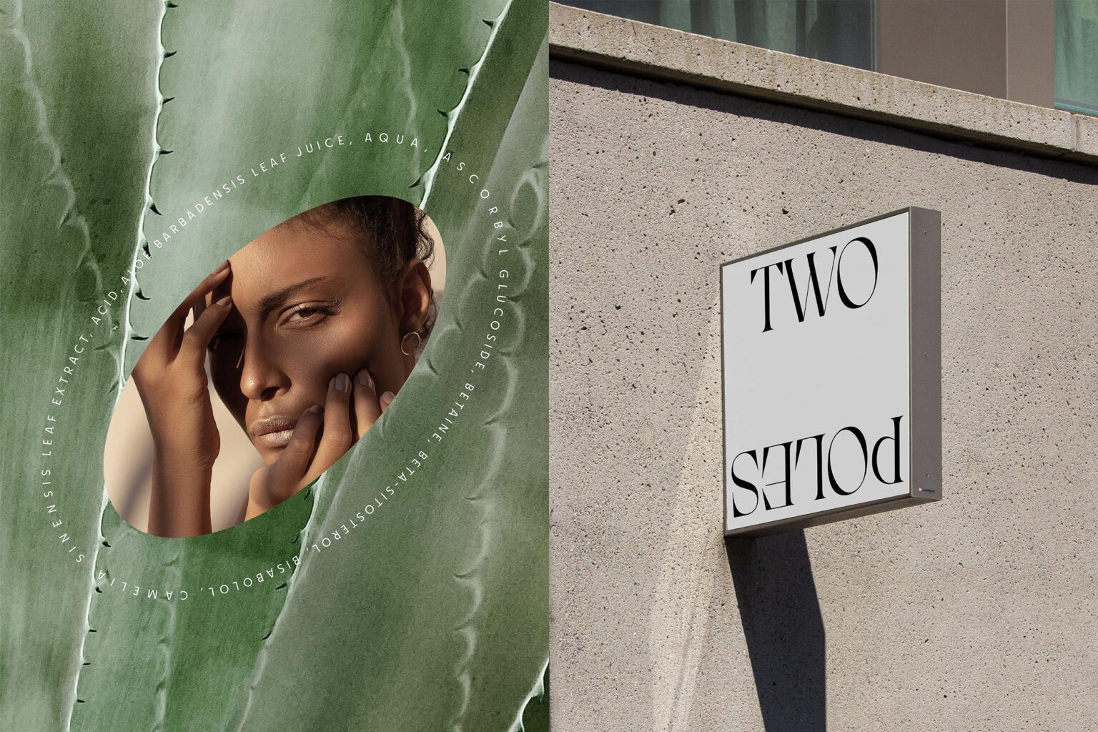
True to our purpose, we shaped the entire visual identity around the literality of these opposites. By applying a touch of magic, we placed the oval in the center of the proposal to represent the poles of the earth, and we used different resources such as the inversion of the words in the visual language and in the logotype. Through these elements. accompanied by pure, light colors that reflect the brand’s imaginary, and an elegant contemporary typeface we devised a sophisticated, balanced and bold identity that reflects the brand’s personality, and at the same time, connects the brand to the cosmetics universe.
In line with the brand’s purpose, we also intensified its sustainability commitment through the use of natural ingredients and recyclable materials in both the primary and secondary packaging, and the use of paper instead of plastics wherever possible.
The result was a global and memorable identity, capable of telling a story that anchors the concept to the proposal’s core: the way of formulating, using an abstract, honest, and attractive concept, and an elegant, pure and powerful visual identity that leaves nobody untouched.

