Meet three fresh packaging identities for three distinctive innovations by Seagrams: the 0.0, IPA, and Whisky variants.
Our approach involved carefully preserving the brand’s core elements while skillfully adapting them to complement the unique characteristics of each product. This meticulous process led to the incorporation of striking details that emphasize the individual value propositions of Seagram’s selection.
For Seagram’s 0.0, we kept the iconic Seagram’s Dry Gin label design, ensuring continuity and a recognizable visual identity, adding a distinctive touch of blue for emphasis.
For the IPA variant, a vibrant green colour scheme takes centre stage, accompanied by a lively illustration of a hop, encapsulating the essence of this outstanding brew.
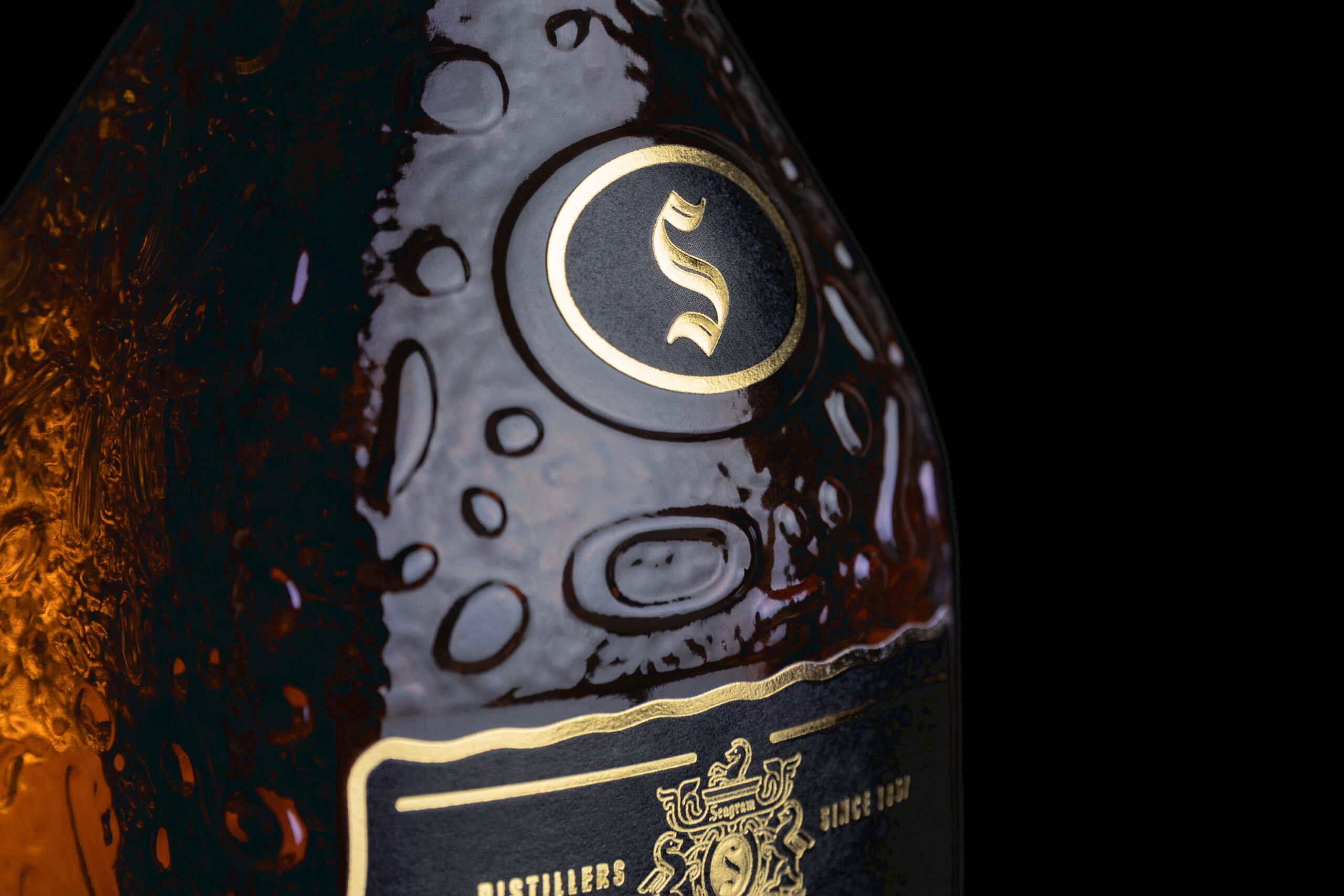
Finally, for Seagram’s Whisky, a refined adaptation of the label aligns it with the esteemed standards of the whisky category. This is achieved through a rich palette of black and gold hues, enhancing the perception of quality.
These thoughtfully crafted designs not only breathe life into the Seagram’s range but also strengthen its presence with a cohesive and memorable visual language. The tailored approach to each variant ensures that consumers can easily distinguish and connect with their favourite Seagram’s experience.