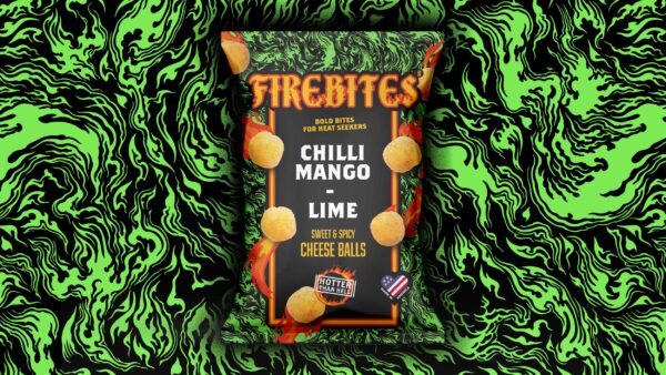
We were approached by Firebites to create a new identity and packaging range for their new brand of hot crisps.
From the off, we wanted to steer clear of typical FMCG hot crisp imagery (chillis, heat dials) and create a range with more of a cult craft feel.
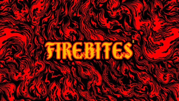
We created a bespoke logotype using traditional woodcut techniques to add layers of interest and sell the heat-led proposition. This was paired with a suite of seamless flame patterns that were flooded across packets in bold SKU colours for shelf standout, and differentiation against other household name brands in hot crisp snacking.
The result is a brand that has immediate shelf standout, encourages repeat purchases and multiple buys, and makes the heat proposition clear to consumers – in a more premium approach to traditional hot snacks.


