Combine creativity and efficiency
Overview
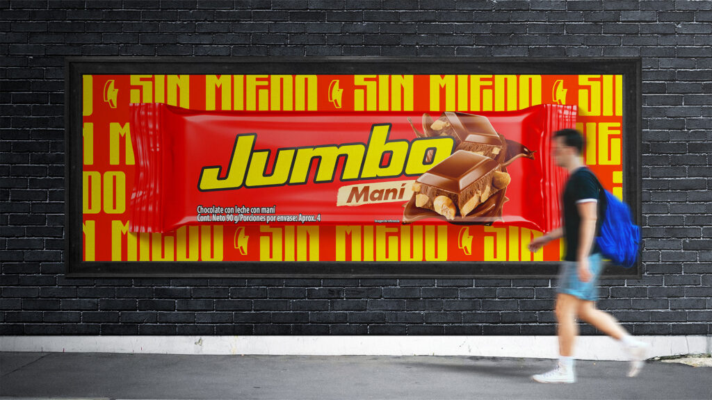
Jumbo Chocolate is a brand that combines the best of chocolate and peanuts, with delicious ingredients. Has looked to represent in the Colombian market the adventures and fun that youth represents in all stages of life for those people who always want to live a limitless pleasure.
Challenge and results
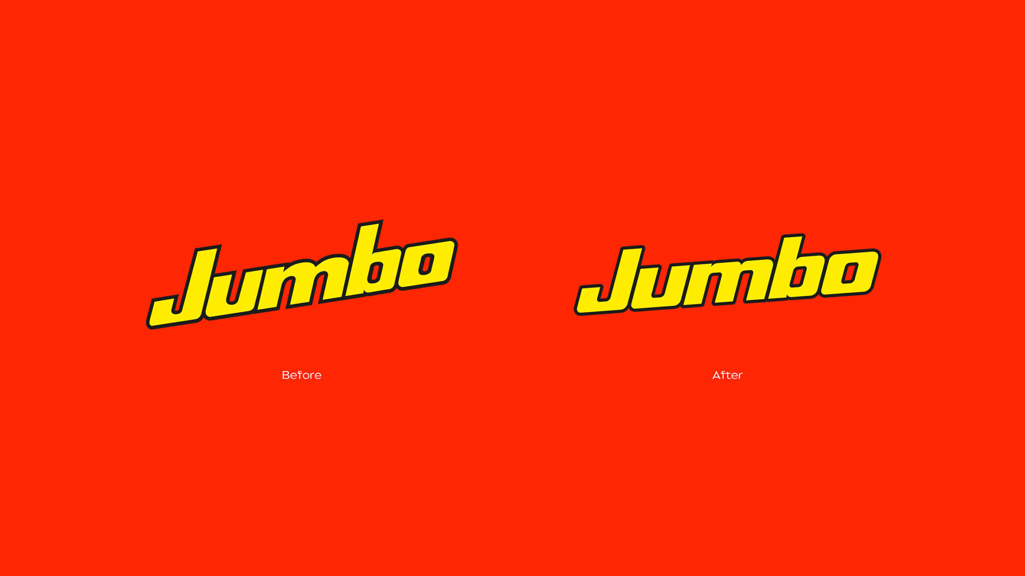
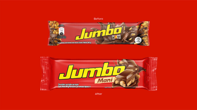
Our challenge was to renew the visual identity of Jumbo Chocolates, transmitting power, freedom and fun, seeking to give it a new modern, attractive and innovative image, moving away from the previous forms.
Our goal was to clean and modernize the logo and its packaging, focusing on the attractiveness of the product, and using bright colors and dynamic shapes to create a new visual language. Therefore, we developed a lifting and a new visual identity for Jumbo chocolates, generating a younger and more attractive look that is aligned with the current consumer, but that generates a communication that connects with new consumers, without changing its essence, its values and its brand territory.
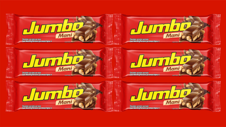
The color palette, predominantly red and yellow, conveys power and boldness, enhancing large, provocative and easily distinguished photographs to strengthen a coherent and impactful visual identity.
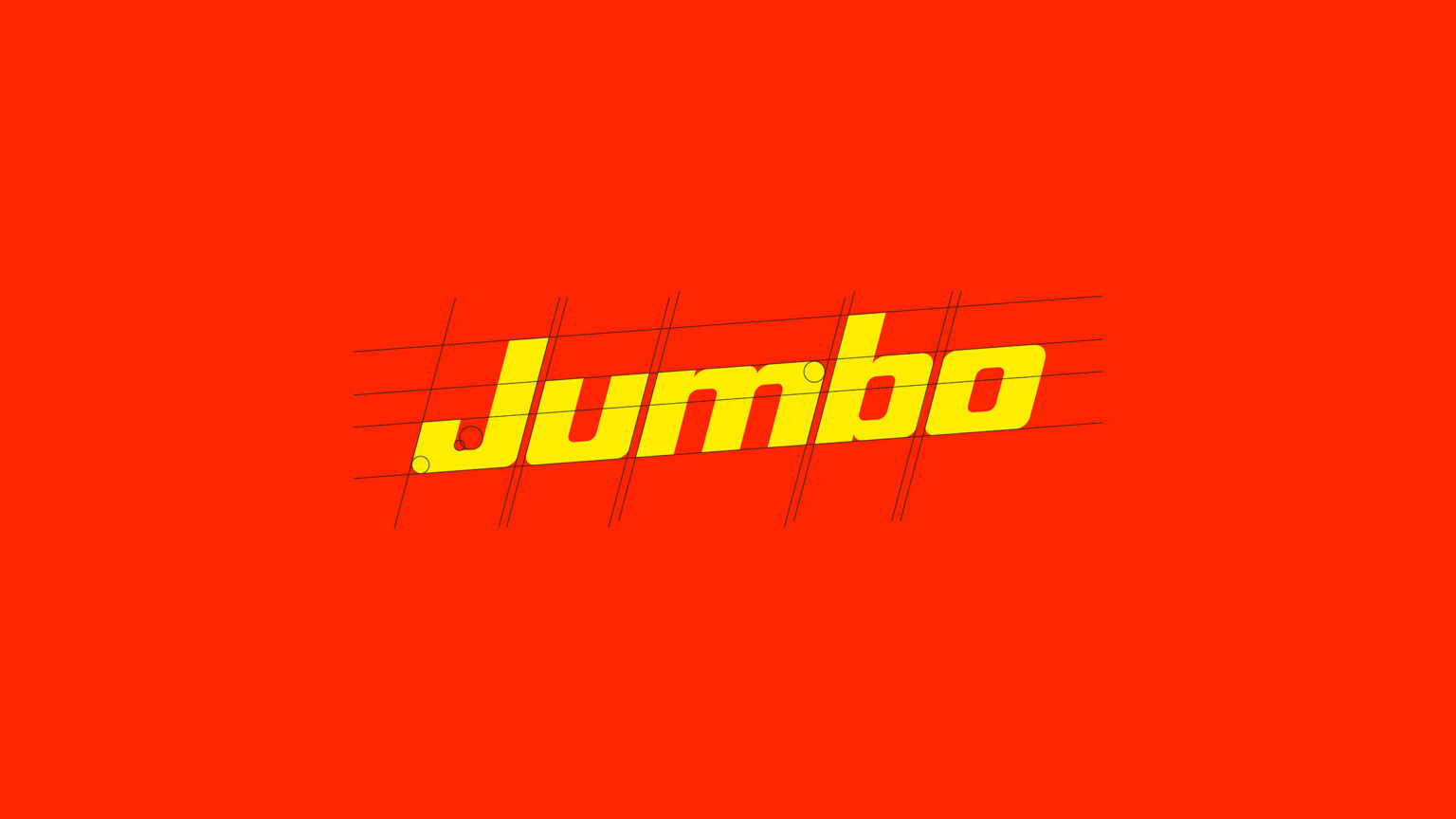
Fluency: Facility of the brain to process information and design.
Hedonic Value: Pleasure and excitement generated by design and information.
Rank: Efficiency and precision with which the brain organizes, hierarchizes and understands messages.
Harmony: The ability of design and information to communicate a successful sensory experience.
(Research results obtained by (https://atrianna.com)