The cultural mixing is really actual and significant in the modern world. For instance, Chinese traditions are getting more and more to the Western culture, at the same time adapting to it. Many typically Asian attributes become a part of daily life for a great variety of people around the World..
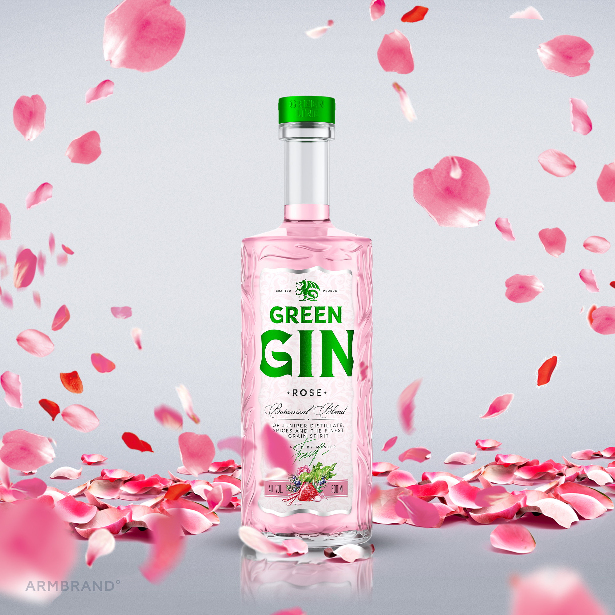
Considering at the beginning of the Green Dragon year according to the Chinese calendar, ARMBRAND studio created the design of the GREEN GIN line produced by the Bulbash LLC.
The true love for letters always used to be this studio’s strength. The lettering of the logo is made in the style of strong alcohol, which fits the other design elements and supports the gin theme itself, combining modern fonts trends with uniqueness.
The label forms an integrated whole with the voluminous plant embossment on the bottle and rhymes with it through a classic Victorian-style pattern.
Today’s life speed makes people spend as little time as possible making decisions, so diversity in the series is done through noticeable and understandable color coding. Unique personal illustrations that clearly and attractively present the taste of the product, complete the balanced image.
As a result, we have got the modern gin line outstanding on the shelf.