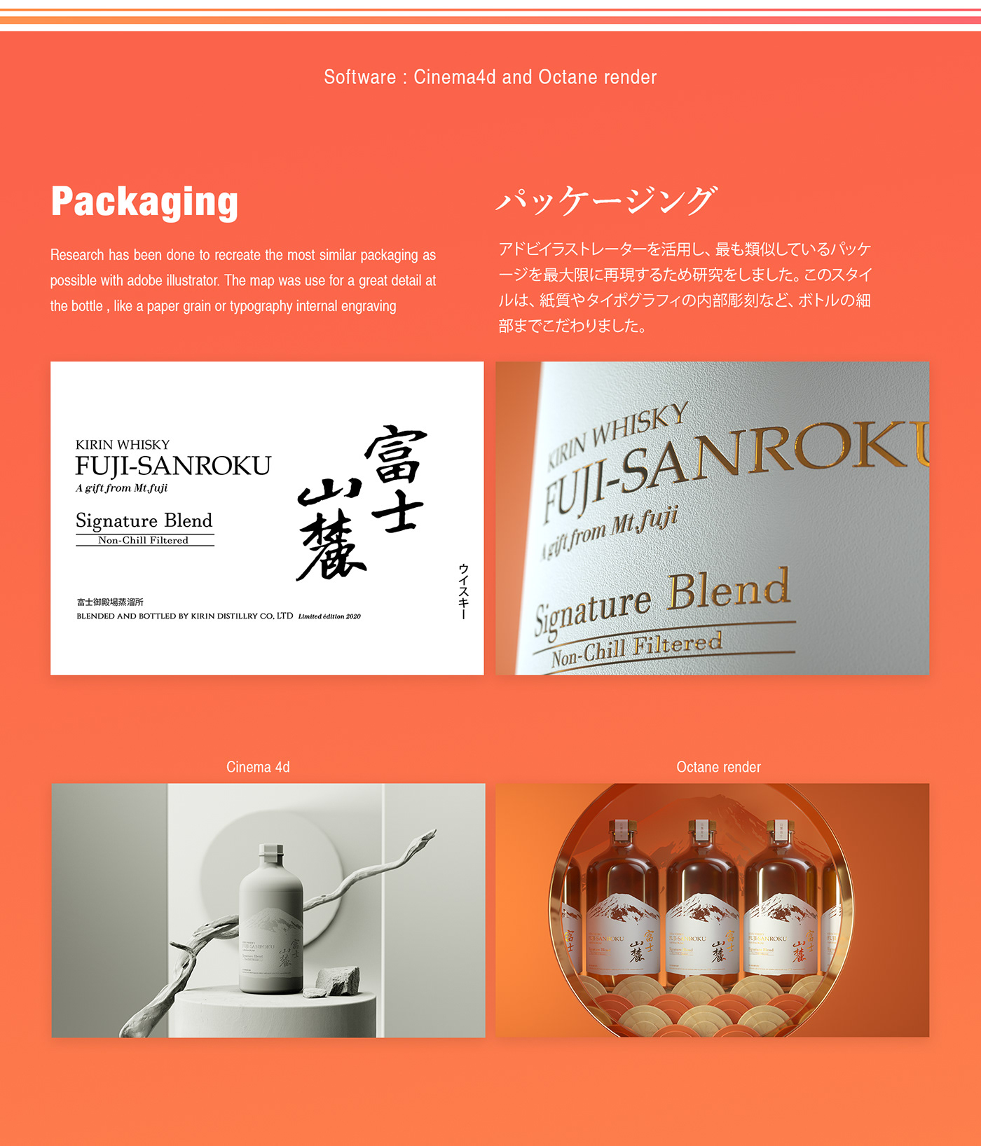
In this Curator’s Insight, we will take a close look at the Fuji Sanroku Whisky limited edition bottle, rendered beautifully in Cinema4d and Octane Render by 3D artist Benjamin Berthelot based in Tokyo, Japan.
The label design features a white silhouette of Mount Fuji. This is a basic but efficient technique to communicate the brand’s name and origin. The beauty lies in the subtlety; the features of the mountain can be seen through the label on the glass bottle itself. It’s like having a small window into the world of Mount Fuji!
The overall aesthetic is classic and classy, yet with a modern touch thanks to the usage of negative space for the mountain silhouette. The Kanji text gives an extra element of cultural curiosity.
The limited-edition aspect and the Mount Fuji theme make this a design that would appeal to collectors. Whisky enthusiasts would likely appreciate the nod to the region where the whisky is produced and would be drawn to the beautiful bottle.
Overall, the Fuji Sanroku Whisky packaging is a great example of how a simple design can be both beautiful and effective. It uses high-quality materials, a clever use of negative space, and a nod to the brand’s origin story to create a package that is both timeless and collectible.