Simply Delish Organic Dips
The global organic trend is gathering momentum as consumers look for more natural and less processed foods. Simply Delish produced an organic range of dips to tap into this growing market.
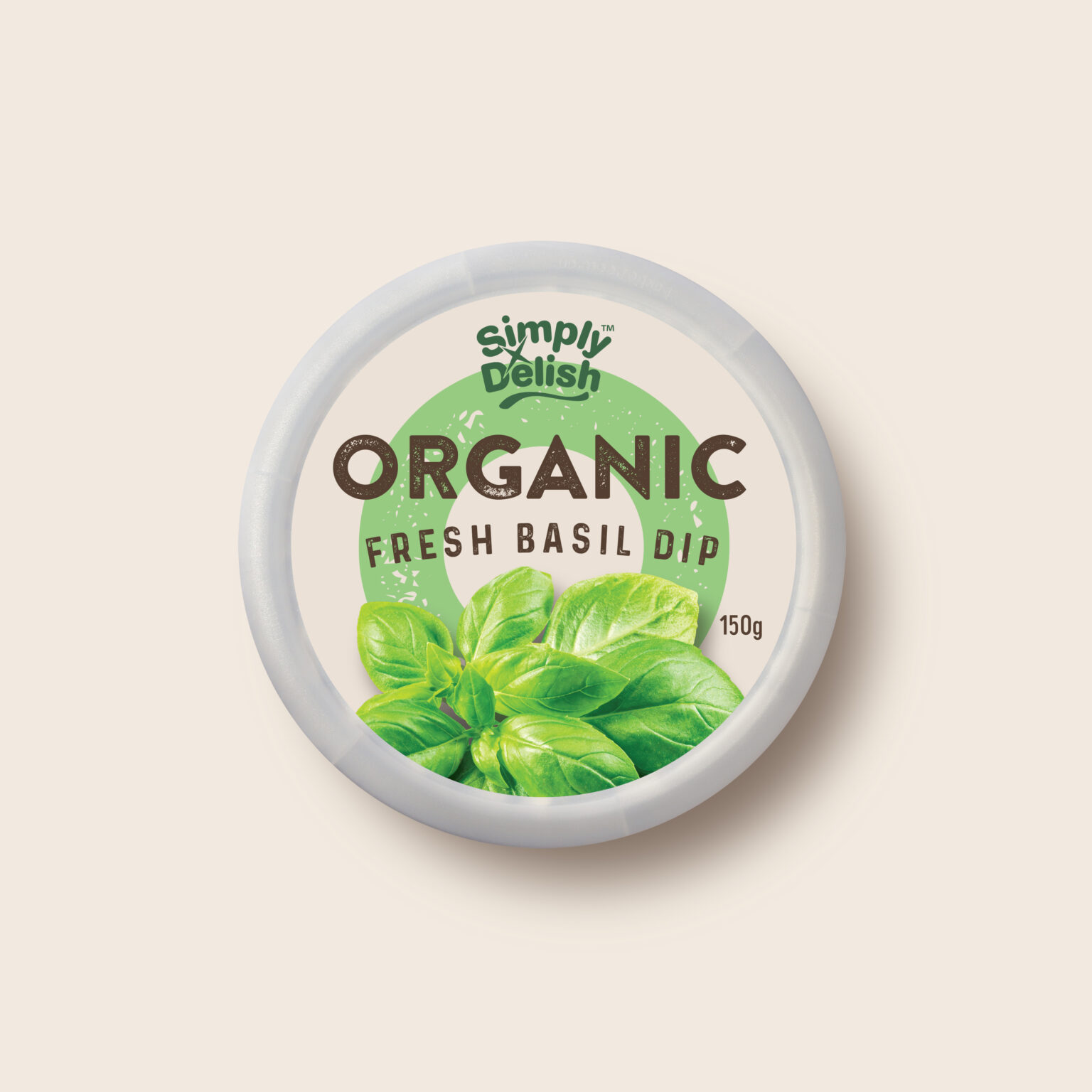
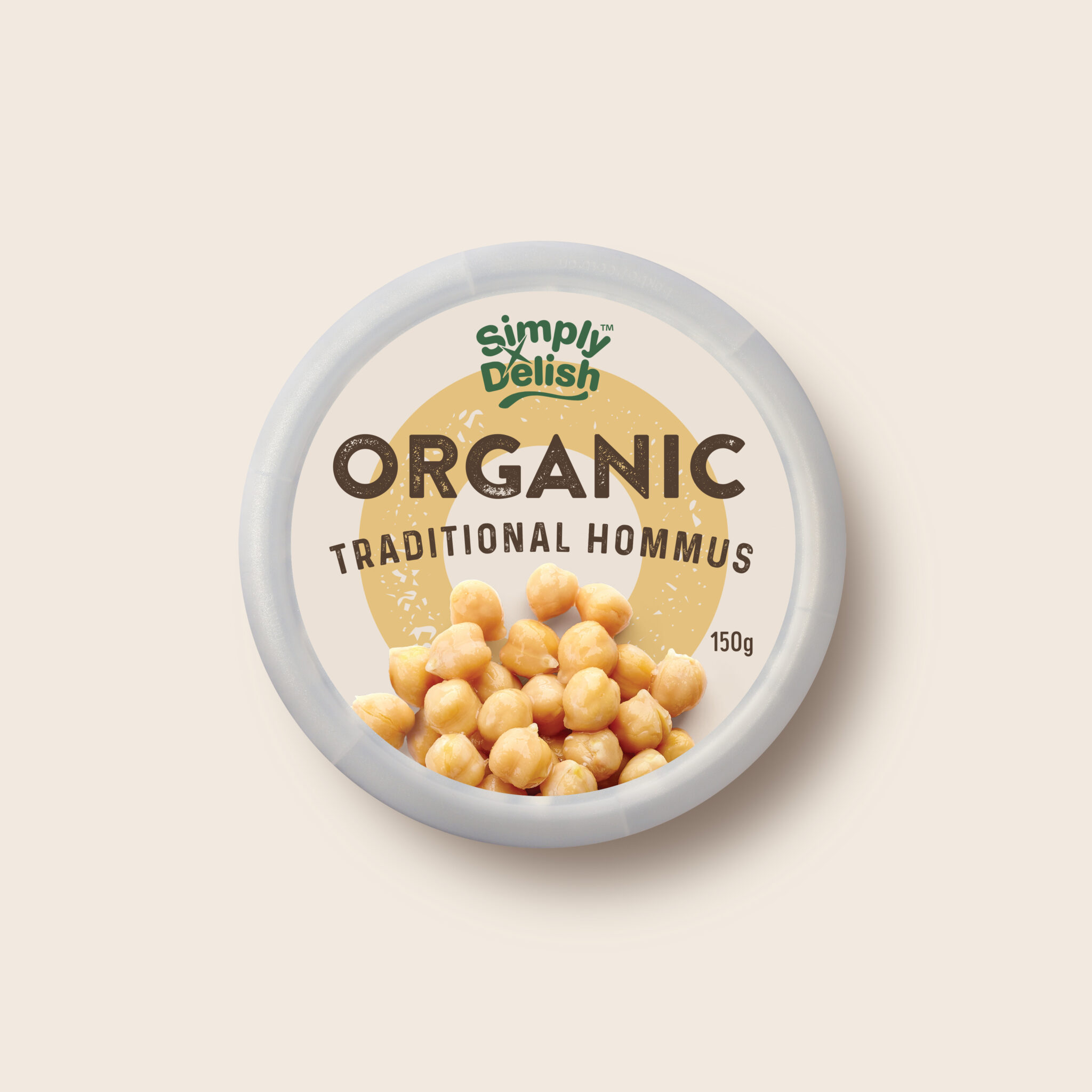
The great thing about designing packaging for simple, honest products is that the packaging can also be simple and honest. Simply Delish’s Organic range is just that. When the one single reason for being is captured in the name, the branding and packaging can be bold and eye-catching. No need to shout about protein, fat or sugar content, just simple, bold graphics and plenty of taste appeal.
We took the ‘O’ from Organic and made it a big, format friendly variant colour device that’s very distinctive in the dips category and a very ownable part of the brand’s equity. Combine that with simple, distressed, natural-feeling typography and prominent, beautiful ingredient cameos and you’ve got some great-looking packaging. The simplicity of this design perfectly captures the spirit of an organic offer.


