TASTY ORIGINS BRAND IDENTITY AND PACKAGING DESIGN
Tasty Origins embraces the rich and vibrant essence of the Mediterranean, translating it into a cohesive and appealing brand identity. The goal was to reflect the cultural and culinary heritage of the Mediterranean through distinctive design elements and color schemes. The Tasty Origins logo features a playful and inviting typography with a vibrant blue and yellow color palette. The flowing lines and dynamic shapes evoke the movement of the sea and the warmth of the Mediterranean sun, creating an immediate association with the region’s natural beauty and culinary richness.
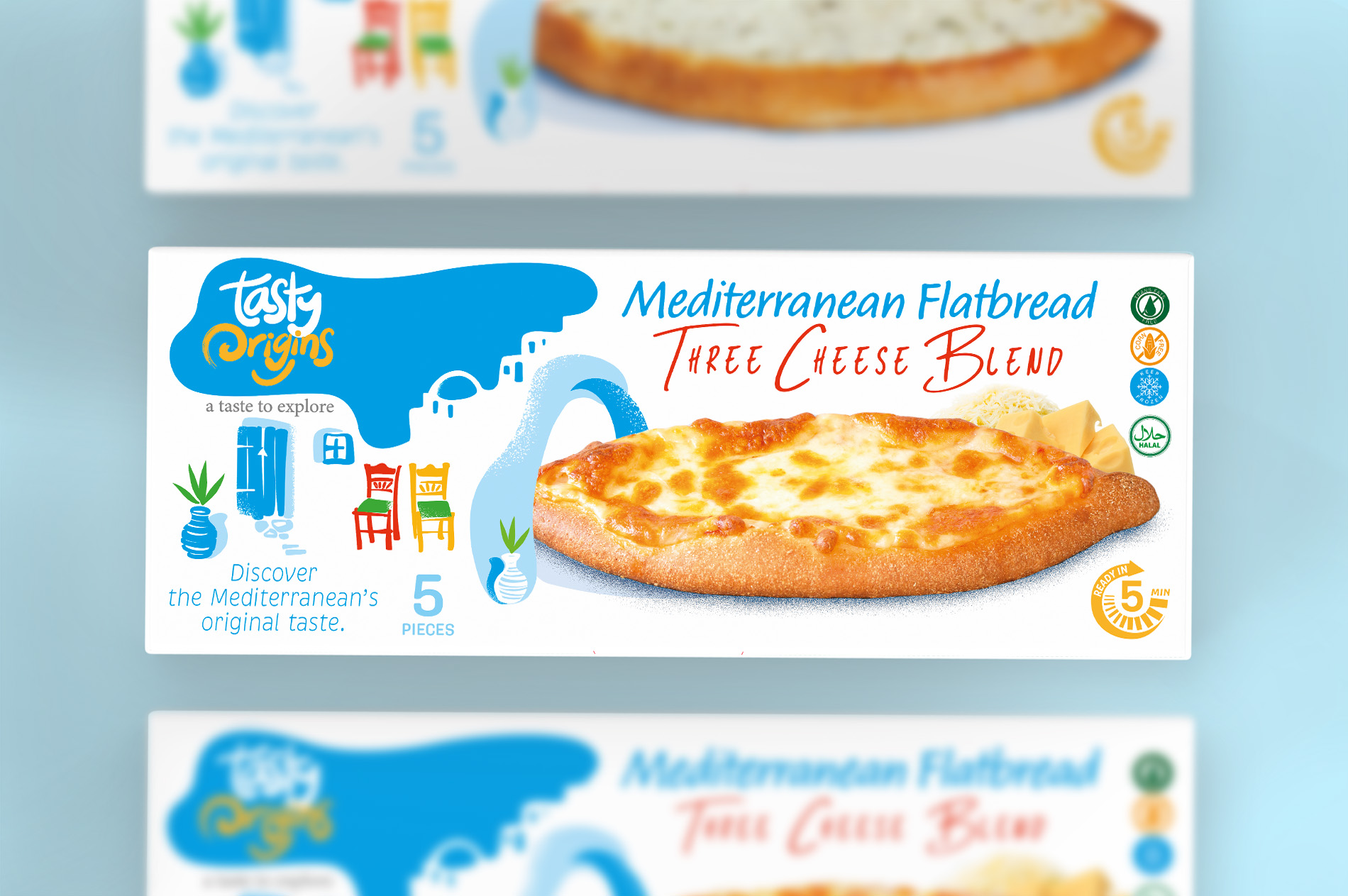
Design Elements
Stationery: The business cards, letterheads, and folders feature the brand’s vibrant colors and dynamic logo, ensuring a consistent and professional appearance. The swirling yellow patterns on the stationery evoke the movement of the sea, tying back to the brand’s Mediterranean roots.
Packaging: The packaging design for Tasty Origins products, such as the Mediterranean Flatbread, incorporates the same vibrant color palette and playful design elements. Illustrations of Mediterranean scenes, like potted plants and colorful chairs, add a touch of authenticity and charm.
Product Imagery: High-quality images of the food, like the Margherita flatbread, are prominently displayed, making the product appetizing and appealing.Illustrations: Artistic representations of Mediterranean elements, such as the sea, boats, and coastal towns, enhance the packaging’s visual appeal and storytelling.
Informational Text: The back of the packaging includes a brief story about the Mediterranean origins of the flatbread, connecting consumers to the cultural and historical background of the product. This narrative approach adds depth to the brand, making it more relatable and engaging.