During this design process, we paid attention to elements such as bright colors, cute characters and fun interaction elements to attract the attention of both children and parents. By creating a packaging design that is both fun and informative, we aimed to make the product stand out on the shelves and become a product loved by children.
Logo Design: We placed the Pınar brand logo prominently on the top of the packaging, a strategic positioning to increase brand recognition. In the “Beyaz KIDS” logo, we wrote the word “KIDS” in a colorful and fun font, which appeals to the target audience of children.
Color Palette: We aimed to create a feeling of coolness and freshness by using blue tones in the overall color palette of the packaging. We provided a balance with pastel and vibrant colors to appeal to children.
Contrast: We created high contrast between the logo, text and background colors to increase readability and attract attention.
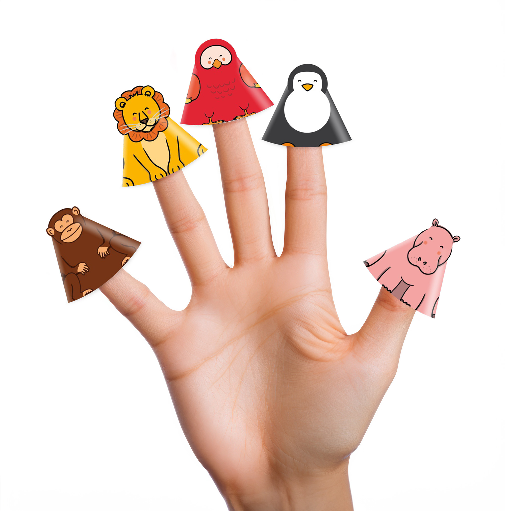
Characters Appealing to Children: We used cute animal characters (elephant, zebra, parrot, lion) on the packaging, designed to attract children’s attention and make the product more appealing.Fun Elements: By adding fun and interactive elements such as “Cut, Glue, Play”, we made sure that children can play with the packaging and have fun. This makes the product more fun and engaging.