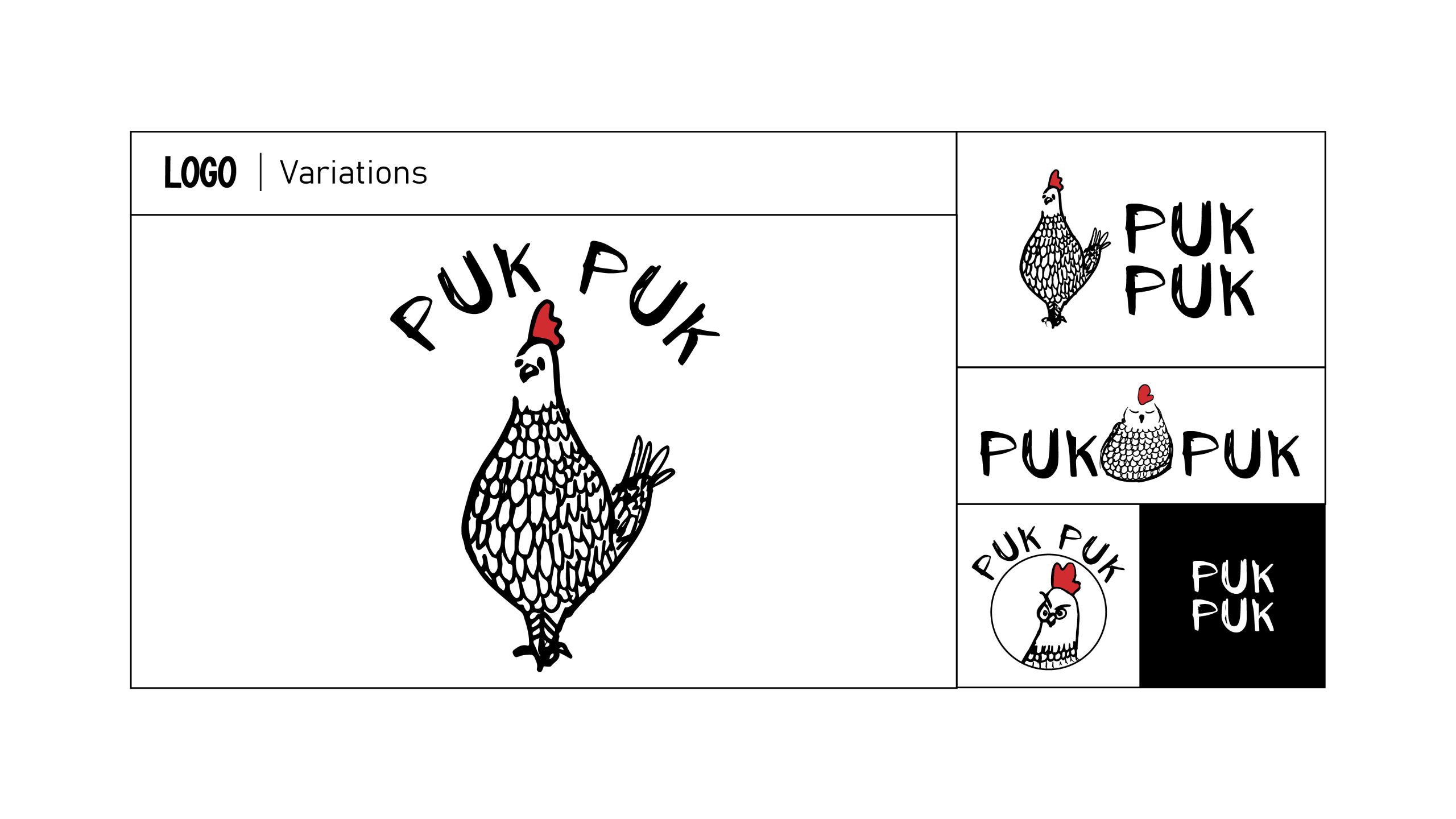
From the farms of Punjab to the hearts of all Indians, we are dedicated to serving eggs that are healthy, pure, and natural. Our unique approach is embodied in an aesthetic brand identity that features fun, hand-drawn illustrations of chickens, paired with a whimsical handwritten typeface. This combination reflects our brand’s quirky, artsy nature and engages consumers, sparking curiosity and inviting them into our sassy chicken world. Both our verbal and visual identities are carefully crafted to be in sync, ensuring a cohesive and captivating experience.
The vibrant, illustrative designs showcase chickens engaged in various activities, adding an element of fun and laughter to our brand. We use a minimalist color palette of black, white, and strategically placed red accents to enhance the overall visual appeal. This creates a vibrant yet sophisticated look that captures attention and makes our products stand out. Our goal is to create a delightful experience that not only attracts but also entertains and resonates with our audience.