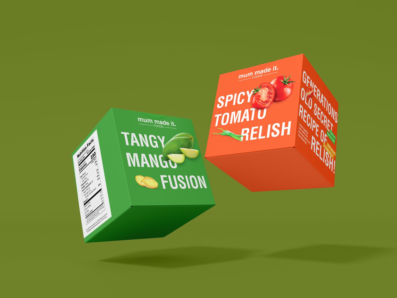
Designed by SpaceBar Advertising, this is a range of Relishes and Pickles that harp on their generations old recipes, remade for modern times. Designed to be E-com forward, the packs boldly place the main ingredients on the front. The sides are not ignored either and are used to focus on the generations-old-recipe story. Text is minimal, images are bright ensuring only the relevant information is out front and square.
What makes them break the clutter? The use of bold solid colours that are inspired by the main ingredient. Simple bold text that interacts with the image while standing out clearly agianst a solid background. Unlike most pickle or relish brands, this design does not show any product image…encouraging the consumer to open the carton and enjoy it in real, instead.

