Möller’s Redesign: A Fresh Take on Tradition
The Task
Möller’s needed a refresh — one that unified its portfolio, strengthened its heritage, and made an impression on shelves. The goal was to create a modern look that still felt unmistakably Möller’s, with a special nod to younger audiences.
The Challenge
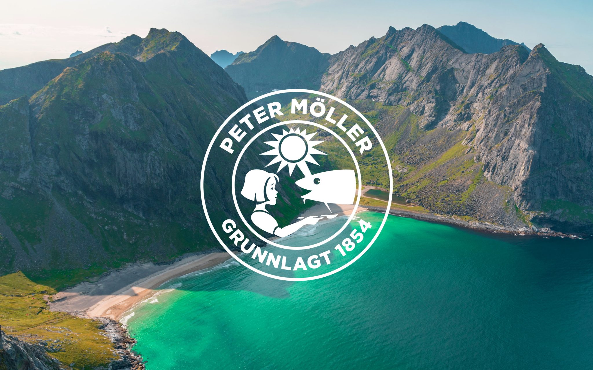
The portfolio lacked consistency and appeared fragmented. Historically, the iconic cod liver oil was defined by its logo, emblem, and green/yellow palette, but it lacked impact. Competitors crowded the shelves, making it crucial to reclaim these colors as uniquely Möller’s. The challenge was to establish a bold, cohesive identity without losing the brand’s trusted legacy.
The Solution
Inspired by Norway’s pristine landscapes, the new Möller’s identity features an arctic color palette that pays tribute to the brand’s 170-year heritage. The emblem, a symbol of trust and quality, takes center stage, creating a bull’s-eye effect, while the horizon of the Nordic sea serves as a strong graphic backdrop. The redesign reinforces Möller’s most distinctive assets in a sophisticated, modern way, unifying the portfolio across various products and packaging formats. Simplified text and symbols improve on-pack navigation, ensuring a clear focal point on store shelves.


