Project Title: The Big Nuts – Walnut Kernels Packaging
Description:
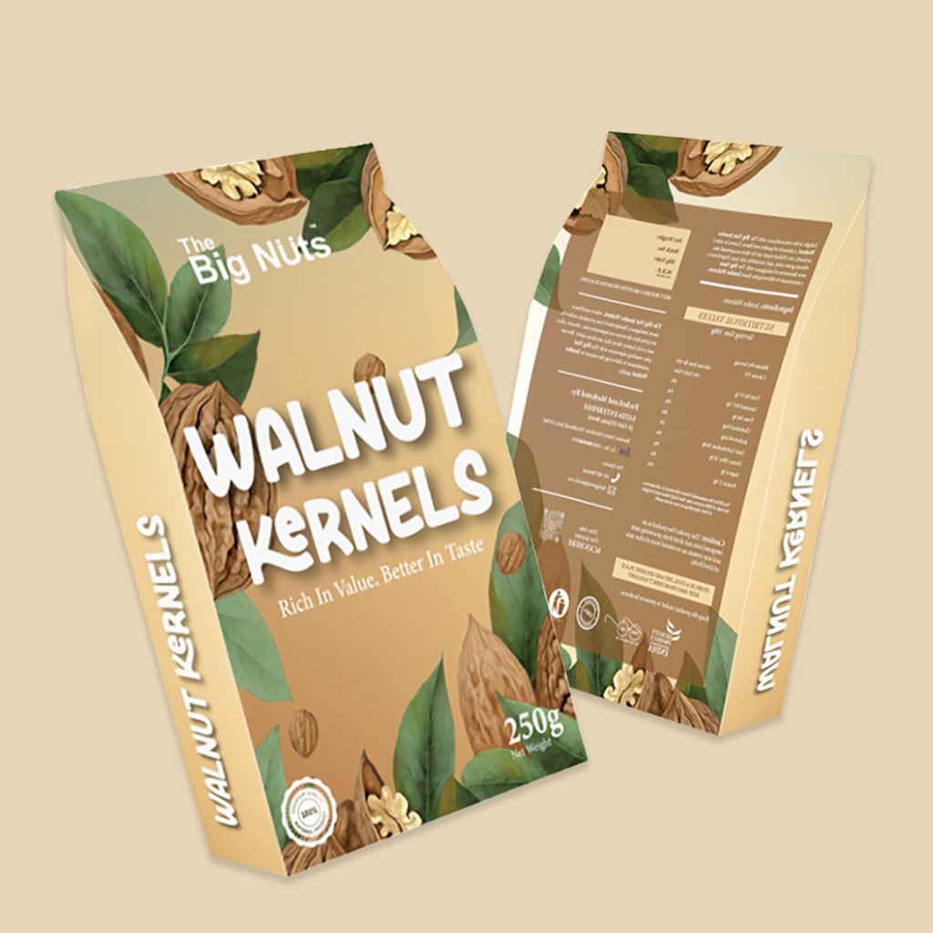
The packaging design for The Big Nuts Walnut Kernels is a seamless blend of organic aesthetics and modern visual appeal. The concept revolves around highlighting the natural richness of walnuts while maintaining a premium yet approachable look.
Design Concept & Aesthetics:
The illustration-driven design plays a crucial role in creating an authentic and earthy feel. Hand-drawn walnut shells, kernels, and foliage add a tactile, organic quality, reinforcing the product’s natural origins. A warm, gradient-toned background, inspired by walnut hues, sets a harmonious tone, making the visuals feel inviting and wholesome. The interplay of soft brown and subtle green reflects freshness and premium quality, resonating with health-conscious consumers.
Typography & Branding:
A bold, playful typeface is used for the product name, ensuring strong shelf visibility while maintaining an artisanal charm. The secondary tagline, “Rich in Value. Better in Taste,” complements the brand’s ethos of quality and superior flavor. The brand name, The Big Nuts, is subtly integrated with a contemporary font, balancing modernity with warmth.


