Talabat is a leading quick commerce platform and the largest food delivery service in the Middle East, headquartered in Dubai. Recently, Talabat decided to relaunch its private brand to establish itself as the fastest delivery service in the region, aiming to deliver orders within 20 minutes using its own fleet. To lead this vision, Talabat challenged us to redesign its brand and reposition it by creating a new brand identity that embodies this new promise.
Being Talabat one of the most visible brands in the streets of Dubai, mainly due to its immense orange coloured delivery fleet, there was a huge opportunity to capitalize on existing awareness. So, the creative concept is inspired by the idea of movement across the city streets.
To portray this idea, the label construction is based on a view-from-above of an imaginary city with its streets and blocks. This “Google Maps” perspective works as a grid for the placement of elements on the package. Buildings and roads are filled with product names and claims. Photography is used as blocks and landmarks.
Each label is different, as it is taken from a different part of the “map” (as products are also delivered to different addresses). By embracing this flexible structure, each range is unique while maintaining a consistent brand identity across all products. The result is impactful and iconic. The most visible element on the pack is typography, as it plays the biggest role. Letters stretch to symbolize movement and speed of delivery. Sentences go around blocks and corners, and arrows reinforce directions.
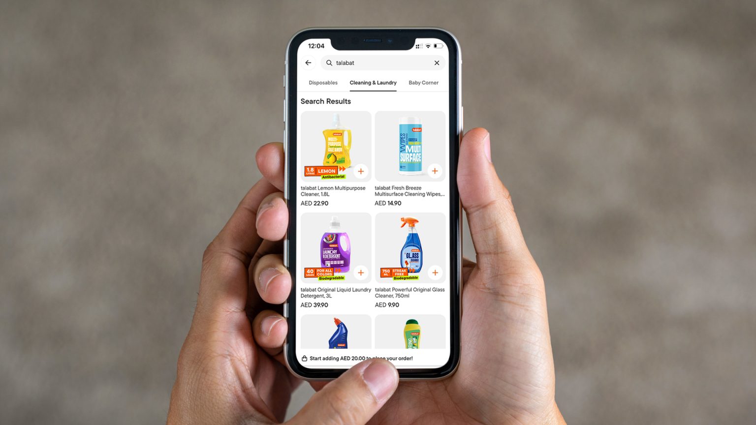
By having typography very big, the labels’ online readability is massive. Being the brand for sale only online, this becomes a key feature. This increased readability boosts the products’ recognition, being easy to read even in thumbnail sizes on a mobile phone, beating other brands sold on the platform.
The platform product display features a banner family for each product that showcases parts of the labeling story and claims. Facilitating the users’ perception of the product attributes. Talabat’s corporate communication is of an irreverent, fun, and provocative company. So, the new private brand needed to be bold, too. Colours used are vibrant and joyful, with high contrast between backgrounds and elements. Giving life to a vibrant personality, aiming at a young audience that wants to be surprised and motivated by the boldness of each package.
Each product features a creative sentence that teases consumers about the product’s usage. This detail contributes to building a connection with people and a desire to see and read more products. It also works as a motivational surprise that builds on the momentum when they see the physical product for the first time at home.
Being a brand for a region that is a melting pot of people from different corners of the world, where English and Arabic languages rule, the packaging has a dual alphabet structure. English and Arabic are integrated in a way that is comfortable for both alphabets, respecting both writing specificities and also people’s visual cultures.
As Talabat’s delivery service is faster than going to the local supermarket, we can easily argue that this private brand is the fastest brand in the UAE.


