

Dedina Rakija
We really enjoy working on projects for branding rakija—Serbian fruit brandy—and we are happy to see that this market is expanding with more and more new distilleries.
And while Widakk Design Studio often works with clients oceans away, this time the universe had a twist for us: the distillery was practically our neighbor—just five minutes down the street in Novi Sad! Both we and the client were equally surprised, and it gave us that extra spark to pour our best work into the project.
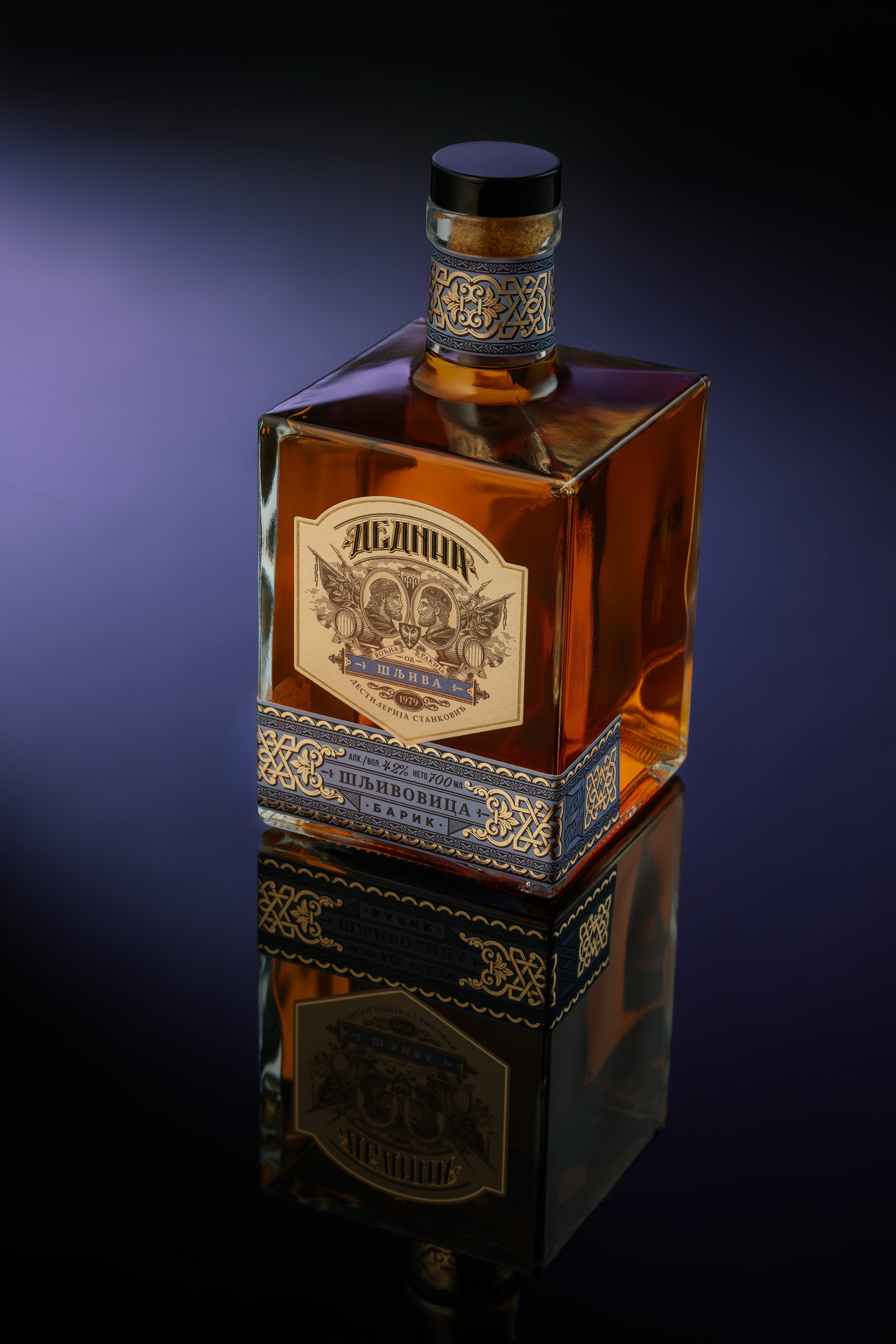
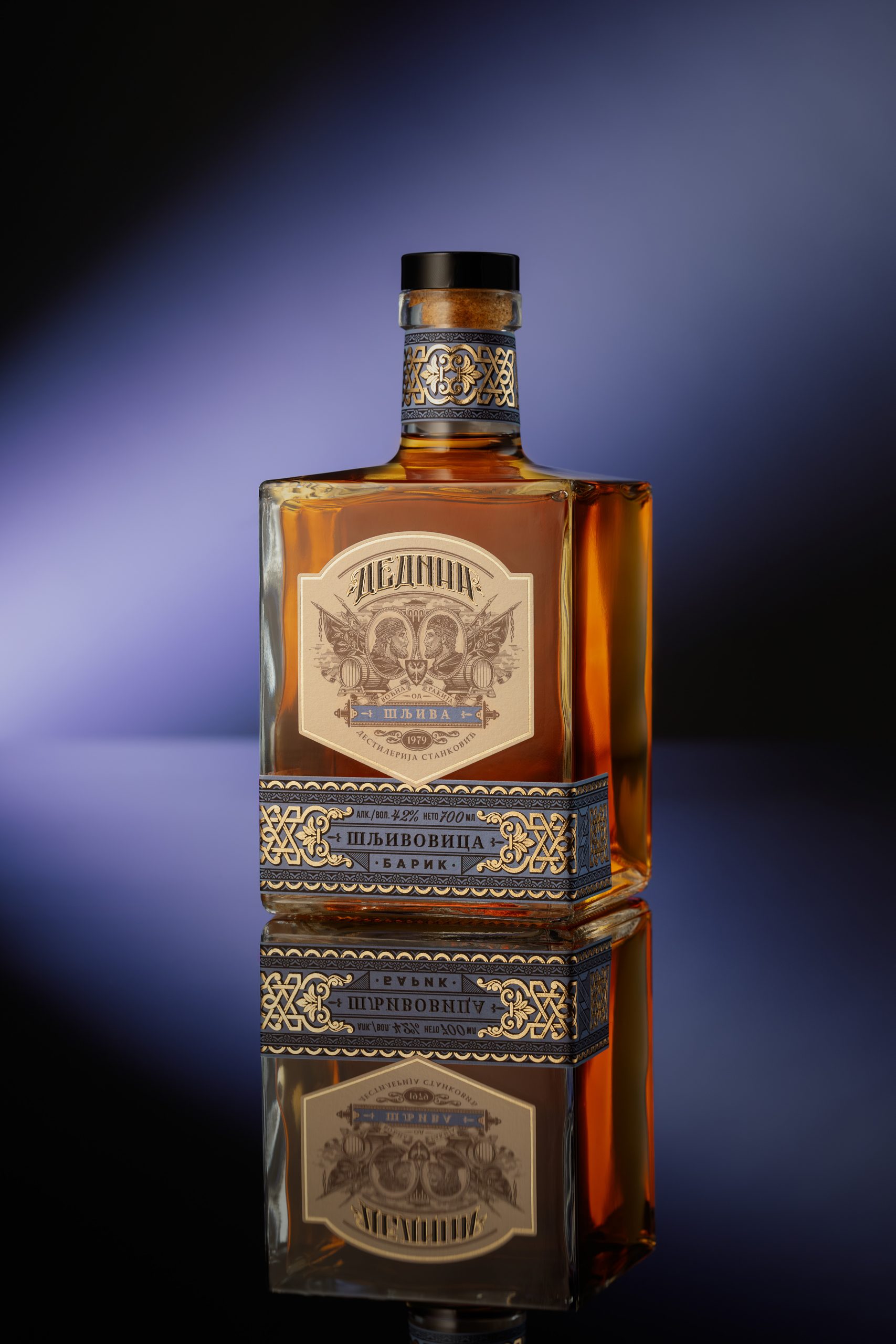
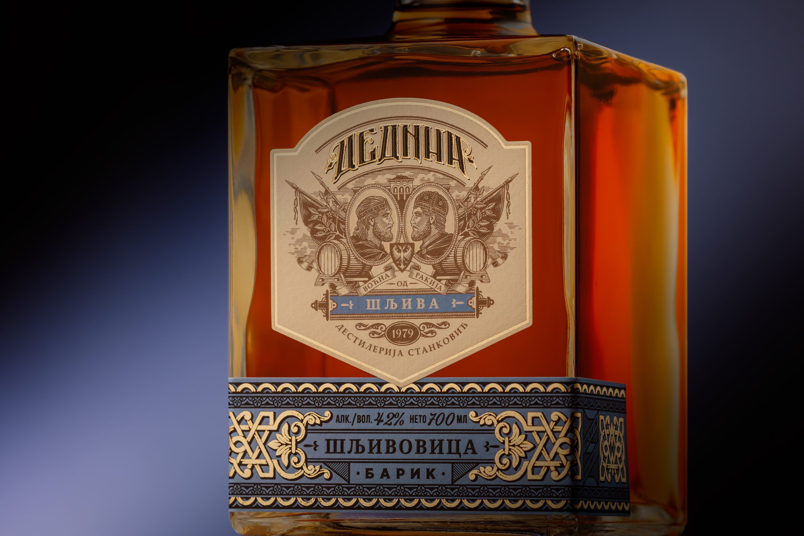
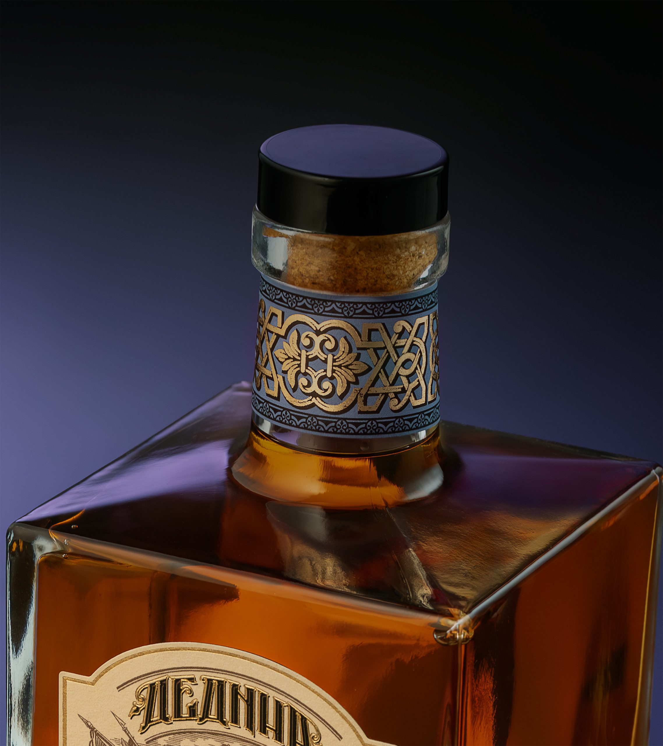
The “Dedina” rakija comes from a small family-run distillery from Novi Sad, Serbia. The name “dedina” means “grandpa’s” in Serbian. With this label design, we paid respect to those who came before us but also to those who will come after. It’s all about tradition and heritage. At the center of the label are placed two mirrored figures—medieval Serbian kings Stefan and Dušan. Their inclusion is purposeful, serving as a symbolic tribute to the distillery owner’s twin sons, who bear their names. The design bridges past and future, paying respect to old times while celebrating the legacy carried forward through generations.
Curator’s Insight:
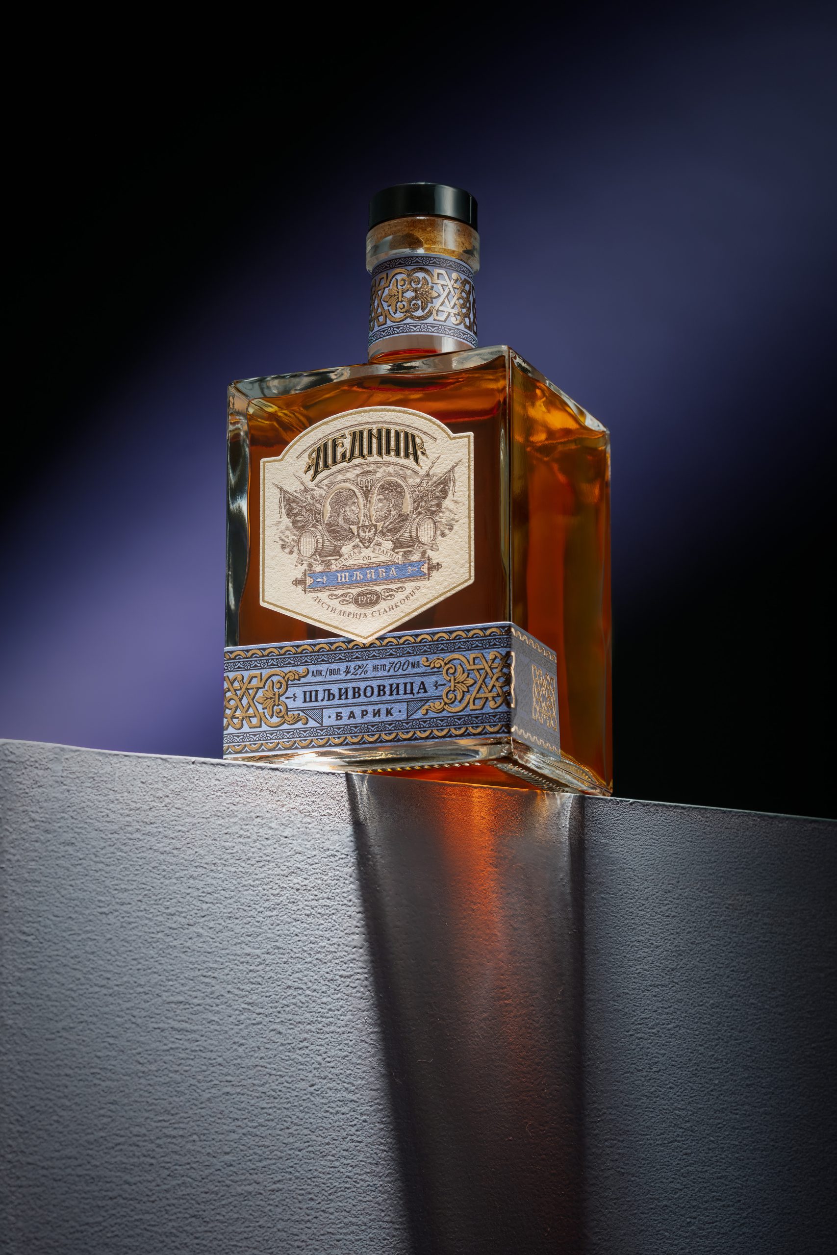
What Widakk Design Studio handles particularly well here is the tension between symmetry and symbolism. The mirrored kings function as a quiet structural logic that runs through the entire design: past and future, tradition and continuation, two sons carrying one name forward. The square bottle reinforces this bilateral thinking, offering four equal faces that give the label room to breathe without competing with the form. The blue and gold band at the base works almost as a typographic footer, shifting the register from historical to contemporary without breaking the visual grammar. For a family distillery operating five minutes from its designers, this feels less like a commissioned project and more like a shared act of authorship.
 alchimistestudioParis
 Estudio Argo
 Modern Theory
 monther al omari
 Ohmybrand
 Affogato Brand Design
 Tancybox
 waanrong
 nazystudio
 Daria Fox
 g.apolly
 sahildoesartt
 Stiandco
 BREAK DESIGN
 ShreyaDighe
 Sameh Elnahas
 Minim Brand Design
 Ebbi
Ebbi Shabouk Printing & Packaging (Shabouk Carton Boxes – شعبوق)
 Brandegree
 Abbydraw Designs Unique Conceptual Branding & Packaging Designing Ideas
 bilel tkouri
 NEV
NEV Stefano Bracci
 Alina
Alina