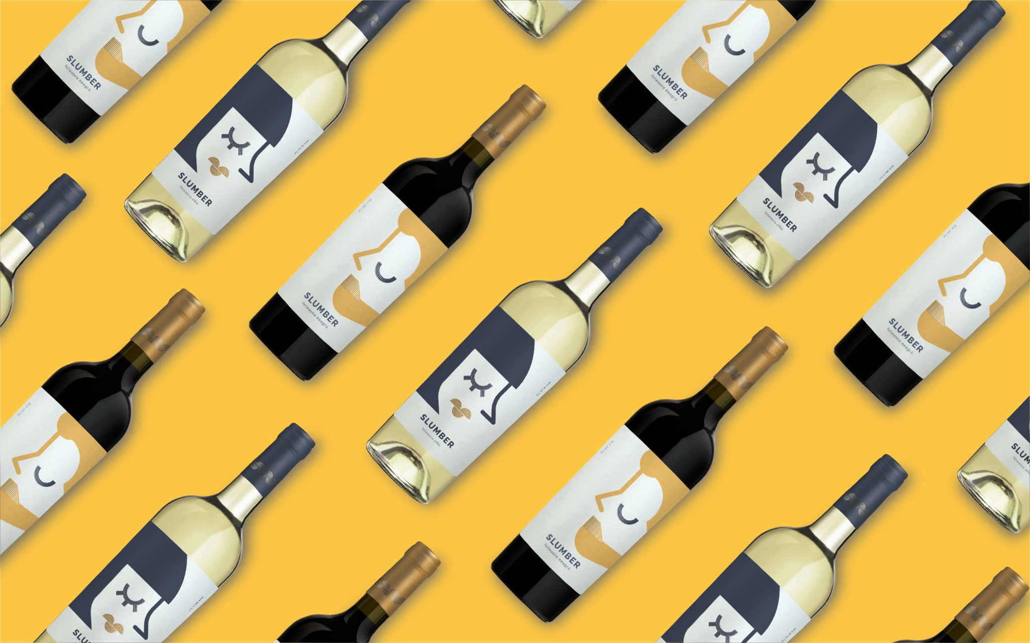

CHALLENGE
Slumber began as a ready-to-print wine label concept created for the Bonsanco design shop. Once the concept found its client, the challenge was to transform the original idea into a complete wine brand with its own name, identity and packaging system.
The initial concept featured a single female character. The client wanted to expand the idea into a couple, creating two complementary SKUs that could stand individually while remaining immediately recognizable as part of the same brand.
SOLUTION
We developed the project from concept to shelf, creating the naming, logo, brand idea and wine label design.
The name Slumber captures the feeling we wanted the brand to evoke: ease, relaxation and that pleasant state of light drowsiness when the busy part of the day is finally over.
This idea became the foundation for the entire packaging concept — a wine associated with slowing down and enjoying simple moments, whether it is a relaxed evening with friends, a dinner for two or a night spent with a favourite movie.
CHARACTER & ILLUSTRATION
The characters became the central storytelling element of the packaging.
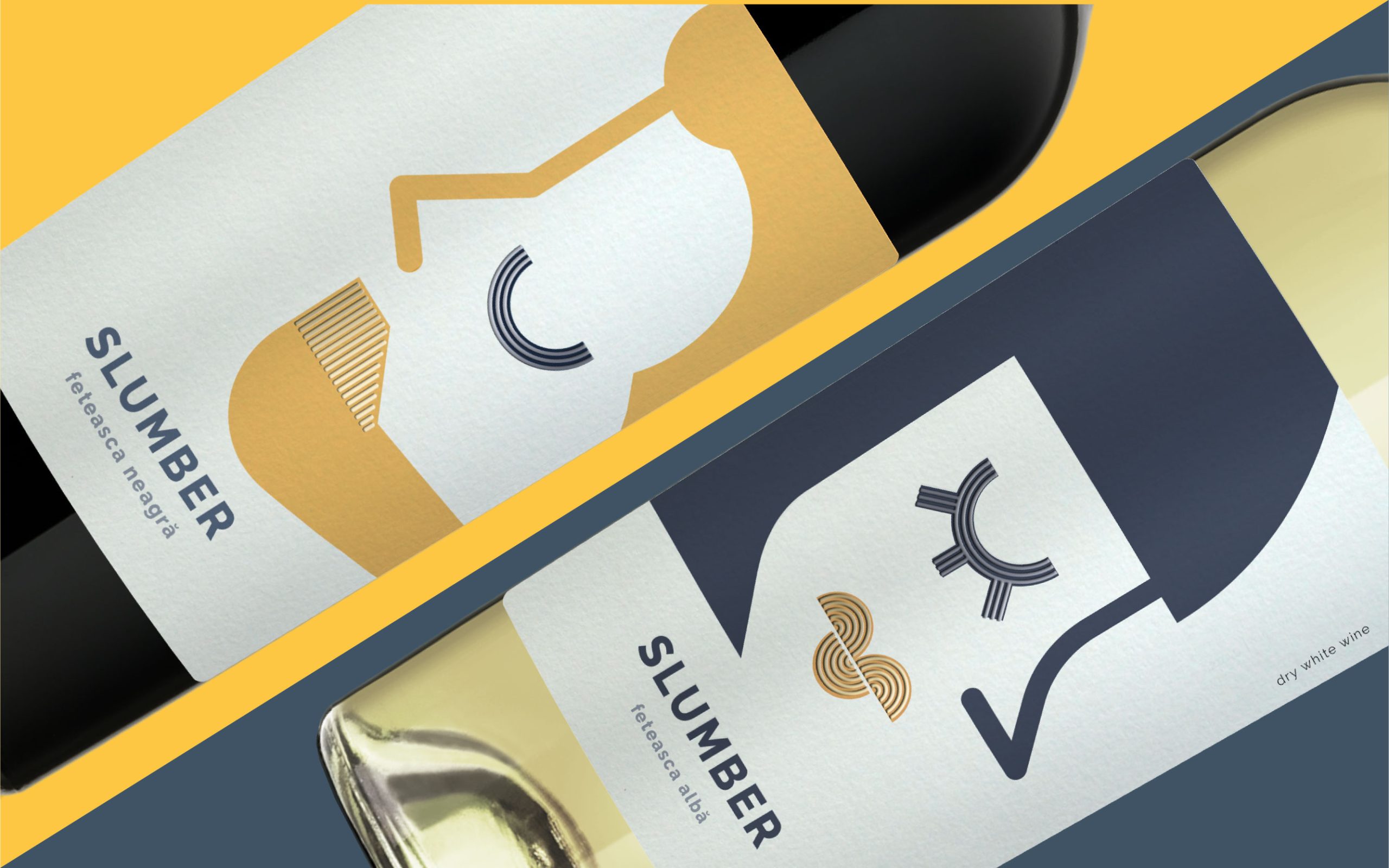
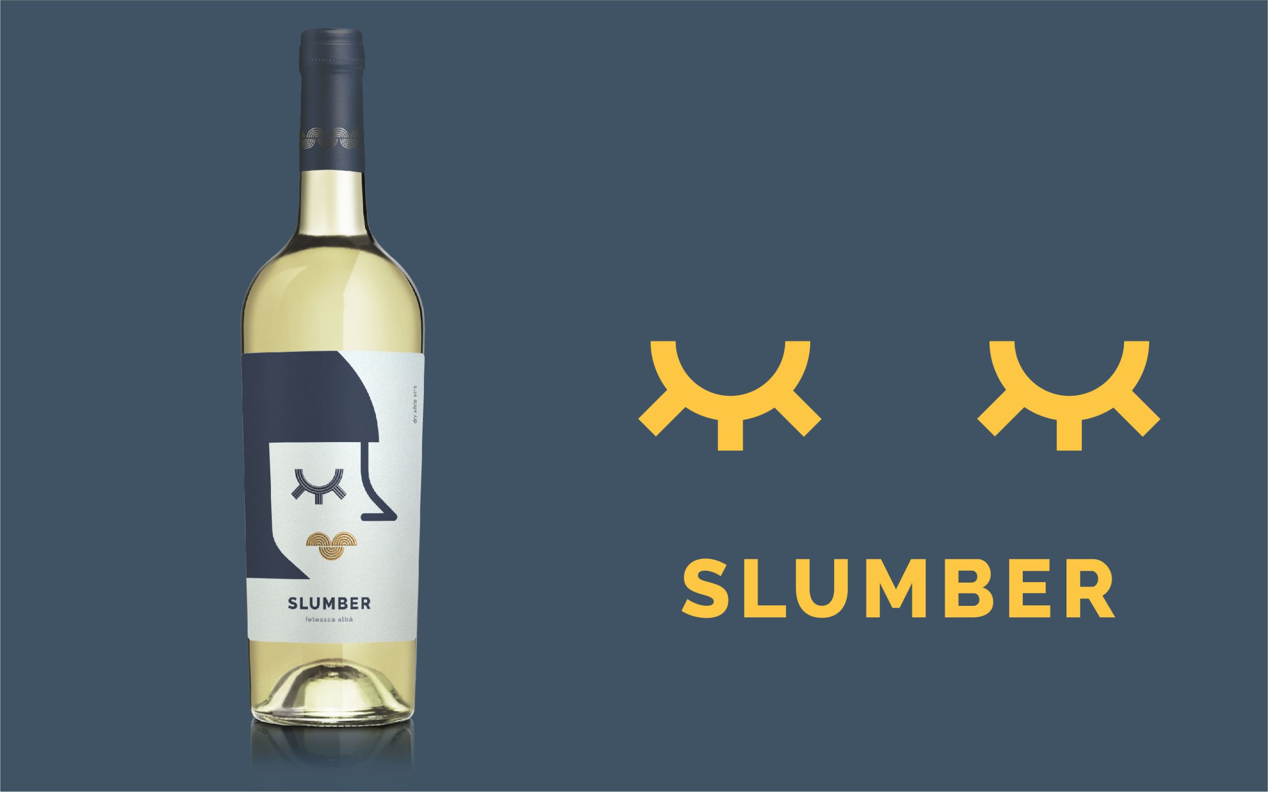
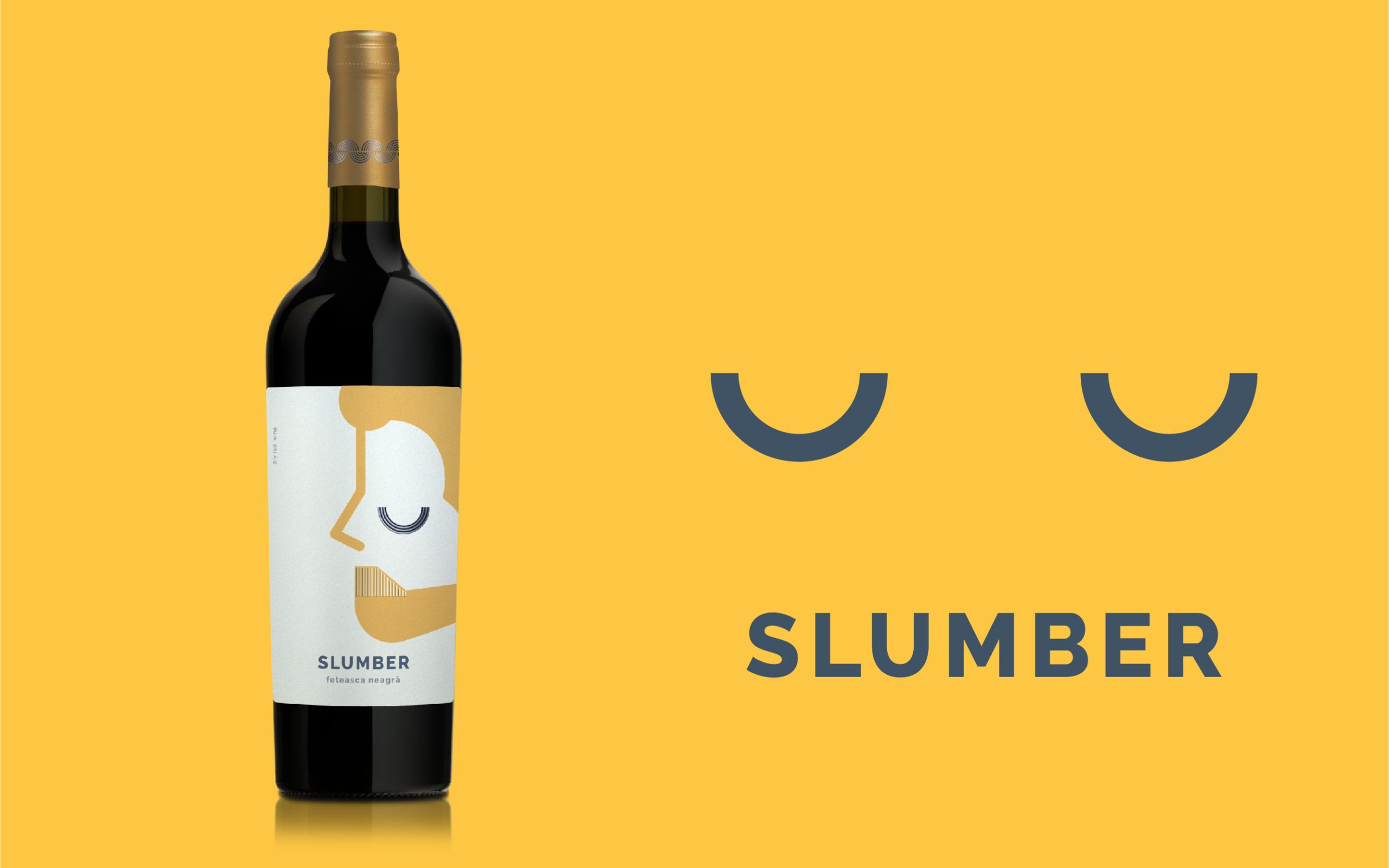
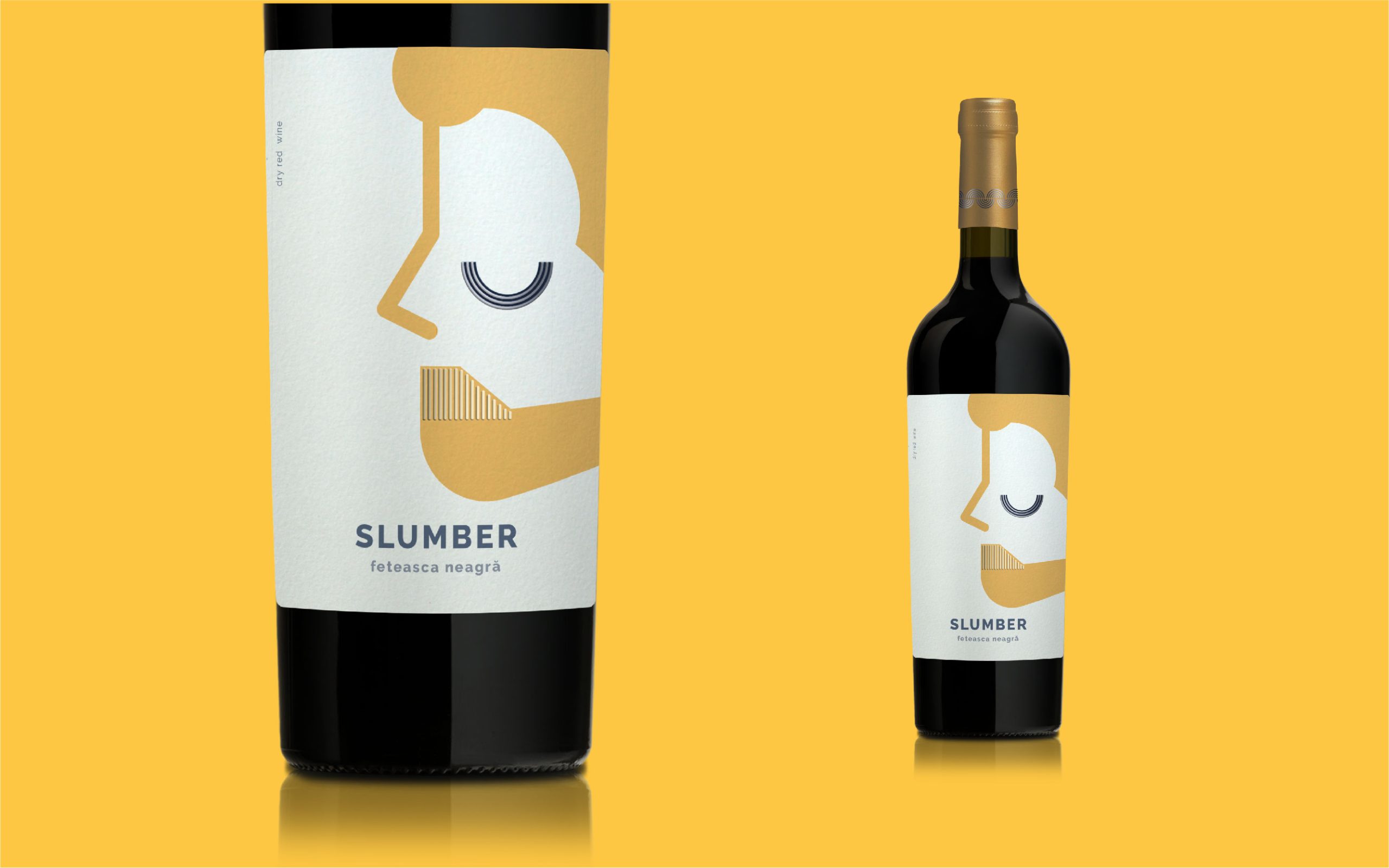
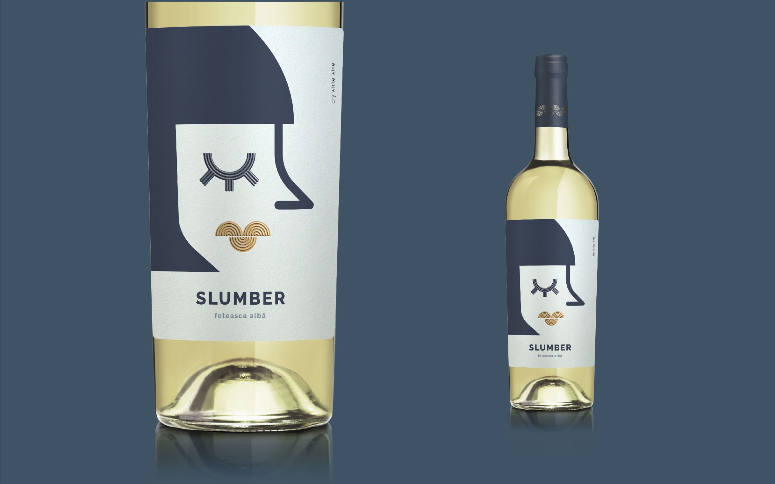
The original female character was refined into a softer, more relaxed personality and paired with a contemporary, Nordic-inspired male character. Instead of conventional wine imagery, we used simplified facial features, geometric shapes and closed eyes to visually communicate the idea behind the name: calmness, comfort and a moment of escape from everyday noise.
Together, the two characters create a playful visual dialogue between the SKUs while giving each bottle its own personality.
VISUAL LANGUAGE
The visual identity is built around minimal geometric illustration, clean typography and a restrained Nordic-inspired aesthetic.
A combination of warm golden tones, deep blue and soft neutral shades creates contrast between the two labels while keeping them visually connected. The oversized character illustrations give the bottles strong recognition from a distance, while the minimal composition keeps the overall appearance contemporary and approachable.
The repeating graphic elements extend beyond the label and create a flexible visual language that can be used across the wider brand communication.
OUTCOME
The result is a distinctive two-SKU wine packaging system designed to stand out in a visually crowded retail environment.
Slumber combines naming, character-driven illustration and packaging into one coherent brand story — turning the simple idea of slowing down at the end of the day into a recognizable shelf presence.
A ready-to-print concept evolved into a complete wine brand with its own personality, visual language and room to grow.
 NEV
NEV Stefano Bracci
 Alina
Alina monther al omari
 Lizakjx
 JOAOMARCOSDESIGN
 alchimistestudioParis
 Harriet Neild
 octavio rojo
 宏洛图品牌设计HONGLT
 DESIGN CONCEPTS
 Alexander Skurihin
 Studio K95
 ARMBRAND
 Richa Rai
 houseoferas by Miti
 Agence des Coteaux
 Kushi Eaknath
 Ann Treasa
 Xiao Ning
 krrrrrllii
 babyage
 Deep
Deep