

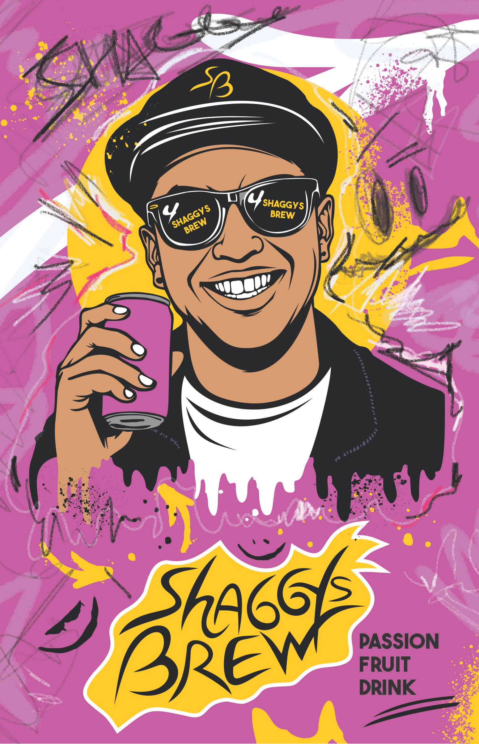
Shaggys Brew- passion fruit drink isa street art-inspired packaging concept centered around Shaggy, an adventurous, confident spirit constantly seeking new experiences.
The SB mark on his cap functions as a short favicon, an inconspicuous version of the logo, a recognizable monogram designed for strong brand recall and multi-platform adaptability ( caps, merch, digital use and also a secondary branding element). This symbol strengthens the brand identity and creates a memorable visual sign.
For this character, Shaggy, the drink is more than a beverage; it’s a source of energy that fuels his next adventure. The vibrant passion fruit reflects his bold, exotic personality.
Graffiti strokes, pain drips and explosive color compositions communicate movement, youth culture and creative freedom.
The background design features
- Custom expressive spray textures
- Dynamic paint splashes
- Strong yellow -magenta contrast
- Dripping paint effects for a rebellious edge.
The hand dtawn logotype design reinforces brand personality and adds a raw handmade touch. The bright yellow shape behind the logo enhances shelf visibility and creates a strong visual hierarchy.
Brand mood is urban, energetic, and expressive.



 NEV
NEV Stefano Bracci
 Alina
Alina monther al omari
 Lizakjx
 JOAOMARCOSDESIGN
 alchimistestudioParis
 Harriet Neild
 octavio rojo
 宏洛图品牌设计HONGLT
 DESIGN CONCEPTS
 Alexander Skurihin
 Studio K95
 ARMBRAND
 Richa Rai
 houseoferas by Miti
 Agence des Coteaux
 Kushi Eaknath
 Ann Treasa
 Xiao Ning
 krrrrrllii
 babyage
 Deep
Deep