

Background
LINMIN is Pyaterochka’s private brand in the mid-price segment, presented in the categories of face and body care, feminine hygiene and oral hygiene. Pyaterochka was faced with the task of taking LINMIN beyond the usual perception and creating an independent brand image that could compete for buyer attention with federal and specialized brands in the care categories. The target audience of the brand is women in the rhythm of “getting it all done”: they value daily pleasures, choose simple products, often make impulse purchases and expect products to be effective and safe without any extra effort.
By the time LINMIN was relaunched, the Asian cosmetics market in Russia was saturated with brands with a similar visual and communication presentation. Many of them relied on recognizable “Asian” codes, but rarely formed their own identity and long-term emotional connection with the buyer. As a result, the origin of the brand often became the main message, while the real benefits of the product faded into the background.
Challenge:
UPRISE agency had to take LINMIN beyond the usual perception of its own brand and form an independent brand with an Asian aesthetic and approach to care. Required:
- develop a brand platform;
- create a single design code for different categories – from sanitary pads to toothbrushes;
- create a system that will work in a real retail environment – on the shelf, in different categories and packaging formats;
- create a visual image that will allow LINMIN to stand out among other brands and at the same time look organic on the Pyaterochka shelf.
Solution
Together with the Pyaterochka team, UPRISE determined the basis of the new positioning of LINMIN – a combination of Asian traditions of care, protection, rituals and pleasure. The task was not just to add recognizable Asian motifs to the design, but to create a brand’s own world that could consistently develop within the chain’s assortment.
At the heart of the design system, the agency’s specialists used the image of spring and sakura, which became the key metaphor for the LINMIN brand. However, it is presented not as a postcard, but as a space for a personal ritual of care.
When developing the system, it was important to take into account the specifics of the Pyaterochka shelf: LINMIN is presented in several categories at once, so the new design had to be recognizable as a single system, but at the same time allow the buyer to quickly navigate a specific product.
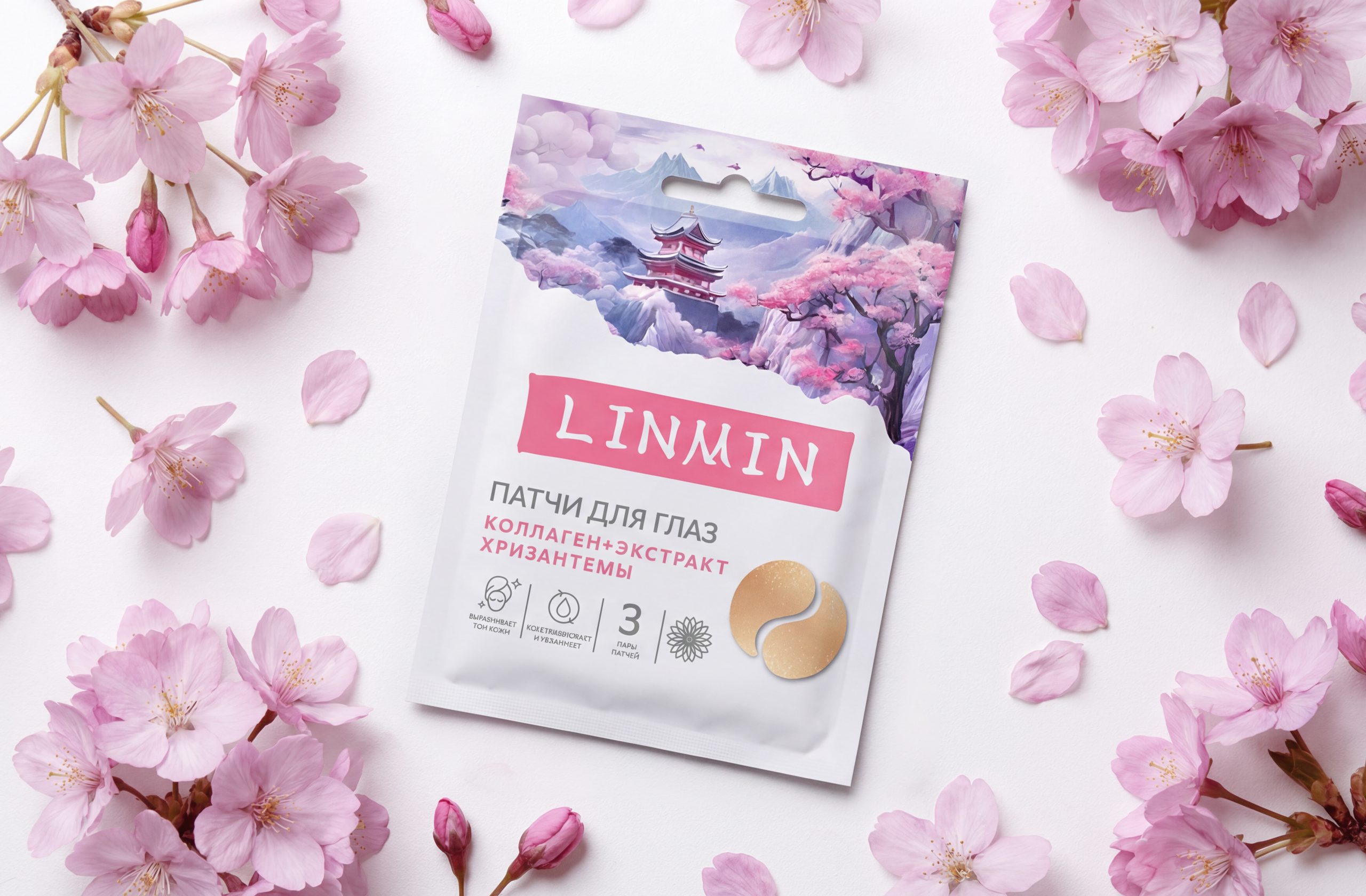
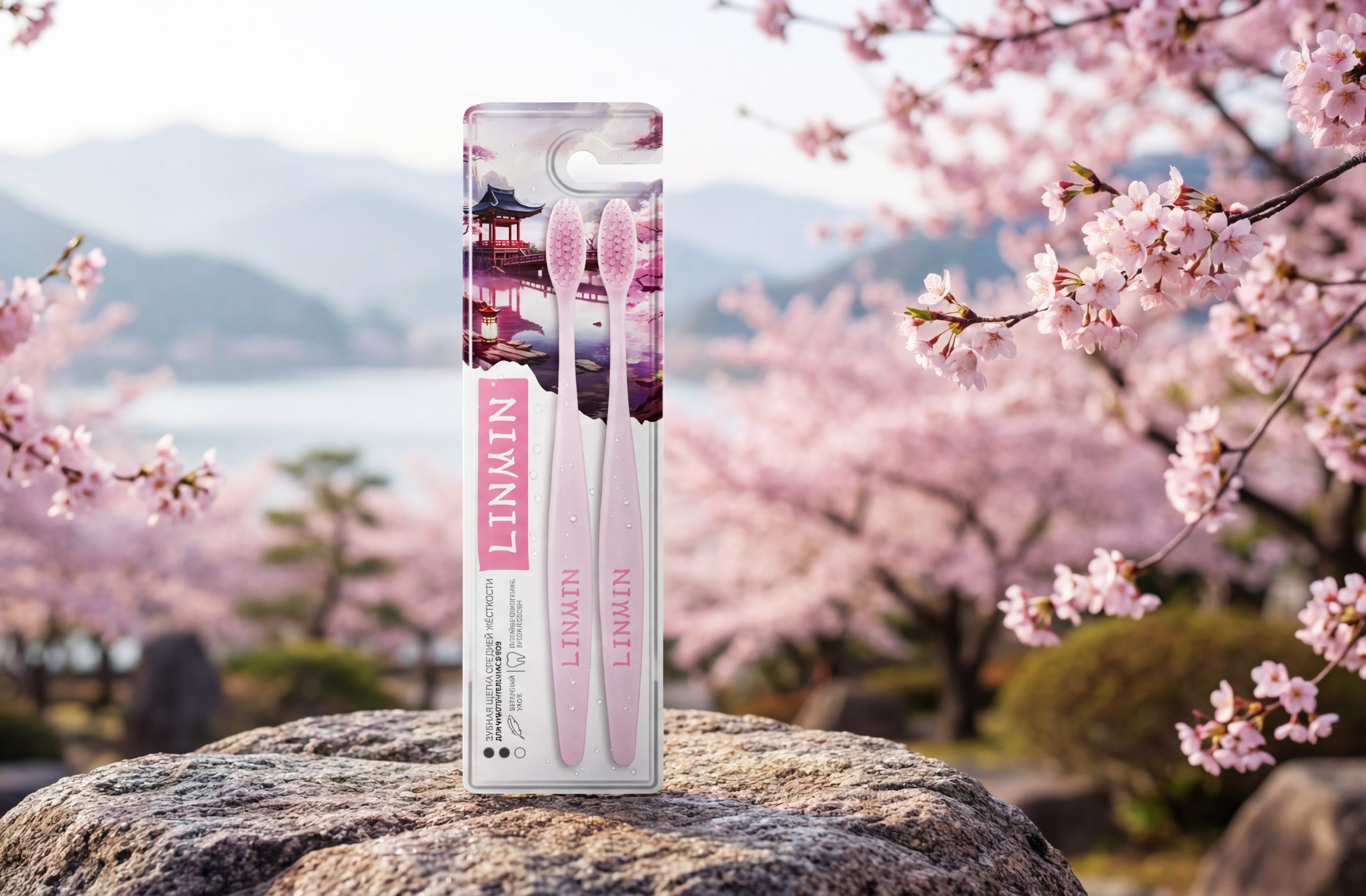
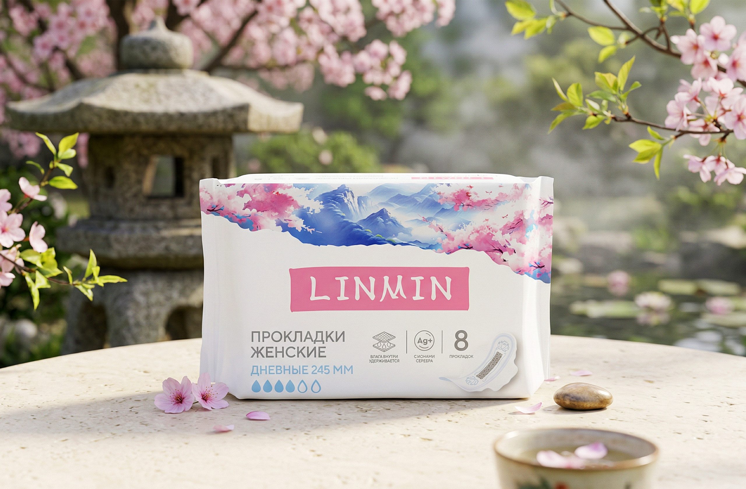
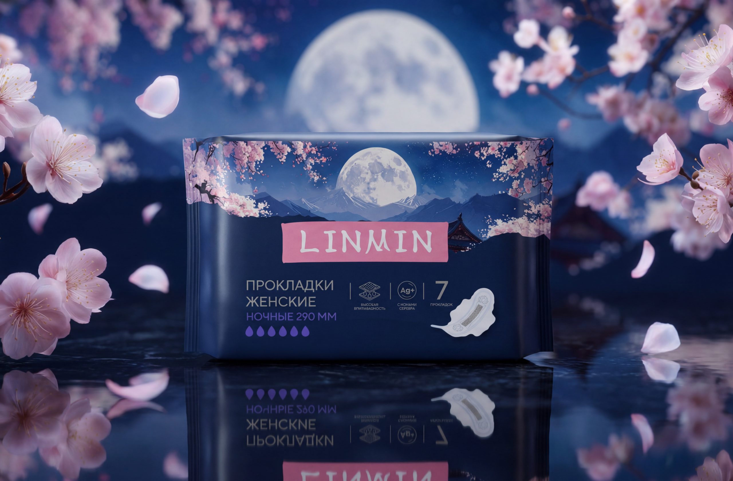
Packaging architecture is built on two “worlds”. The upper part is responsible for emotions: a panorama of mountains, sky and flowering branches. This “horizon” is easily adaptable to any format – from sachets to blisters. The lower part, on the contrary, is rational: the pink LINMIN logo block, product name, volume and icons are located here.
The color system becomes a metaphor for the time of day: deep blue with the moon signifies nighttime remedies, creating a feeling of protection and silence, while blue-white shades with fog represent daytime ones, associated with freshness and movement. These codes are read intuitively.
As a result, Pyaterochka received a unified development system LINMIN: from positioning and packaging to visual materials in the application and in-store communication. The new design allows us to maintain brand recognition while expanding the range and entering new categories.


 lunapanda
 Tridimage
 Analoguecreative
 lettera7
 alchimistestudioParis
 Lana B
 Colossal
 Pivot Studio
 M&A CREATIVE AGENCY
 monther al omari
 Anastasia Cherepanova | xtramez
 Hollóka Grafikai Műhely / Graphic Design Studio
 BOLD branding
 Antonia Skaraki
 Pâmella Lorrany
 Z9BKAdsgn
 Francesco Paternoster
 b1studio.ro
 Chris Creative Works
 Boordon
 Dmitriy Kuzovlev
 Brand Society
 yasharpic