Vida is a canned Cocktail product with an inclusive spirit, unique, modern and more accessible than traditional cocktails. There is a famous Costa Rican motto “Pura Vida” – “Pure and wonderful life”. People use “Pura Vida” instead of greetings, meaning to wish each other sweet things.
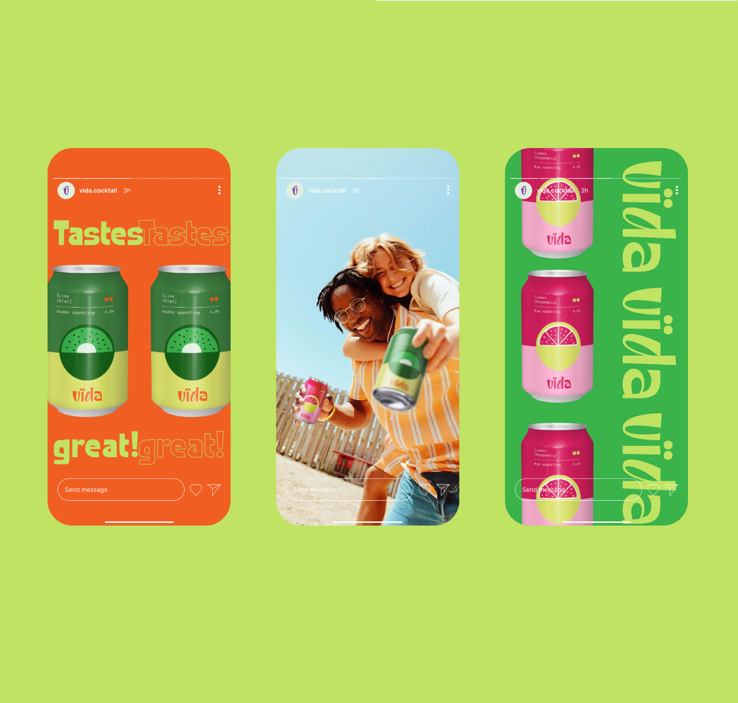
With the desire not only to ensure the taste is felt by the taste or smell, but also the feeling from the soul through each different Cocktail. Vida will be an indispensable emotional piece in your stories.
The term “Cocktail” itself also has a long history filled with anecdotes. It can be simply defined as follows: “A cocktail is understood to be a beverage that combines two or more ingredients, with at least one ingredient being alcoholic.” So cocktails are the same as life, with countless flavors and colors. A cocktail will sometimes be passionate and passionate; sometimes peaceful and serene; sometimes radiant and rejoicing; sometimes lonely, disappointed, …
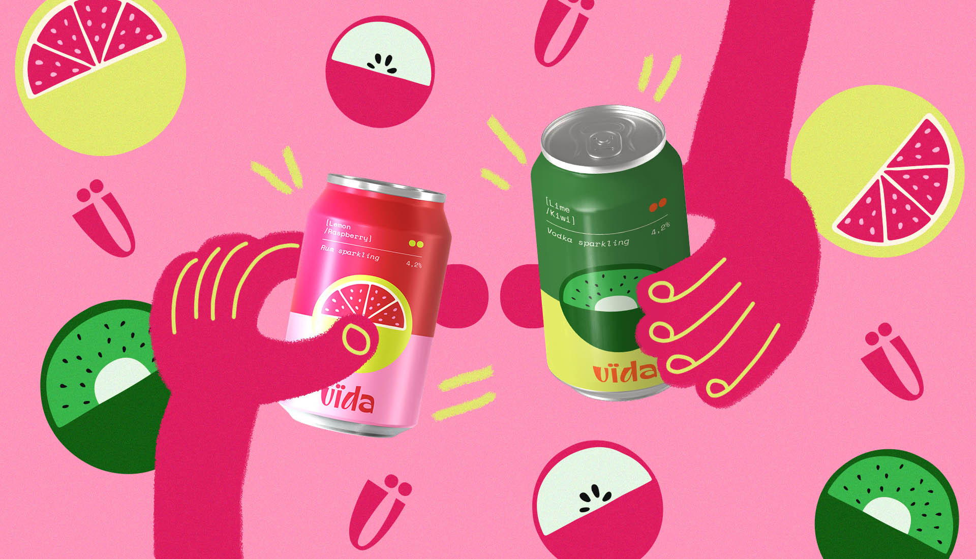
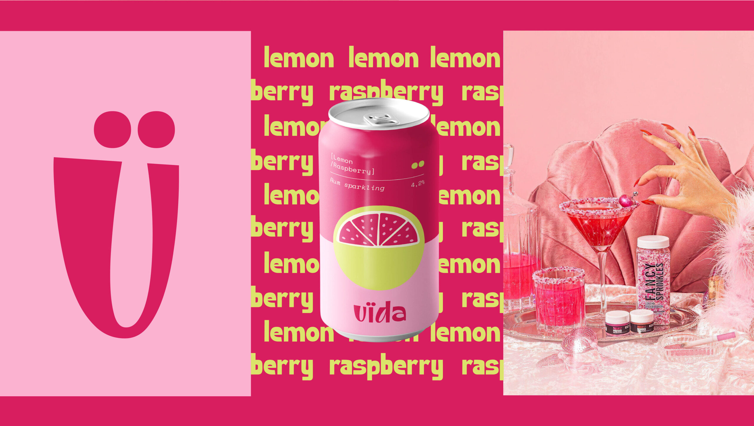
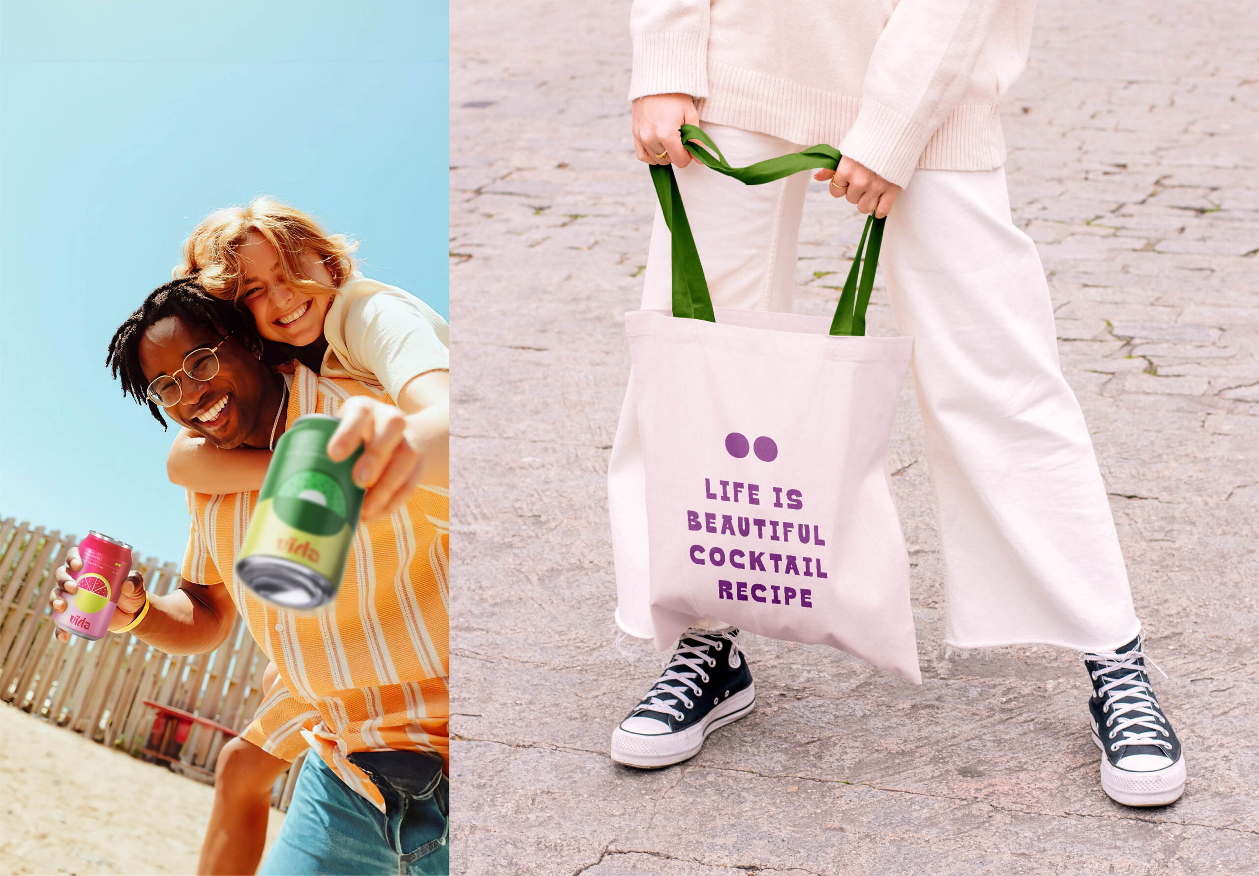
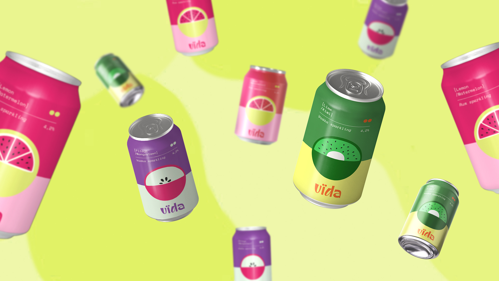
The Vida logo keeps the spirit that the brand wants to bring to the user, showing the difference but still has a classic and close feature. The italicized letter “V” symbolizes the shimmering surface of water when enjoying a cocktail. Although it is a canned beverage, Vida still provides an authentic and delightful experience. A cocktail always contains at least two different ingredients, and the colon represents Vida’s mission to be the emotional link that connects people during gatherings.
However, Cocktails are not simply about mixing and mixing. It is the art of emotional preparation, which both the enjoyment and the bartenders find in their own story. Because of its creative combination, Vida Cocktails will be your companion in life’s moments, with countless flavors and full colors.
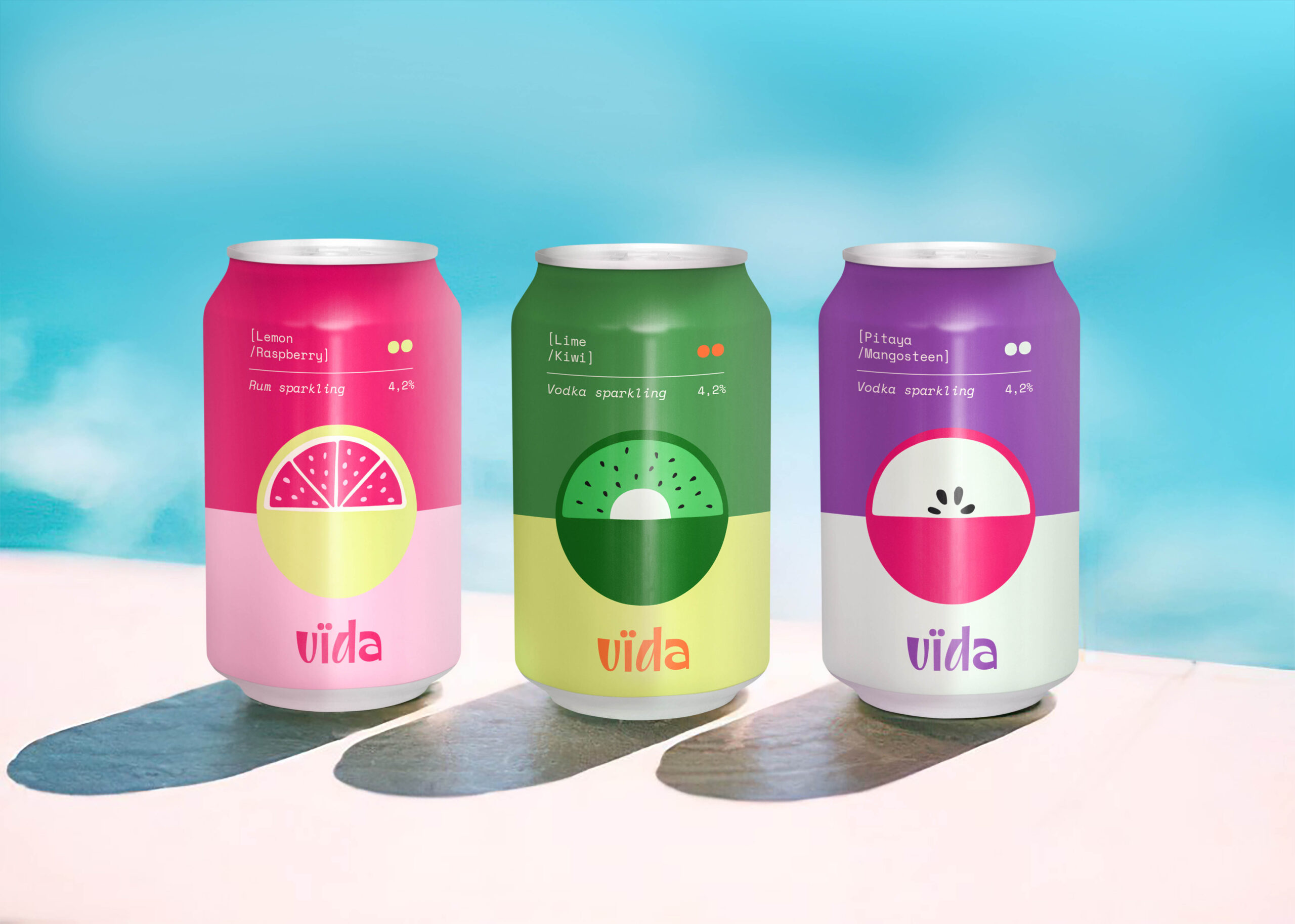
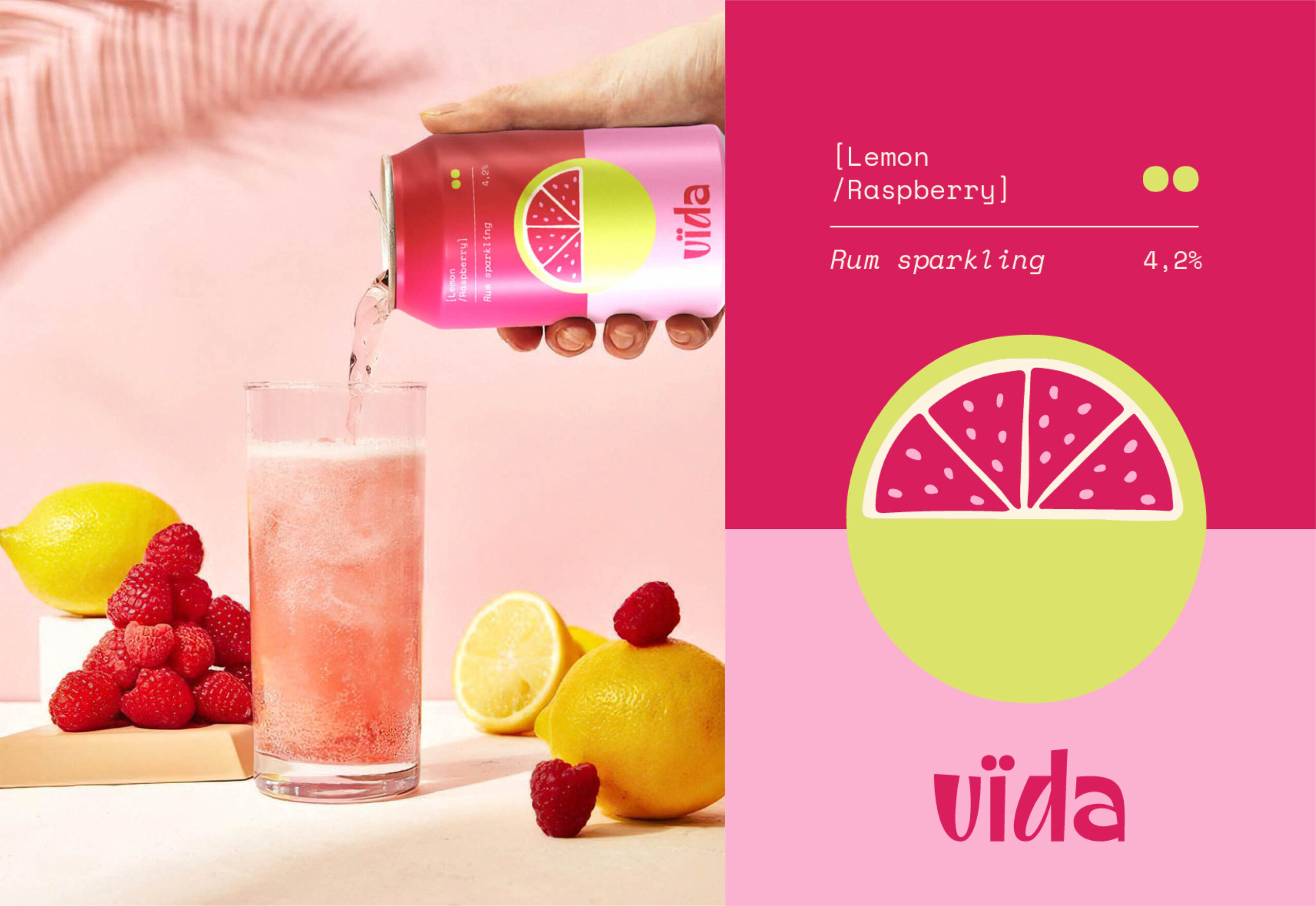
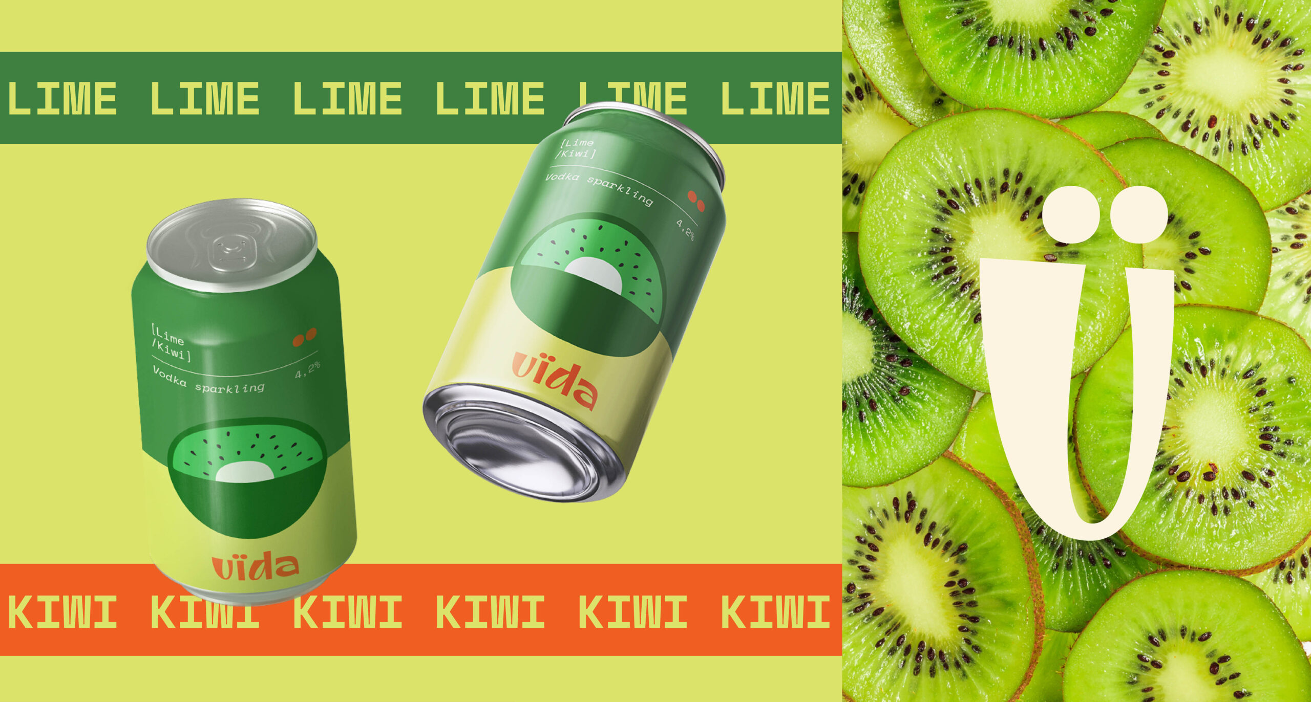
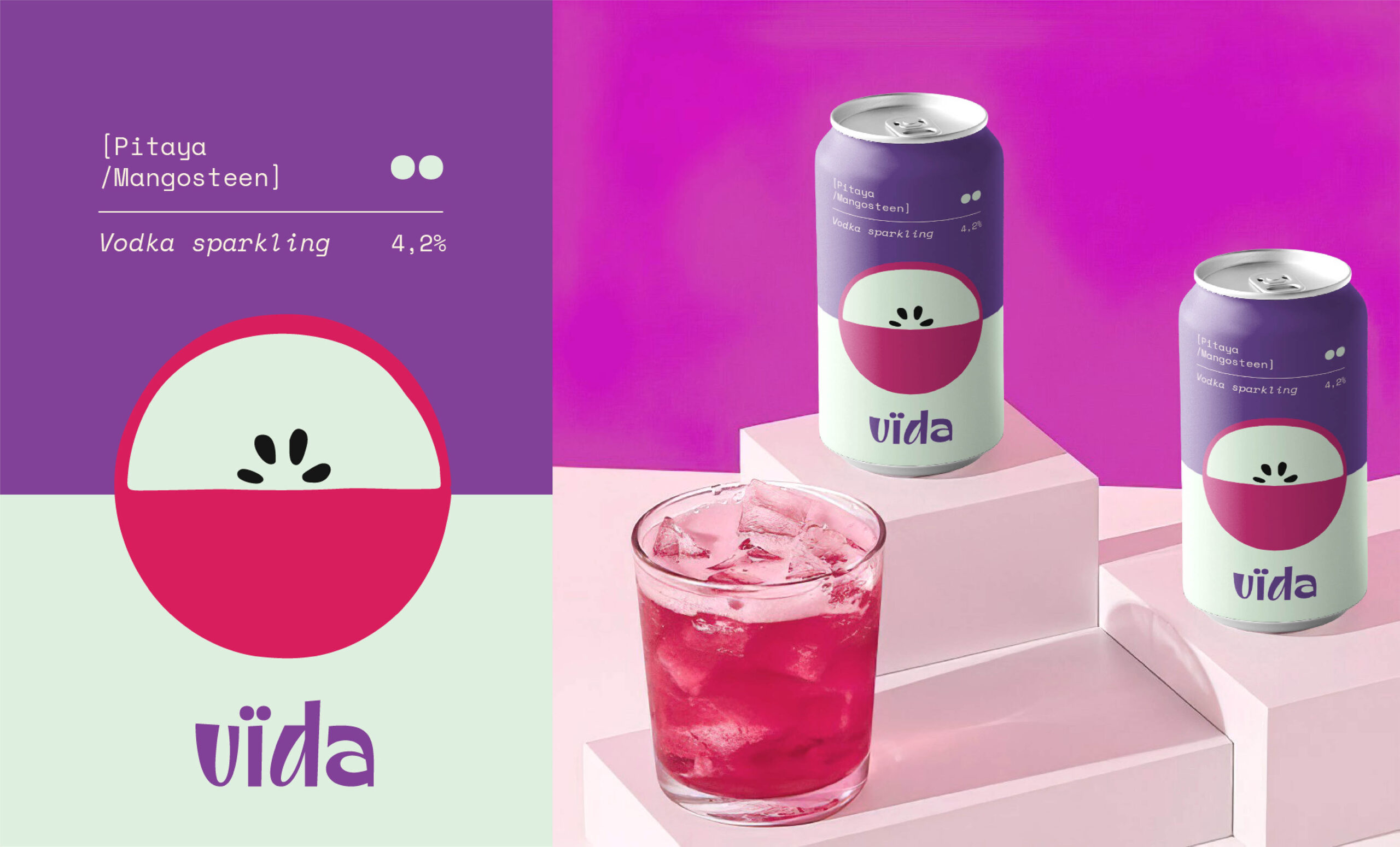
About the packaging, central to this design is the use of simple graphics simulating each type of fruit based on two dots, which serve as the brand’s key visual element. Each package features unique patterns inspired by the shapes and textures of the fruits inside. This minimalist representation ensures the packaging is not only visually appealing but also distinctive and instantly recognizable.
We utilize vibrant and contrasting color palettes to highlight the geometric patterns, making the packaging pop and stand out. The colors are meticulously chosen to evoke the natural freshness and vitality of the juices inside. For example, green signifies the mildly sour flavor of lemon juice, while a deep purple denotes the rich taste of grape juice. This thoughtful use of color not only makes the packaging attractive but also provides visual cues about the flavor profiles, enhancing the consumer’s shopping experience.