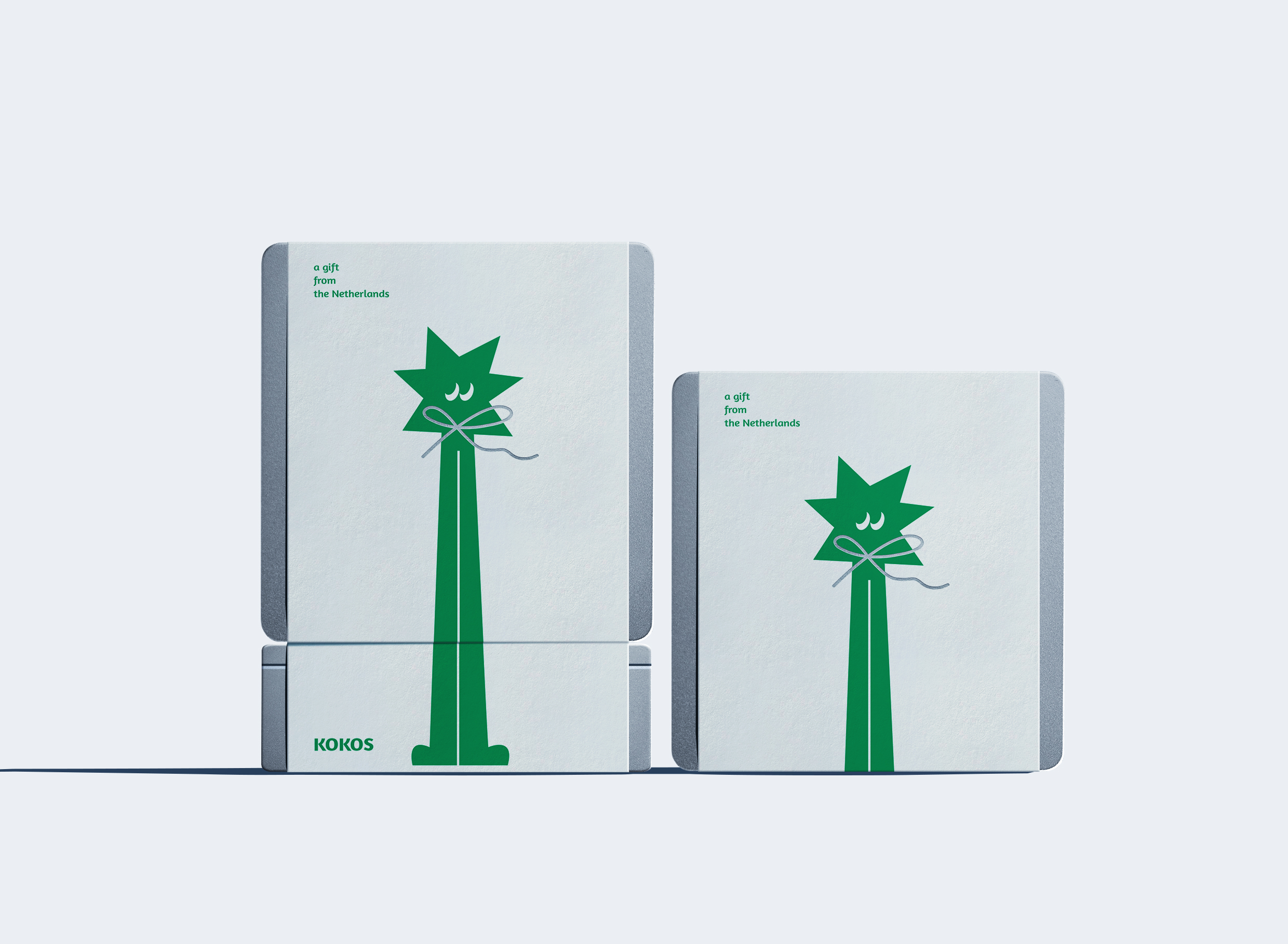
KOKOS means coconut in Dutch (yes, the founder loves coconut), the founder from the Netherlands and his wife from Taiwan came to Pingtung, southern Taiwan, hoping to run a restaurant for the purpose of life, with delicious dishes And a comfortable environment welcomes everyone. The brand identity and packaging design use the image of coconut as a character design, hoping to echo KOKOS’s brand spirit of passion for food and land with a clean, interesting, and more “human touch” emotional feeling.
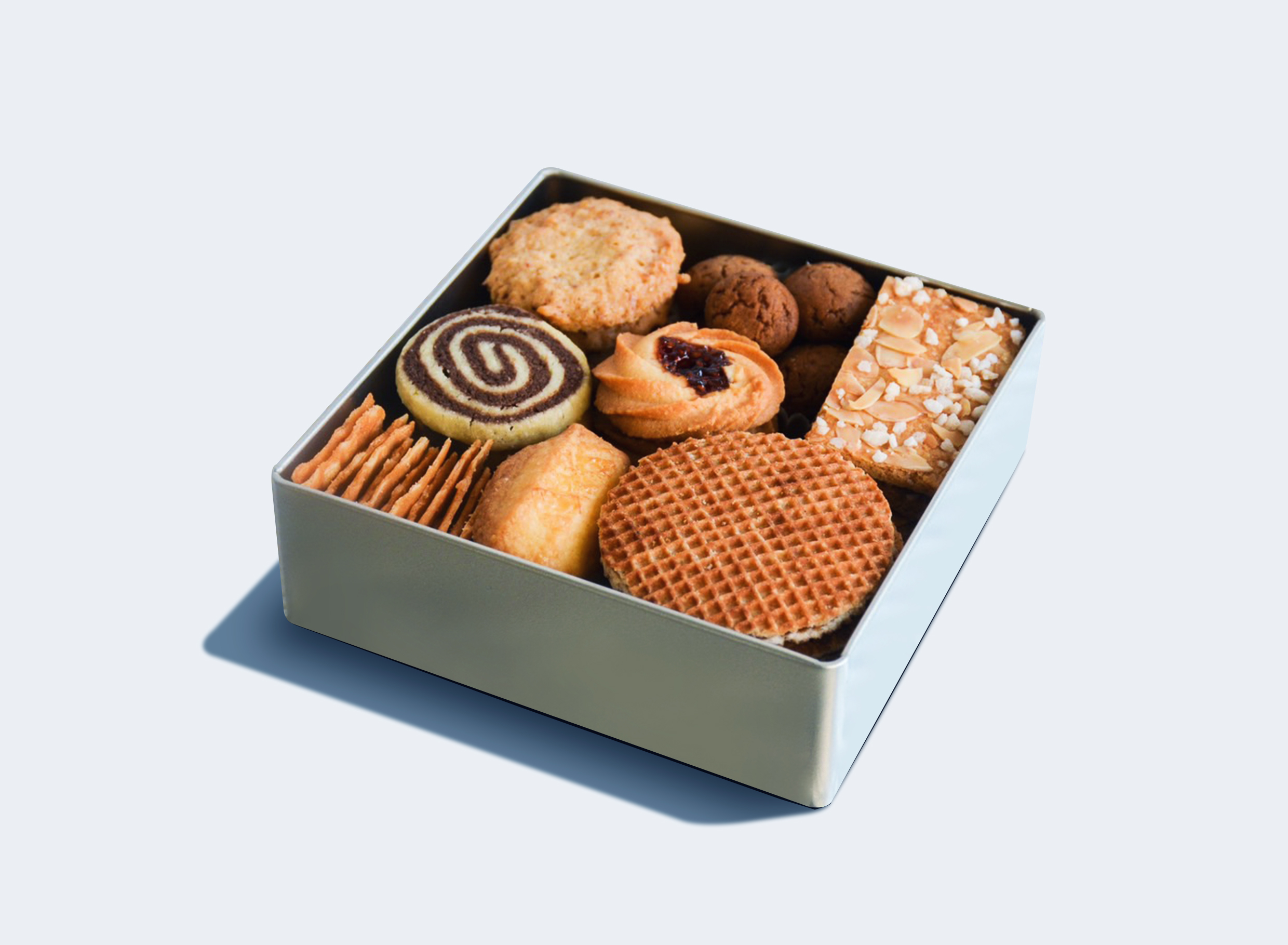
Due to the COVID-19 epidemic, the desire to travel to other countries is unlikely to be realized in recent years. We have combined the concept of “take everyone to the Netherlands with your taste buds” into the biscuit gift box. There are 8 types of biscuits with the Netherlands different provinces, various festivals and a little history and culture. When people are in Taiwan, the warm aroma of baking cookies in the store is like the Netherlands in winter.
Although they are all made with cream, flour and sugar, we still hope to provide consumers with a warmer and special brand experience. It is better to think of it as a magical portal. Opening the lid is like coming to the Netherlands, and 2022 will start from a day full of beautiful visions.
We hope to show a flexible and variable visual identity through humorous and interesting brand identity and use interesting illustrations to express the personality of the ingredients and the brand’s love for local ingredients so that consumers can feel relaxed when they come into contact with the brand image. , Comfort, instead of ignorantly emphasizing how high-grade and expensive the selected ingredients are, in this brand space, you only need to enjoy delicious food and a comfortable dining experience.