4SEAS! NORTH ATLANTIC SARDINES
When 4 partners and friends from different countries reunion their business ideas, a new brand are born!
While working for the seafood market for more than 20 years, each of the partners had a huge experience in sales, but canned sardines were a new challenge for them. While making the business plan they faced some kind of difficulties with papers so the partners decided to rebrand a working company which was founded in 1998 by Elias Jérémie. When the agreement was signed the sales department of the TV LAB agency received the request for rebranding and packaging design. Shortly the brand name and packaging designs were ready.
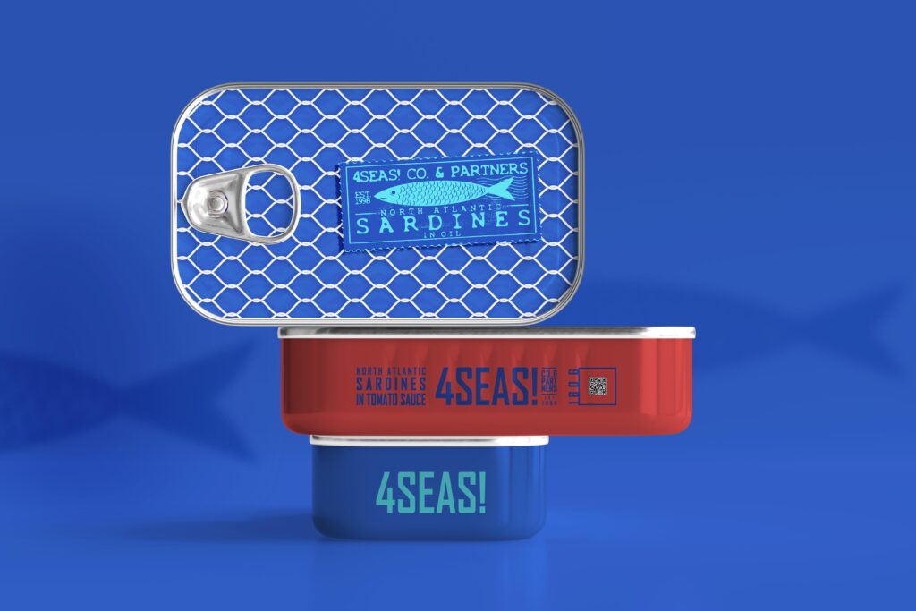
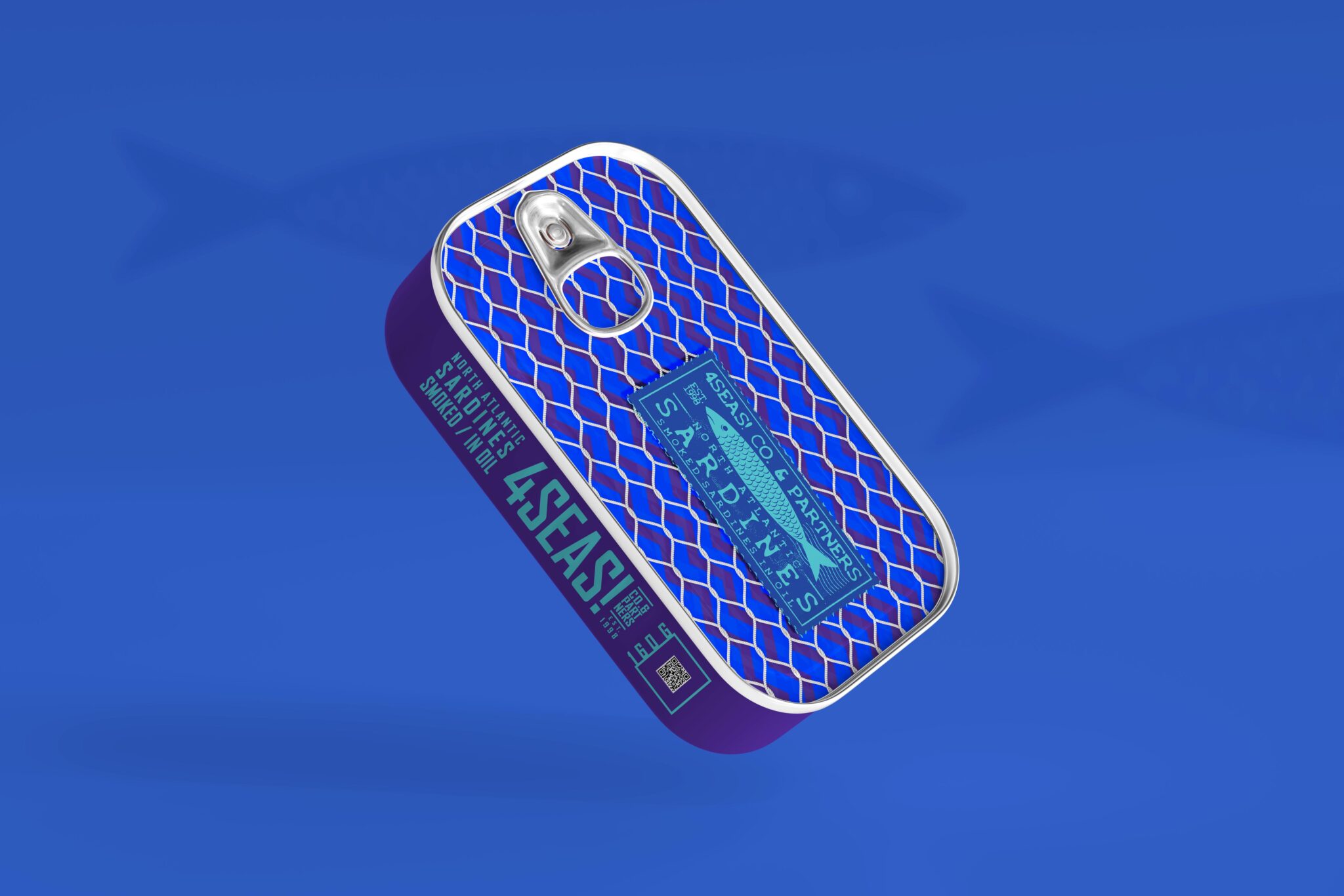
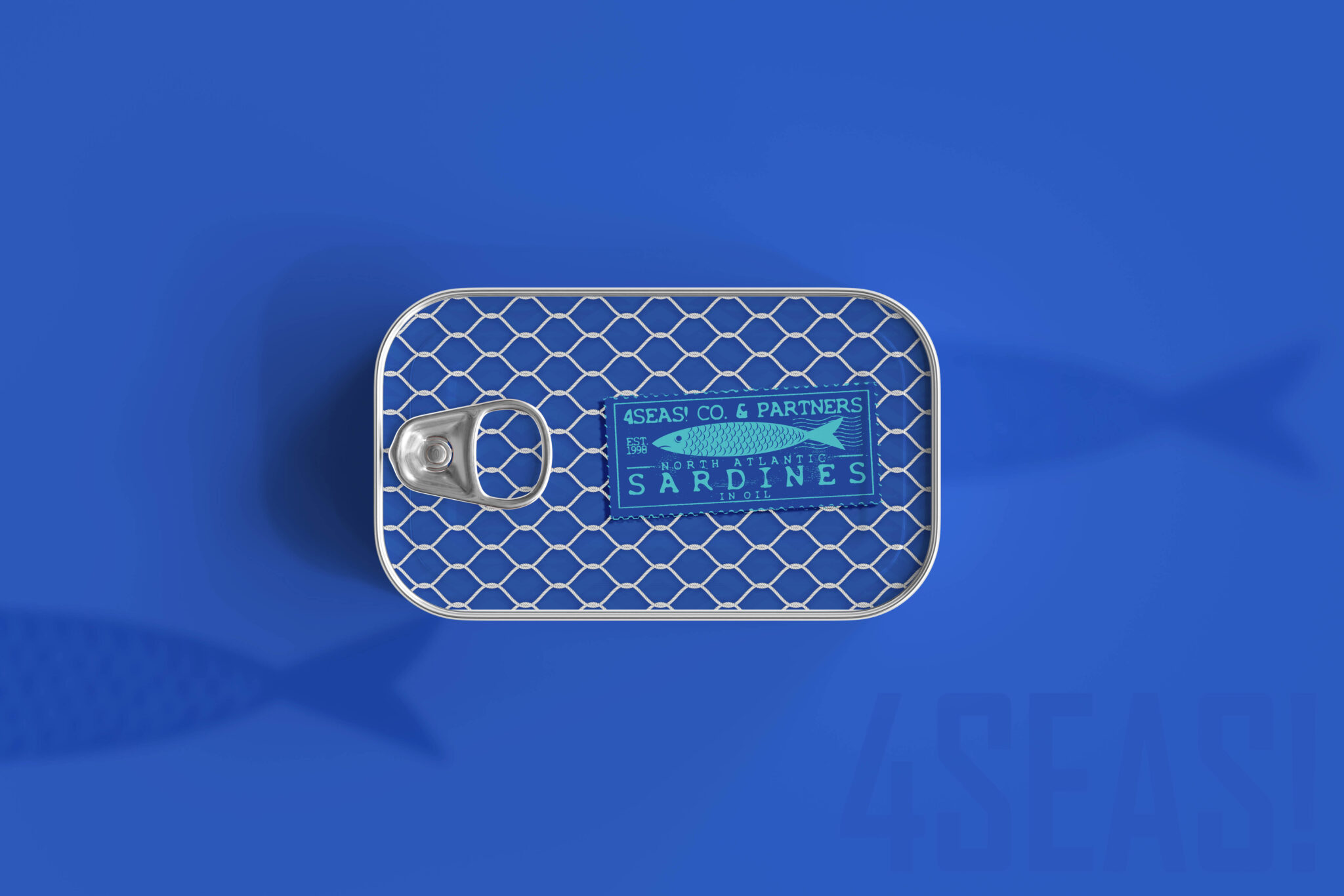
The name “4SEAS!” reflects 4 partners from different parts of the world. We add exclamation marks at the end to indicate strong feelings or to show emphasis.
The solution for packaging designs for tin cans of sardines was examined strongly.
While exploring the retro labels, packaging and stamps of the market we decided to create a stamp form design to underline the historical and iconic way of identity. The illustrations of a sardine fish were done in a simple way to express the direct form of the fish which is widely recognizable. By adding additional info and company name on the “stamp” we created a special and smart sign mark for different kinds of products by 4SEAS! The second element of the design is a fishnet pattern which is drawn by hand and is a strong brand identity element for canned productions of the company. Hand-drawn wave symbols, graphics and color solutions make the design of backgrounds full-fledged.