About the project
The company “Dzerzhinsky Plant of Organic Synthesis” is a major supplier of high-quality auto chemicals in the Russian market. The main activities of the company are the production and sale of cooling and windshield washer fluids for domestic and foreign cars. To date, the company has managed to earn trust in the market and establish itself as a conscientious manufacturer and reliable business partner – not only in Russia, but also in the CIS countries and neighboring countries.
A task
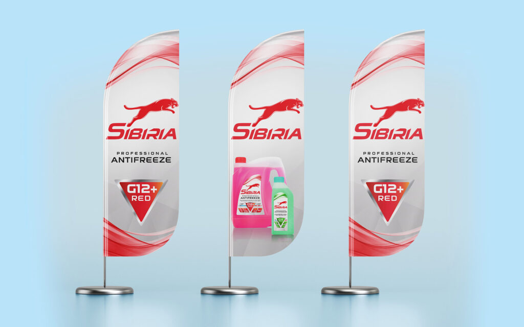
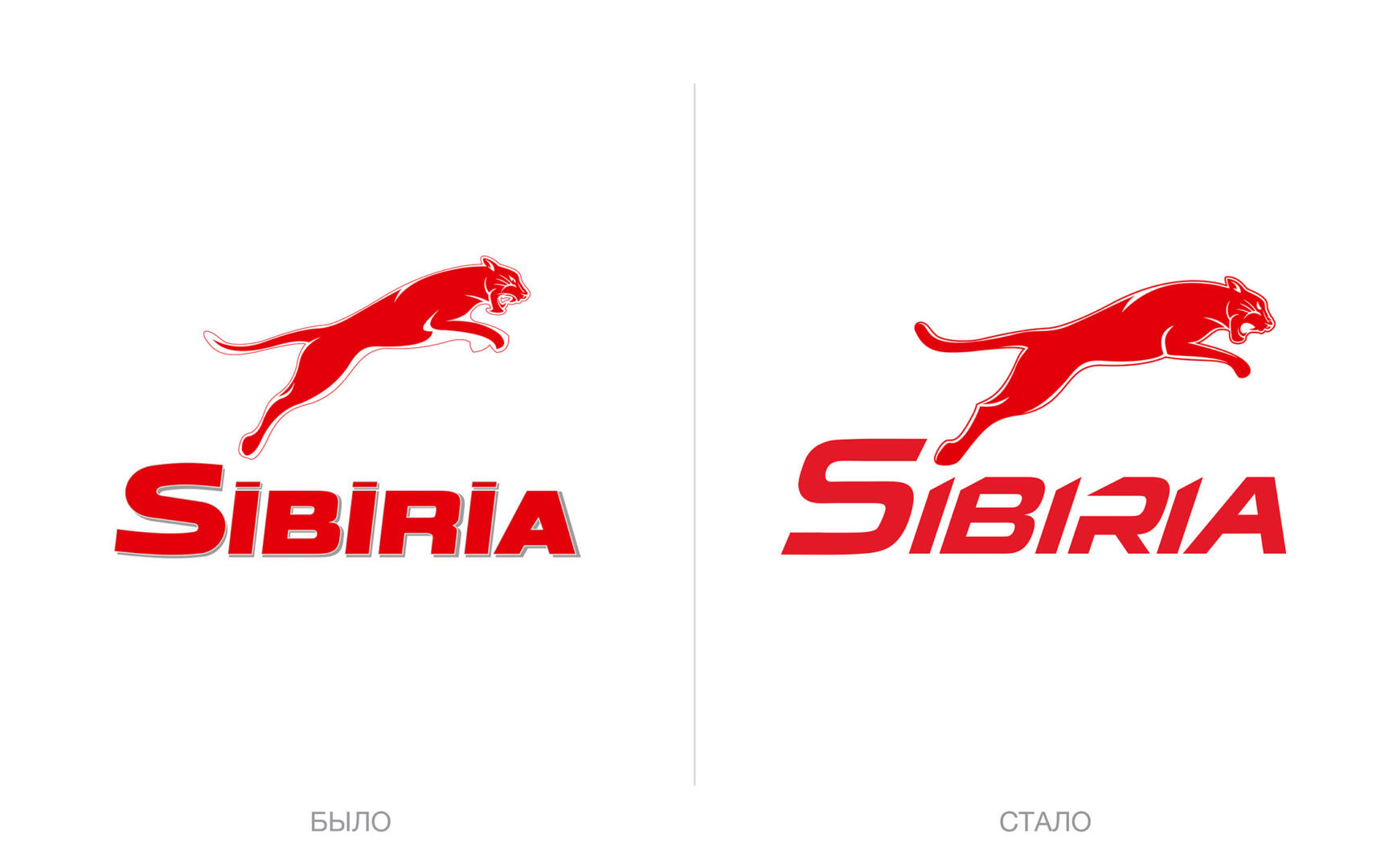
To restyle the Sibiria brand in order to increase the overall visibility and attractiveness of the packaging on the shelf by modernizing and adding dynamics to the current design.
Solution
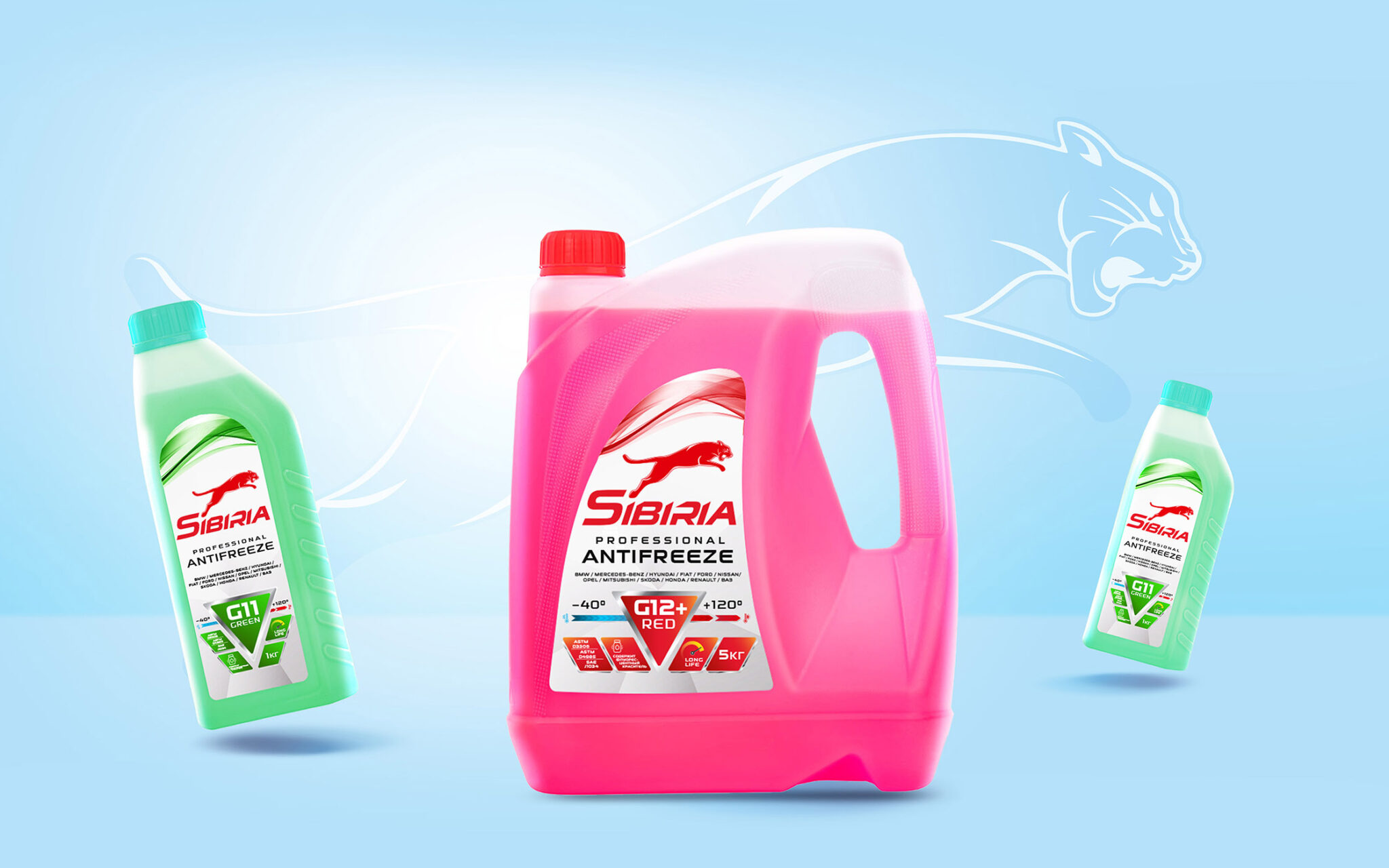
Sibiria is an antifreeze of class G11 and G12 +, which has a wide temperature range and normalizes engine operation under any load.
It was important for us to maintain continuity and recognizability, but at the same time to create a balanced packaging architecture so that the buyer can quickly understand the information and understand all the benefits of the product without reading the label.
We strengthened the brand block and removed the words “Professional Antifreeze” from there, placing them under the logo. The image of the wild cat remained the central element, becoming more dynamic. The name Sibiria now looks more technological and energetic. We also highlighted the Antifreeze Professional category, and placed all the required information in the center: the type of antifreeze is placed in a large red triangle, and additional information is located on the sides of it. In addition, we added a temperature scale from -40 to +120 so that people can immediately see this benefit.
The Sibiria brand is a shelf leader and has excellent sales, but we hope that sales will be even higher due to the redesign, due to the fact that the packaging design has become more modern and emphasizes the brand’s positioning.