About the project
Averton snack is one of the largest Russian factories for the production of snack products, which are known and loved not only in Russia, but also abroad.
A task
To develop a strategy, brand platform, design and naming for a new brand of rye bread.
Solution
Before proceeding directly to the development of the brand platform, we studied the market trends and consumer habits and came to the following conclusions. The trend of a healthy lifestyle is no longer actually a fashion, but a reality. In this reality, bread is often perceived as unfriendly or at least optional product. According to research, 8 out of 10 respondents from Russia would like more food brands to inspire them to snack properly. At the same time, 73% of respondents are sure that snacks will be more useful in the future than they are today.
In connection with the audience’s request, it can be assumed that snacking will become more natural and there will be a growing interest in traditional recipes “shifted” to modern production capabilities.
Most domestic loaves on the Russian market are made by extrusion. However, this method has recently been criticized, in particular, they write that after such processing, nothing useful remains from the grain: fiber, vitamins and minerals are destroyed, and the grain itself becomes a refined empty carbohydrate.
Averton has developed a new technology for the production of bread, different from what is currently on the market. Crispbread is made from bread that is cut into slices and baked in an oven. The composition includes grains and cereals, the characteristic crunch, vitamins and minerals are preserved. The product looks different than regular crispbread and is more like a complete snack.
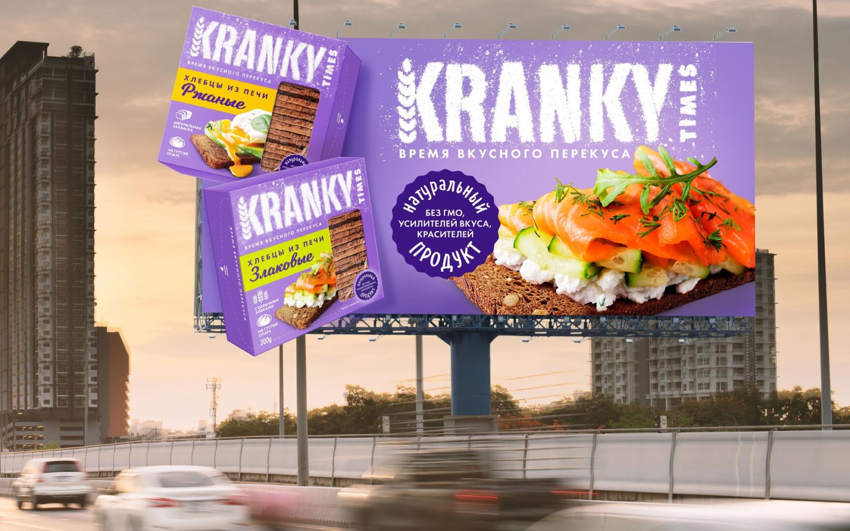
Since this is a completely new product, unlike all other breads, we wanted to choose a name that could define the category of such breads. And we made up such naming as «Kranky Times», combining a unique crunchy taste and a time for a delicious snack, a time to crunch.
The bright purple color was chosen for a reason, as it awakens the taste buds. The food zone depicts a healthy snack with curd cheese, red fish and avocado. The decision to write the name of the brand in flour adds the package some craftiness and warmth, and at the same time is a reference to the naturalness and usefulness of the product.
The bright contrasting stripe “Bread from the oven, cereals” adds accents and contains the brand’s USP.
The design is replete with stigmatizing rational benefits – “with whole grains”, “on a thick dough” and testifying about quality control. A window on the front of the package shows the product so that the buyer can make sure that the bread looks exactly like in the food zone.
The design is made according to our method “Three layers of efficiency”. An accent color, a large logo, a clear category, an impressive food zone, a good conversion layer – everything works to attract a buyer at first sight. We hope that the design will provide the brand with a high purchase frequency, and Kranky Times will become a hit this season, occupying its niche and winning the love of buyers.