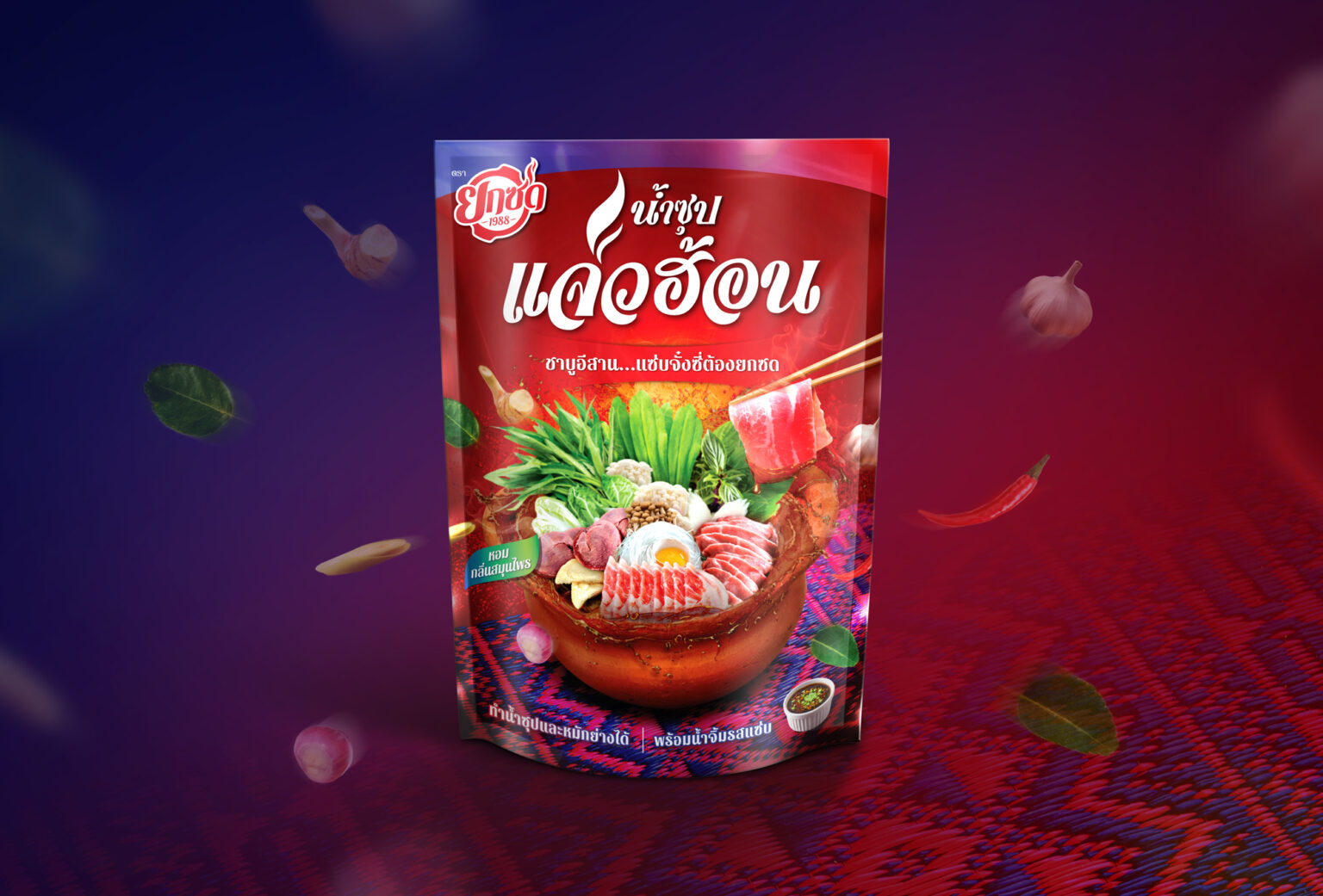
Yoksod- Thai Isan Hot Pot : Branding & Packaging Design
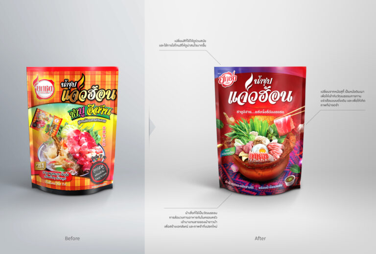
Challenge: I-San-style shabu hotpot with rich and bold taste is best enjoyed with a group of friends or family. However, the name ‘Yoksod’ is hard to pronounced, and the packaging does not convey the well-known ‘I-San’ flavors. The ads can be misleading for a sauce, instead of the authentic I-San Jaew Hon soup.
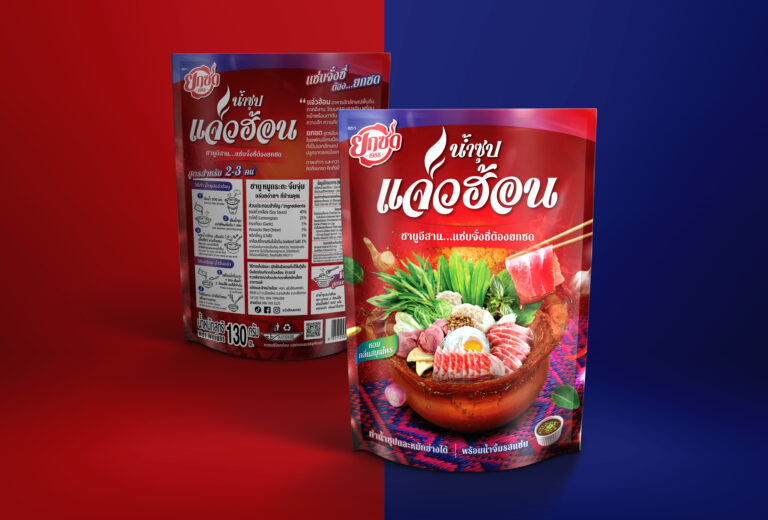
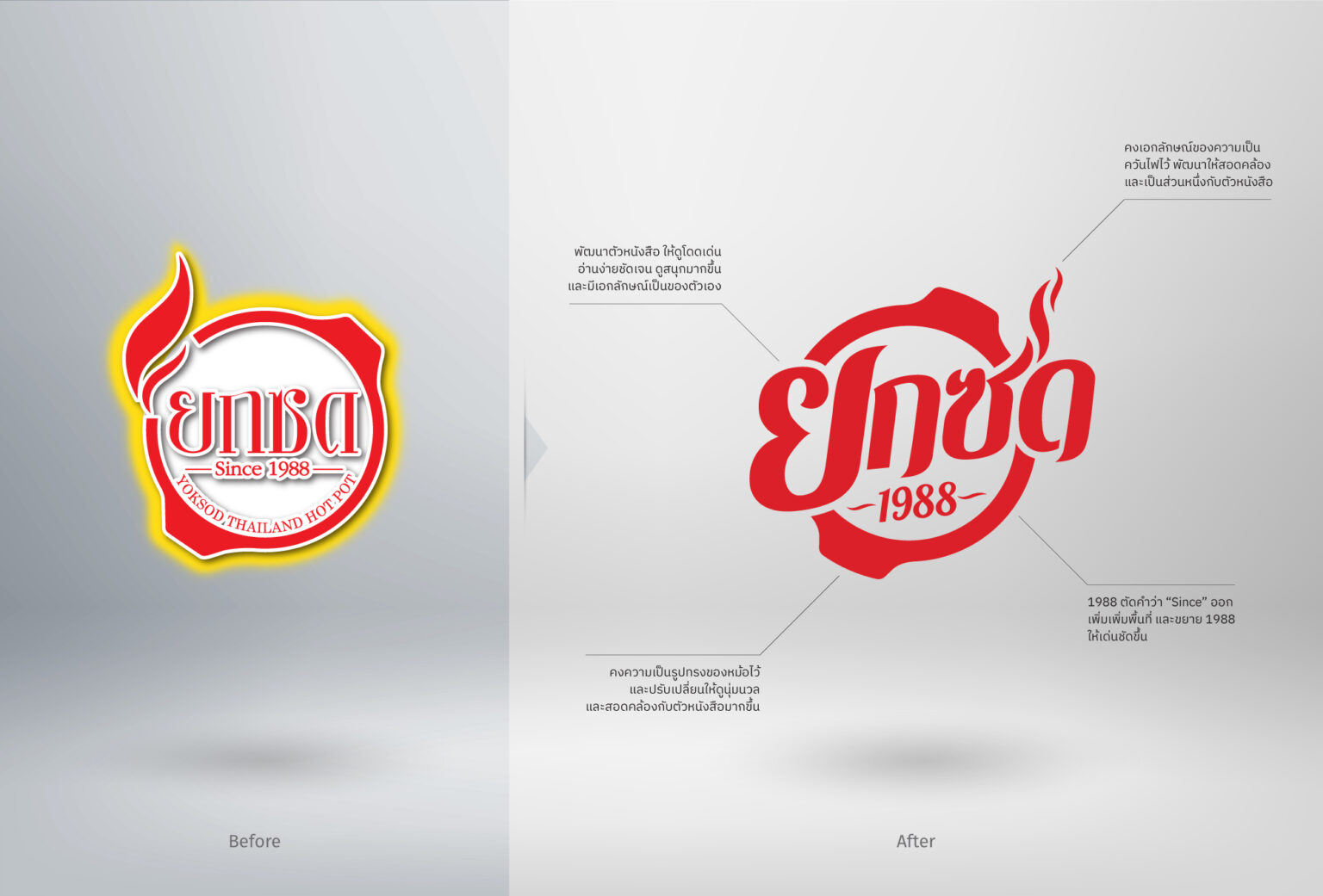
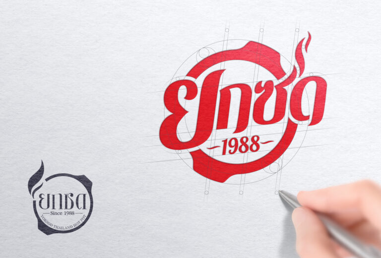
Idea: ‘Yoksod’’s font is adjusted to feel local, homely but still gives off fun energy. Jaew Hon soup in a clay pot exudes herb and spice-filled flavors, I-San pattern mat implies the culture of eating in groups. Red and blue intensifies the spicy flavor and at the same time represents Thainess.
