A BRAND REFRESH FOR INDIA’S HEALTH FOOD PIONEERS
PACKAGING DESIGN:
Forbes famously monikered Bagrry’s as a “Cereal Killer” brand. And for good reason! The homegrown company has managed to give stiff competition to giants like PepsiCo to become India’s second-biggest breakfast-cereal maker after Kellogg’s. Bagrry’s is an innovative venture that created a niche for itself against MNC competition. They were the first to launch muesli in India, back in 1994.
Bagrry’s grabbed attention when former US President, Mr. Bill Clinton, was served its muesli during his visit to India in the year 2000. As of 2022, the company is present across 70,000 retail outlets and exports to eight countries.
Our association with Bagrry’s began just before the pandemic, in early 2020. Up until then, all efforts related to brand packaging were managed in-house. We were brought in to give the overall range a packaging refresh for existing products and a way to seamlessly introduce new variants or categories.
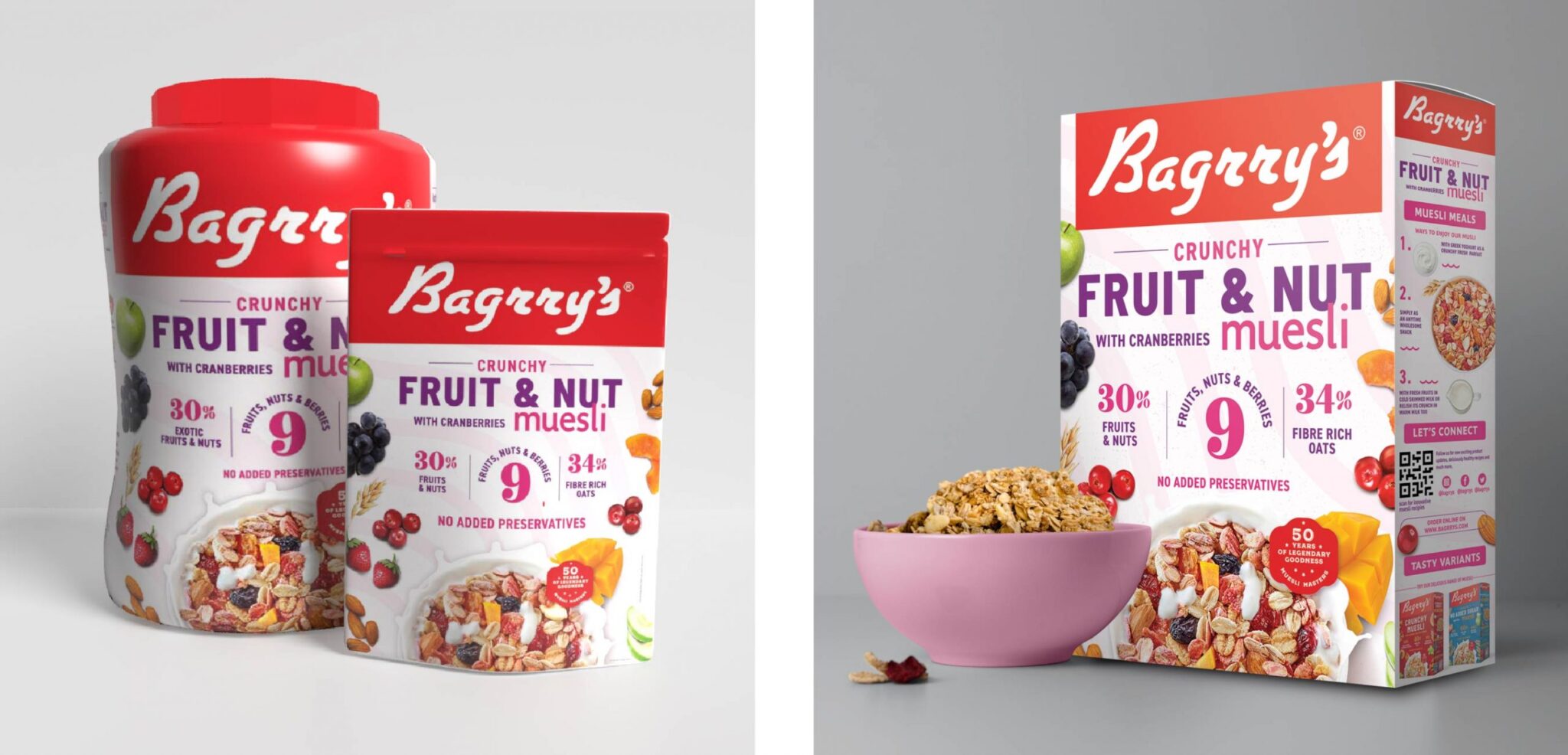
MUESLI MASTERS
Today, Bagrry’s is the pioneer of muesli in India and is loved equally, if not more, than Kellogg’s. (Fun fact, Kellogg’s entered the Indian market years after Bagrry’s had introduced muesli to the Indian breakfast table.)
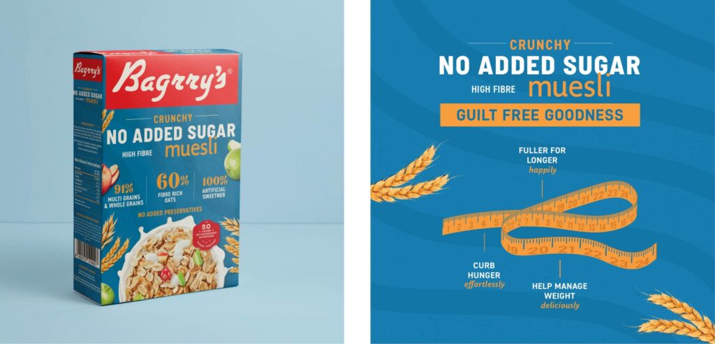
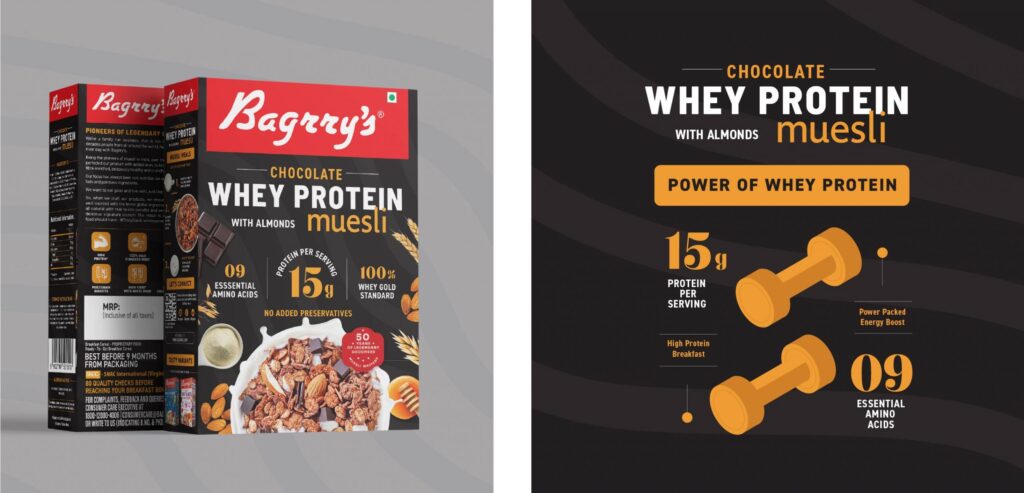
Bagrry’s especially ensures the ratio of fruits, nuts, seeds, and grains is ideal for optimal health, taste, and mouthfeel. A consumer research study conducted showcased clearly, how loved their products are. The brand has many, many loyalists in different parts of the country.
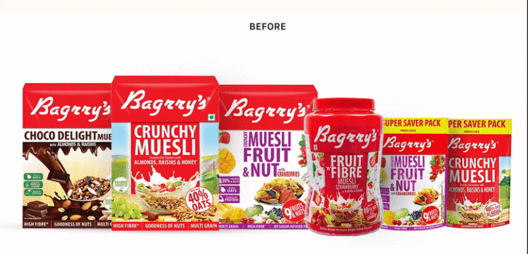
There is a recognizable legacy attached to brand Bagrry’s. But, their packaging was dated, clumsy in parts, and would not stand the test of time. Bravely, the new generation at Bagrry’s decided to revamp their packaging to compete with their international counterparts.
As brand strategists, it is hard to ignore the tremendous equity and loyalty built over the past 50 years by the brand. This is a truly healthy brand, and have been honest and vocal about their health claims and product performance, years before it was considered cool to speak factually with the consumer via the front of pack real estate.
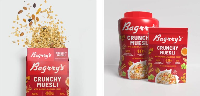
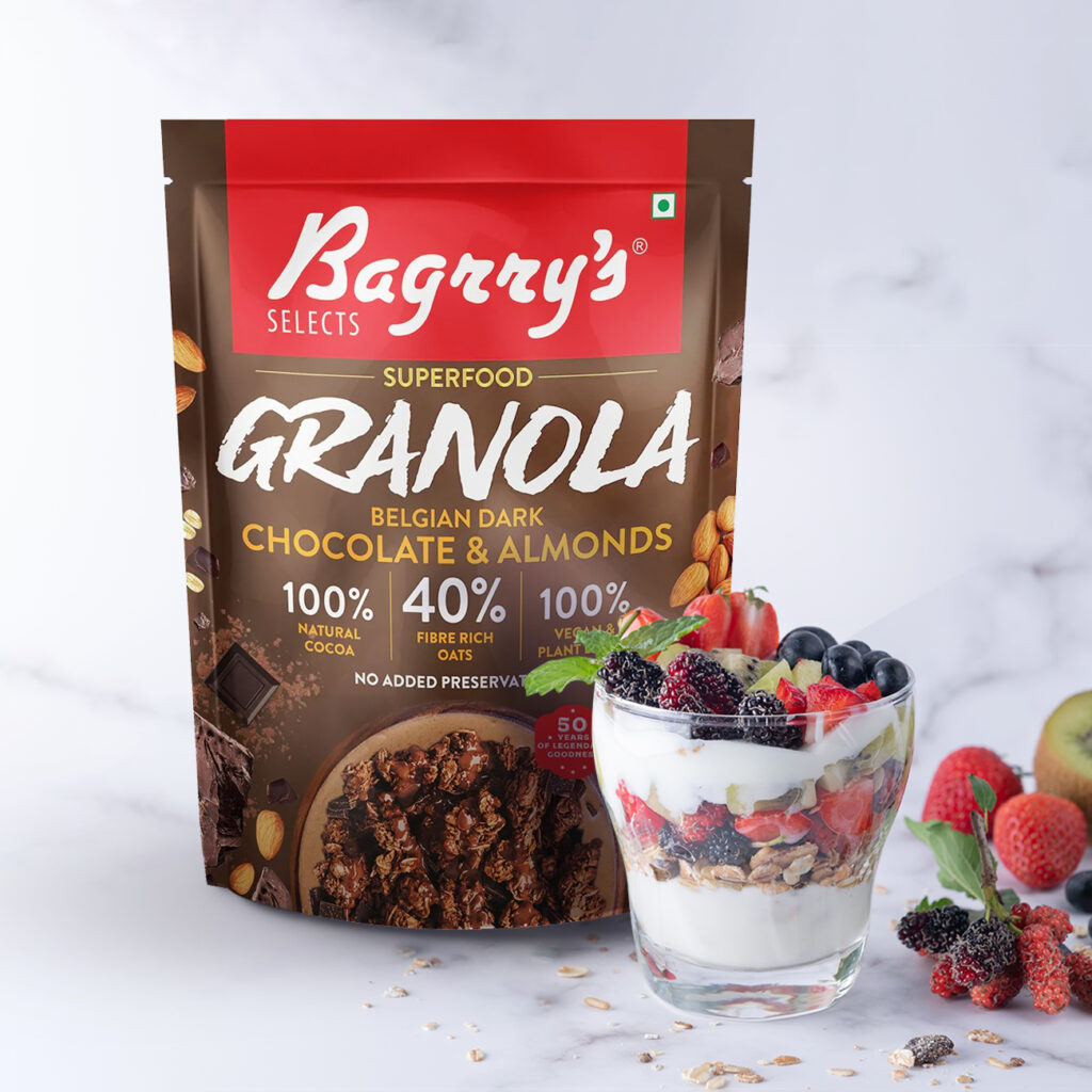
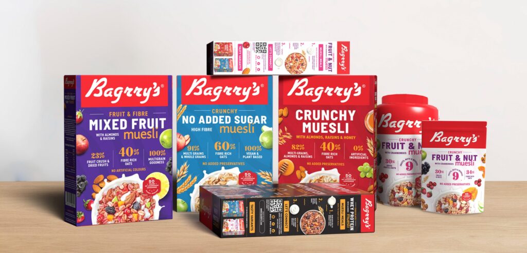
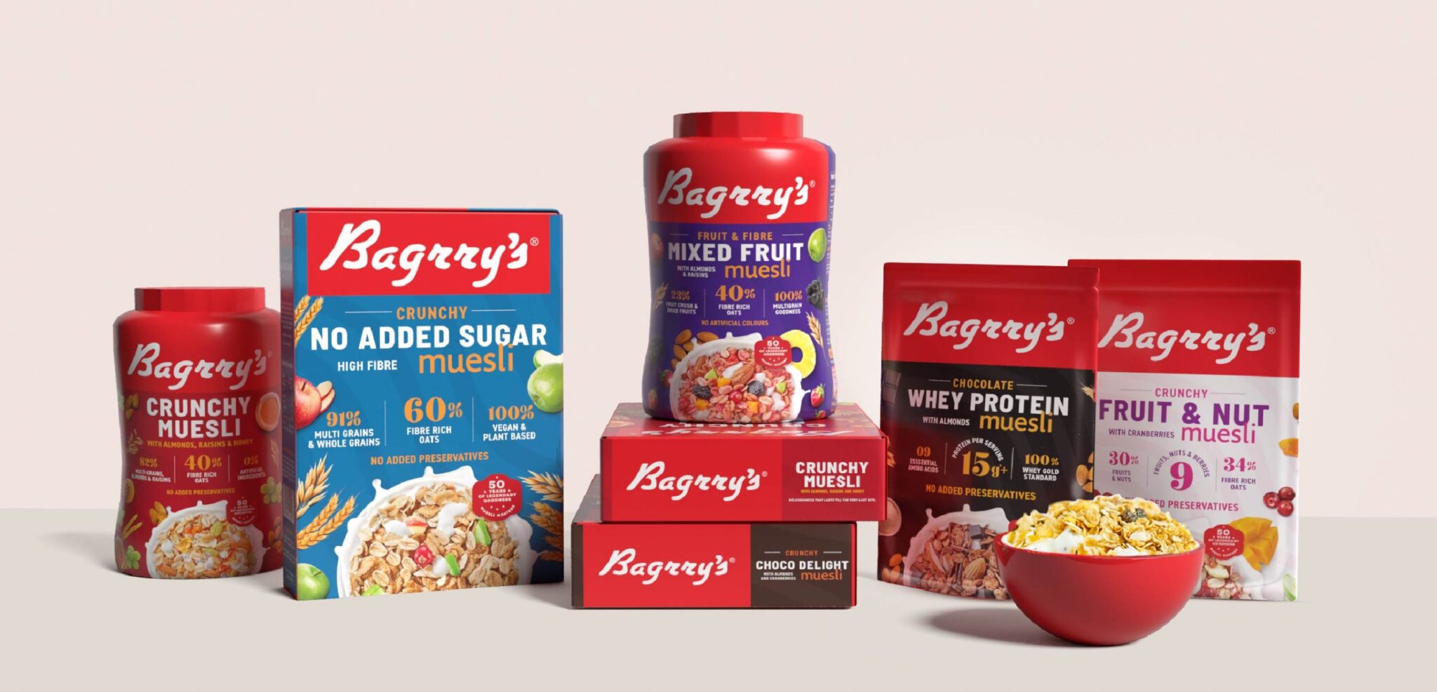
While a complete packaging overhaul was due, there were key legacy aspects that we decided to retain. The red flag of the logo, the abundance of ingredients and prominence attributed to the product shot were upgraded to remain a part of the brand’s narrative.