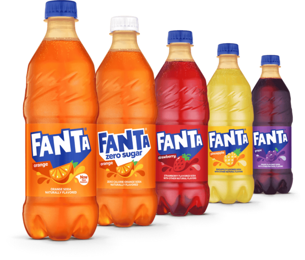
With the recent rebrand of Pepsi. Fanta is getting a fresh new look too – and it looks great! The iconic soda brand has just unveiled a vibrant new global brand identity, featuring brighter colors and an updated wordmark. The refreshed look is sure to make you smile and take you on an adventure of flavor.
The refreshed look, created in collaboration between Coca-Cola’s design team and creative agency Jones Knowles Ritchie (aka jkr), is bright, colorful, and full of joy and fun. Everything from the updated logo to the accompanying illustrations was crafted with one goal in mind: to make the every day more playful. And this new design does just that! The brighter colors, like orange, lime green, blue and pink were inspired by the various flavors available around the world. Meanwhile, the graphics like diamonds and lightning bolts give us a glimpse into the fun-filled flavor we can expect when we grab a bottle of Fanta.
There have been some changes to the look and feel of this iconic logo, most notably, the change from an orange background to a predominantly blue one. With this new brand identity, Fanta wants to prove that it can still be exciting and vibrant despite being dropped down to a single color! The most fascinating aspect of the redesign is the dropping of the leaf in the logo, which was always a big part of the original design. By doing so, Fanta is now signaling its readiness for future-proofing, as well as its eagerness to explore different flavors aside from the classic orange.
It’s clear that with this revamp, Fanta is making a statement – that it won’t be stuck in the past when it comes to flavor and design. Instead, it’s ready for whatever comes next, with a modernized logo that captures the spirit of the brand.