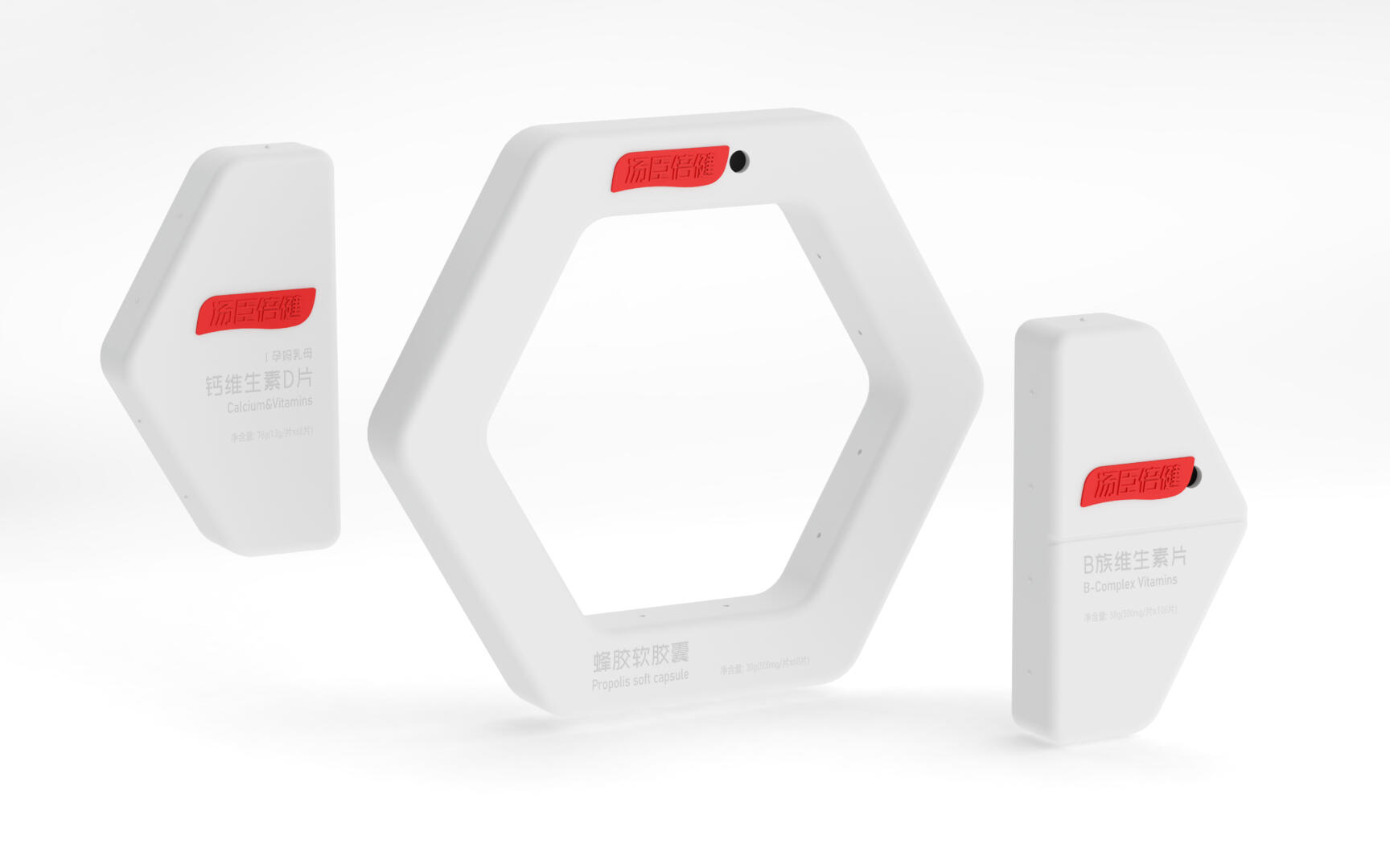
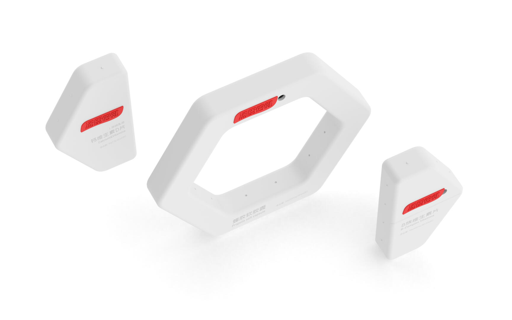
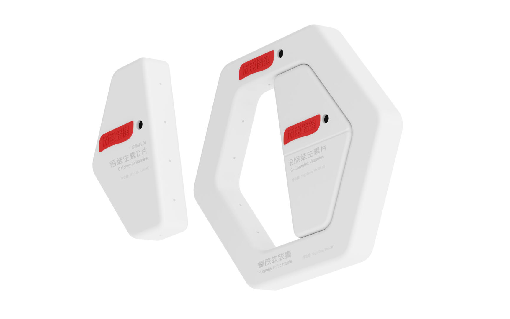
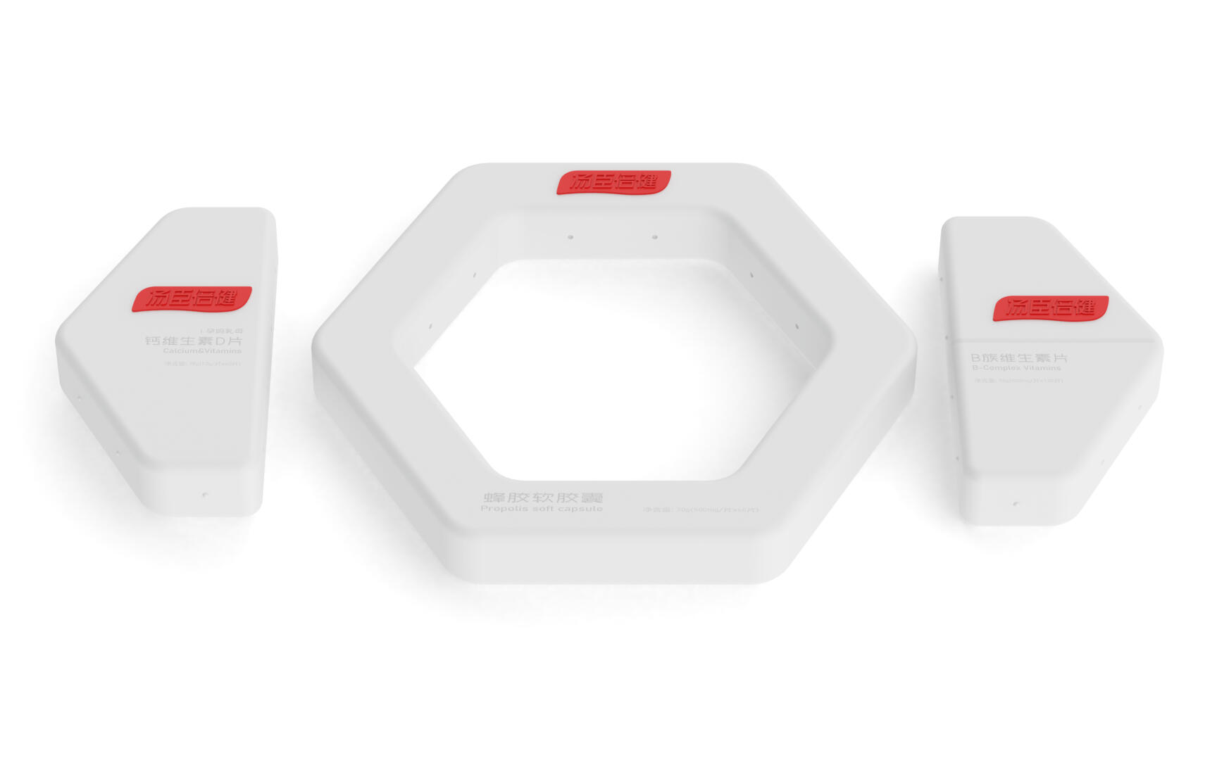
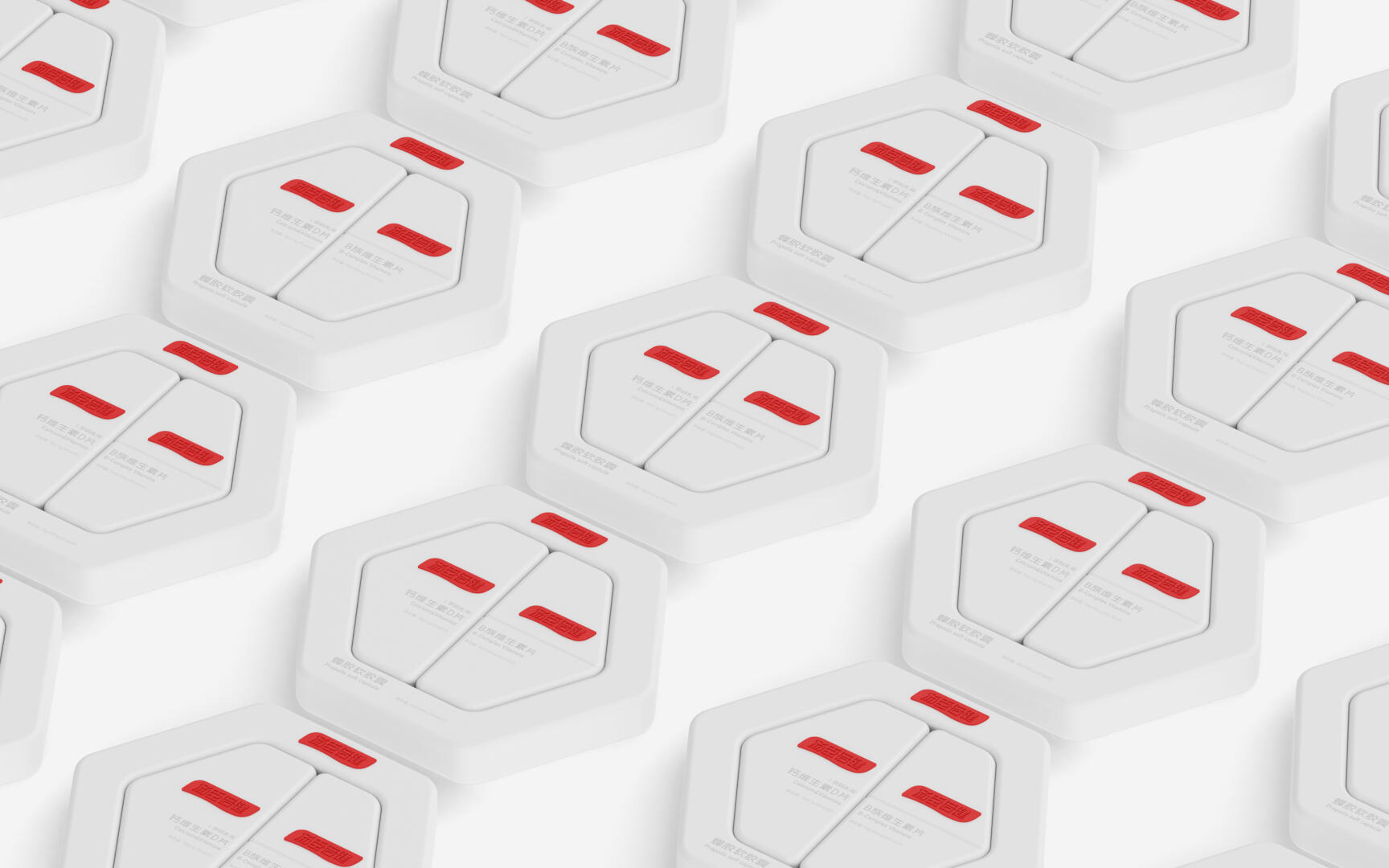
Exploring the future trends of Thompson’s health products and interpreting them with a philosophy of separation and integration. The hexagonal structure of the honeycomb can perfectly form the letter vision of D and B through reasonable cutting, which can overturn the traditional packaging method of health products. The clever combination of the structure makes the three single products merge into one.
The red switch is opened by moving left and right through the track of the box body, and the circular opening can solve the problem of “accidentally pouring too many” in traditional box types. Its buttons are designed with a red brand logo, deepening the brand’s memory points.
The shape of the outer box can be made of recycled pulp and processed with special technology under high temperature and pressure. The shape is simple, rich in memory points, and has a strong futuristic impact, and the material is very environmentally friendly. The surface text can be printed using high-temperature physical colorless embossing, or sprayed with eco-friendly ink in light color on the surface. This can well answer the brand proposition of “healthy and natural” by Thomson Bejian, and explain the future trend of Thomson Bejian with clever separation and integration philosophy.