Ukrainian fish and seafood brand
Scope of work:
- Strategy
- Logo design
- Brand identity
- Packaging
Flagman holds a leading position in the seafood market in Ukraine. The company specializes in import and export, processing, distribution, as well as wholesale and retail trade. The group includes Ice Terminal, an ultra-modern refrigeration and logistics complex designed for storing products at low temperatures. This complex set a record in Ukraine in the “Business and Technology” category as the largest and most modern refrigeration logistics complex in the country.
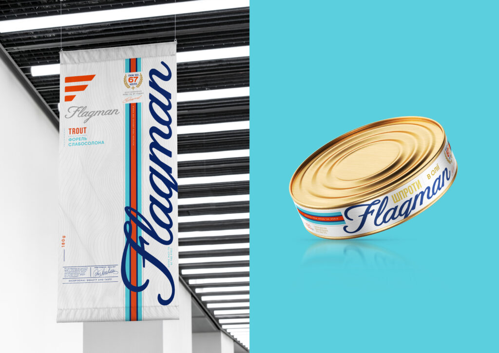
Over time, the company has expanded its product range to 400 items, which has led to some disorganization in the brand portfolio – different SKUs had different brand colors and designs. A study confirmed this problem, and it was decided to unify the design of all products into one style. A consumer survey also showed that the main type of product sold often ends up in the shadow area of the shelf, making it less visible. Therefore, white was chosen as the new main background color, with blue and light blue as additional colors to add freshness.
The iconic F-shaped logo was reimagined, simplified, and moved to the category of additional design elements. The main logo became the stylized handwritten font of “Flagman,” which is intended to be used together with stylized stripes. The colors of the stripes resemble the combination of flags of several European countries since a significant portion of the products is exported from there. And to add volume to the graphics, the signature white background was supplemented with a pattern of thin graphic lines resembling sea waves.


