Frankly gets rebranded by EVERLAND
In 2014, Frankly set out to shake up the juice market for good. Fast forward, and their organic cold-pressed juice has become the category standard. To stay fresh and keep up their competitive edge, the good people of Frankly looked to “stand out and get in front, once again. And they had just the right idea and products to do so.
The Scandinavian consumer branding agency Everland helped with the repositioning, new brand strategy, visual identity and packaging design. An initiative that will help the growing company succeed in its future endeavours.
A frank purpose
Never before have so many people suffered from anxiety, inability to cope, or burnout. Consequently, Frankly has stepped up to encourage physical well-being and highlight the importance of mental strength.
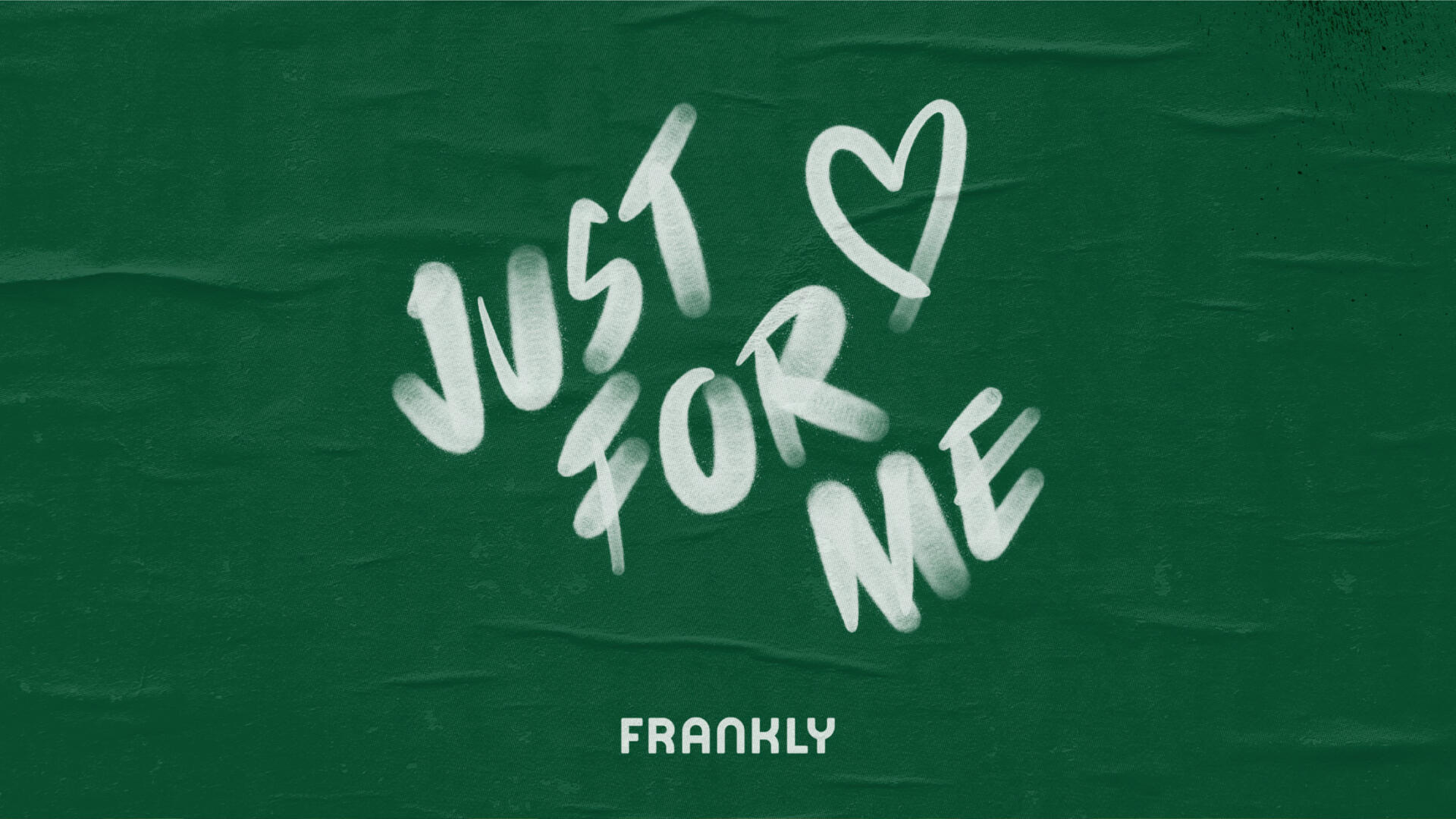
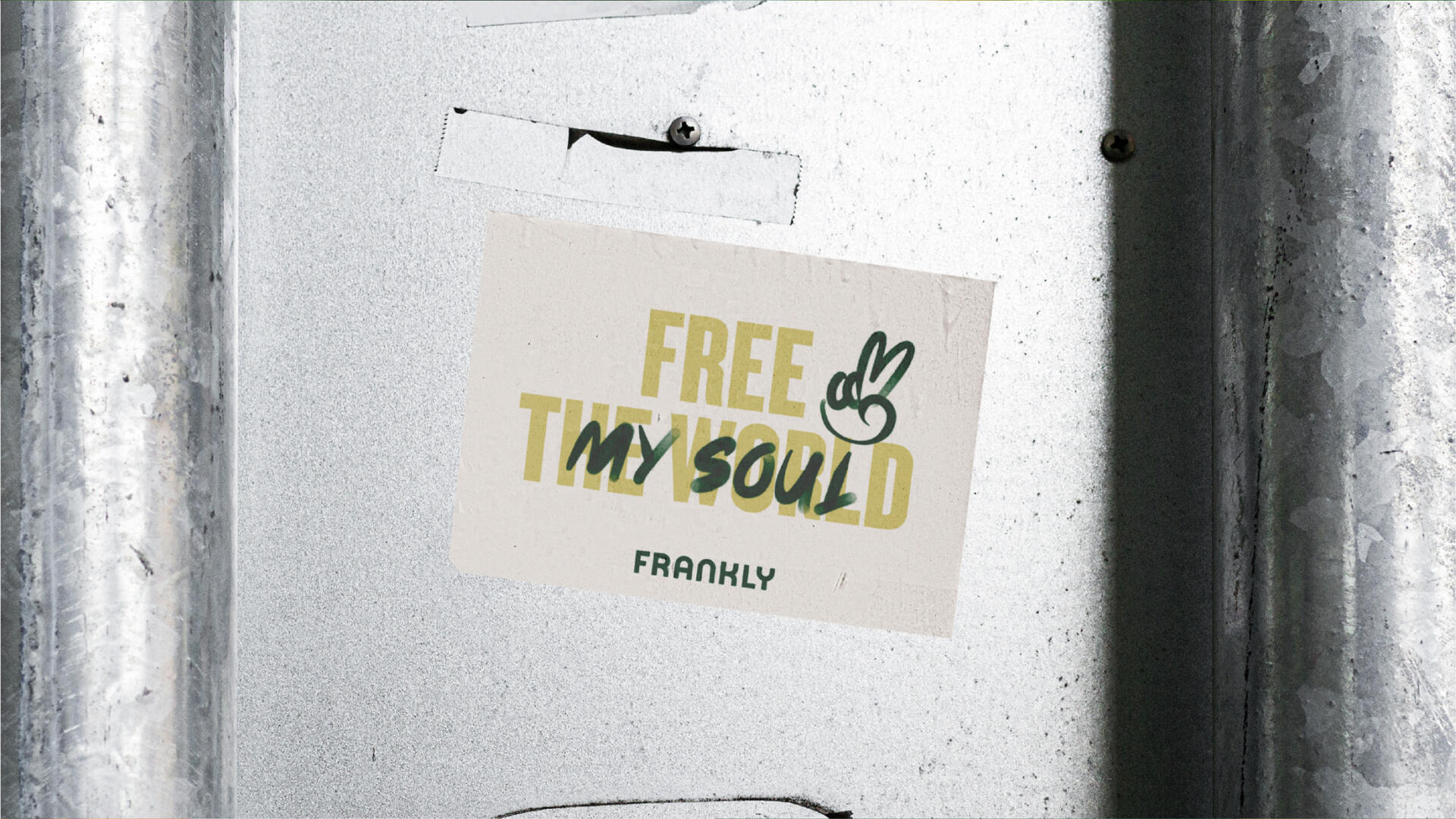
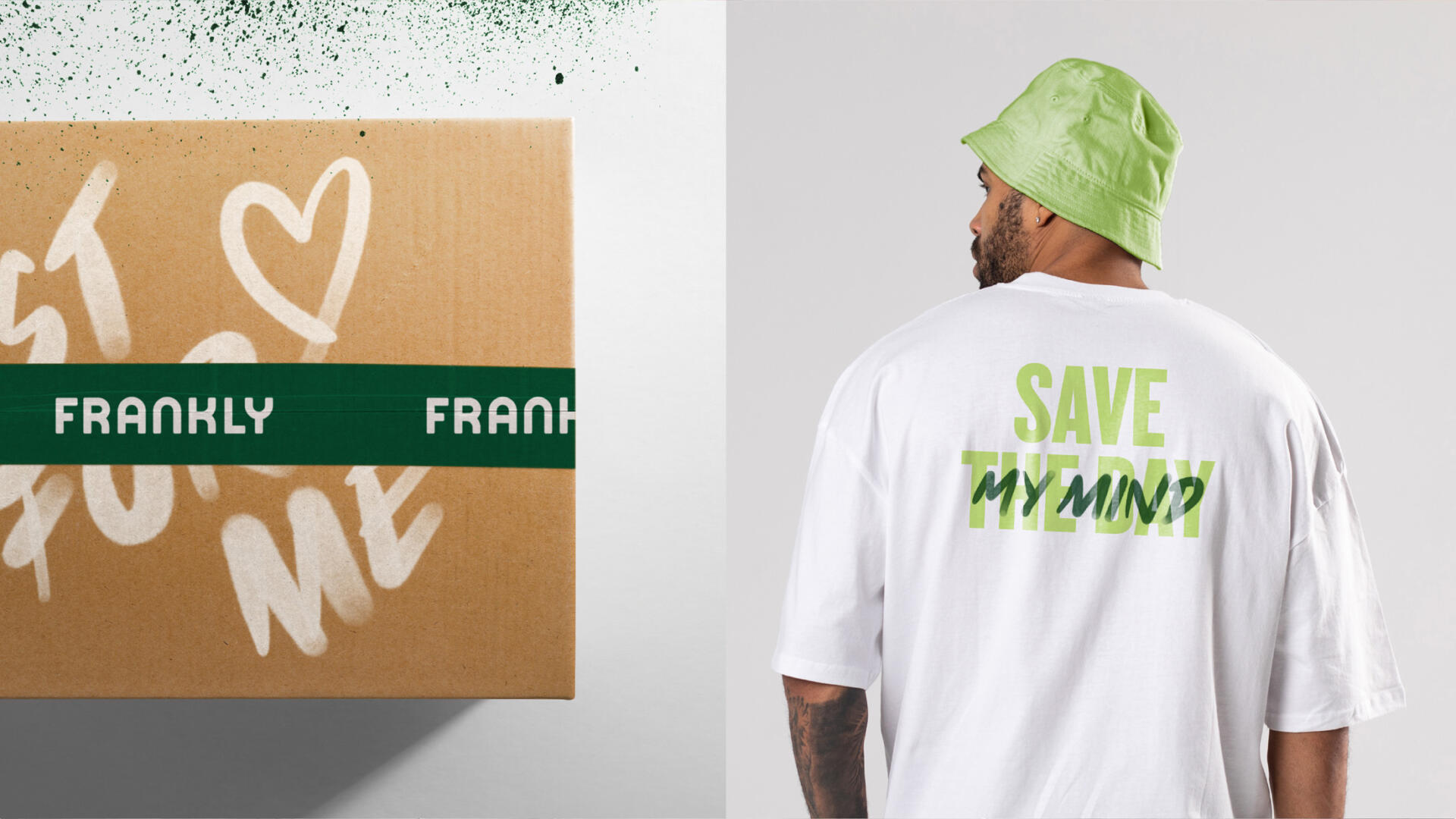
The products are still organic and outstanding. Only, now they have a purpose: encourage people to prioritise (mental) well-being through honest and genuinely healthy juices. This new strategic brand position is summed up in their tagline, ‘FRANKLY SPEAKING’. It’s encouraging, sincere, and speaks of total transparency at the same time.
“Frankly avoids the corny, fake and high-(p)reaching statements,” Lobber Levin, Senior Strategic Writer at Everland, says. “Rather, they move a little closer to home with a design that promotes a genuine health agenda. You’re a better version of you, when you feel good about yourself.”
The new position is communicated across Frankly’s website, packaging and social media. The new packaging design is an evolution of the old one and adds a range of graffiti-inspired icons that reflects the activistic ambition for general well-being.
Catalyst for commercial ambitions
Frankly was founded back in 2014 by Christian Seiersen and Christian Bowall. The two entrepreneurs quickly won consumers’ hearts and made the competition up their game thanks to high-quality, organic, cold-pressed juice and an honest, transparent brand. In 2022, Ann Forup Helmich og Rasmus Helmich bought the majority of the Copenhagen-based company.
“We focus more and more on mental health in a stressed-out society,” tells Ann Forup Helmich, co-owner and Chief Marketing Officer at Frankly. “Our juice is our medium for making people feel better. Now, we got the tools to tell our story in the best way possible.”
Curator’s Insight:
The first thing that caught my eye was their tagline: ‘FRANKLY SPEAKING’. It’s bold, catchy and honest. It tells me that they are not afraid to speak their mind and share their values. They want to inspire us to prioritise our well-being and be ourselves.
The second thing that impressed me was their use of graffiti-inspired icons. They add a touch of fun, energy and activism to the packaging. They show that Frankly is not just a juice, but a lifestyle. A lifestyle that celebrates diversity, positivity and creativity.
The third thing that made me smile was their colour palette. They kept the bright and vibrant colours that made them stand out in the first place, but they also added some new shades that complement them nicely. The colours are fresh, lively and inviting. They make me want to grab a bottle and enjoy it right away.