Bodegas Delgado, in its project to improve and expand its range of product brands, has relaunched the range of red wines under the name “LEMONIER”. Under this premise, we began the development of the idea with the “storytelling” of the arrival of Leopoldo Lemonier to Puente Genil.
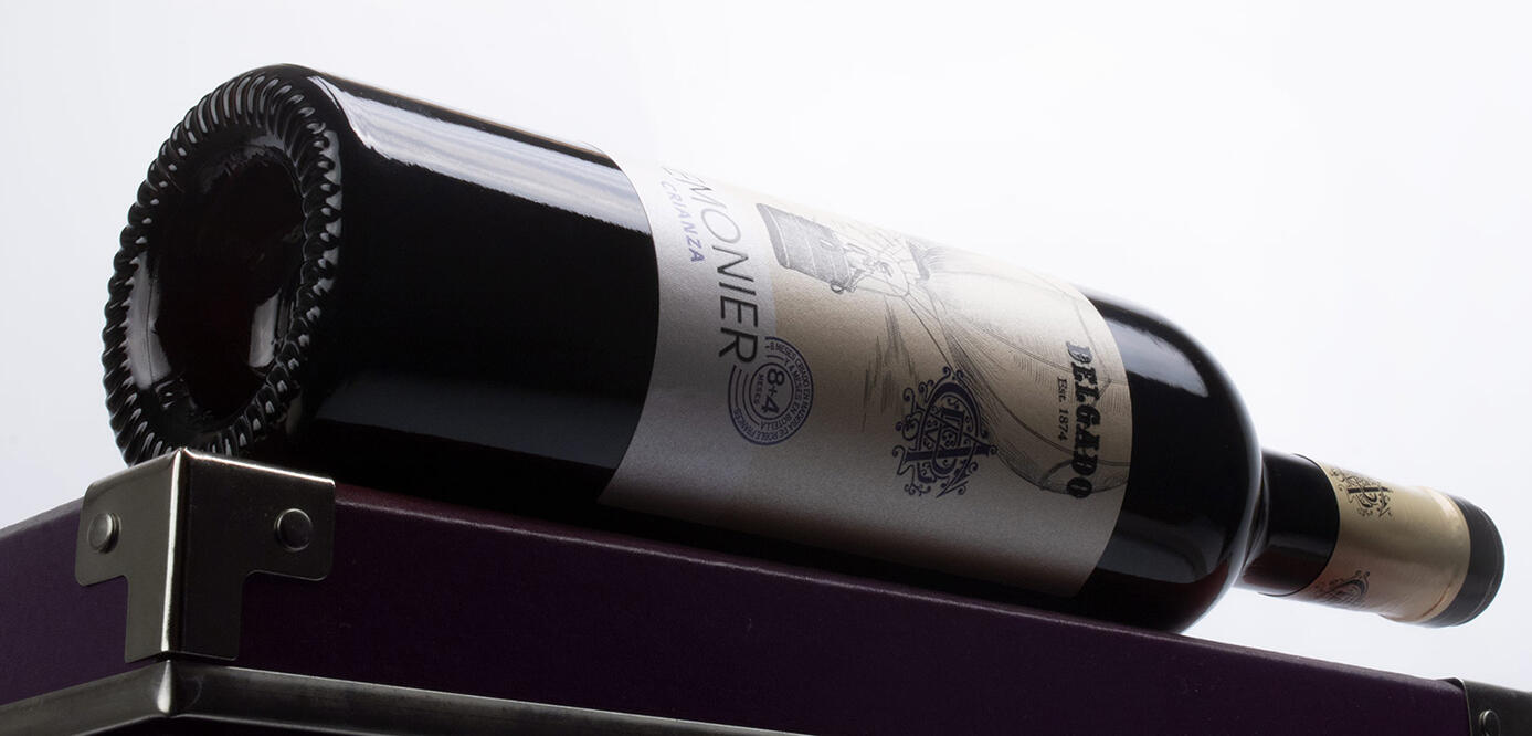
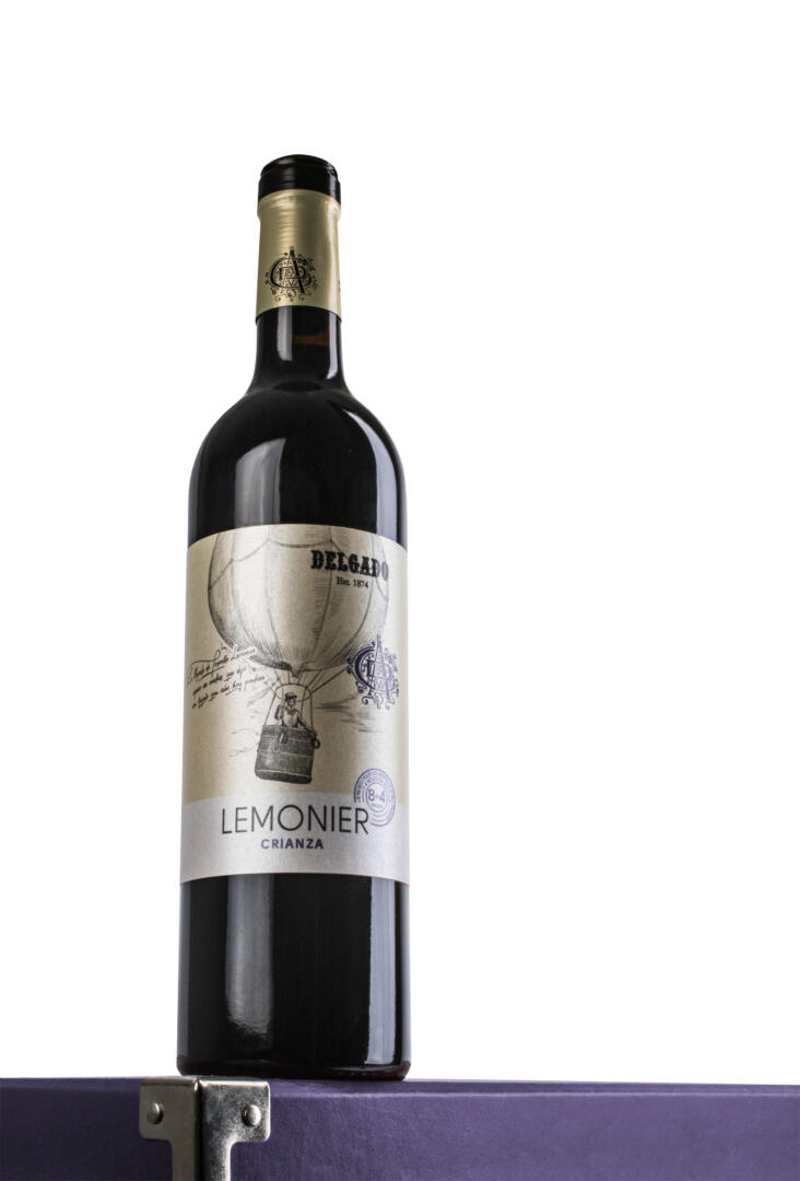
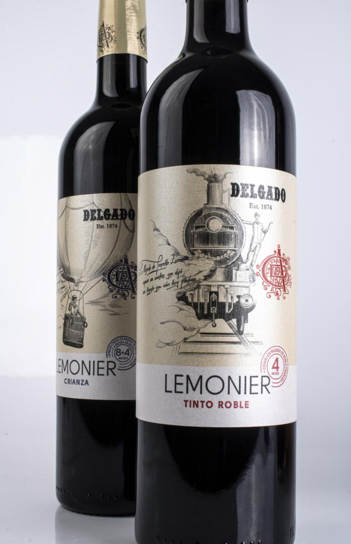
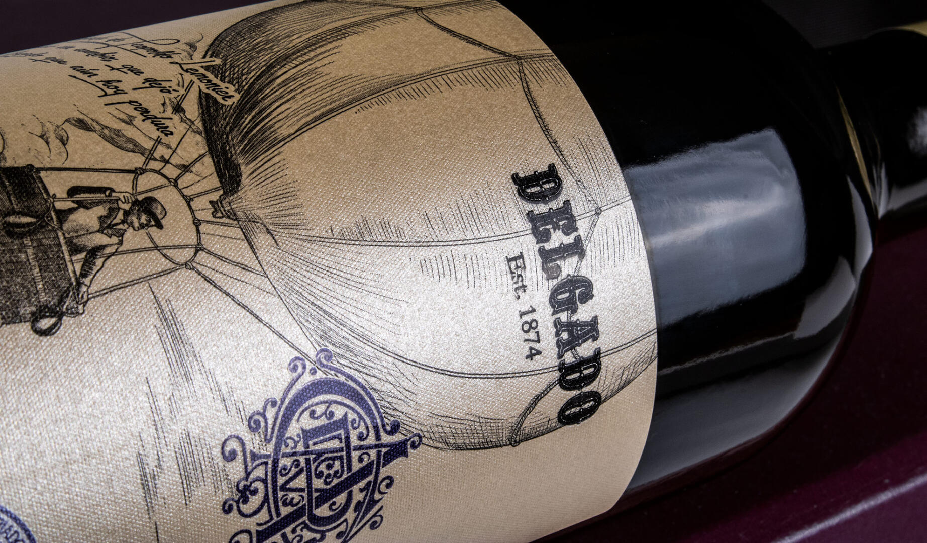
We have created a unique illustration that shows the arrival of Leopoldo Lemonier to Puente Genil in a balloon. Recreating in this way, the importance of his arrival in the region, both in its industrial and architectural development.
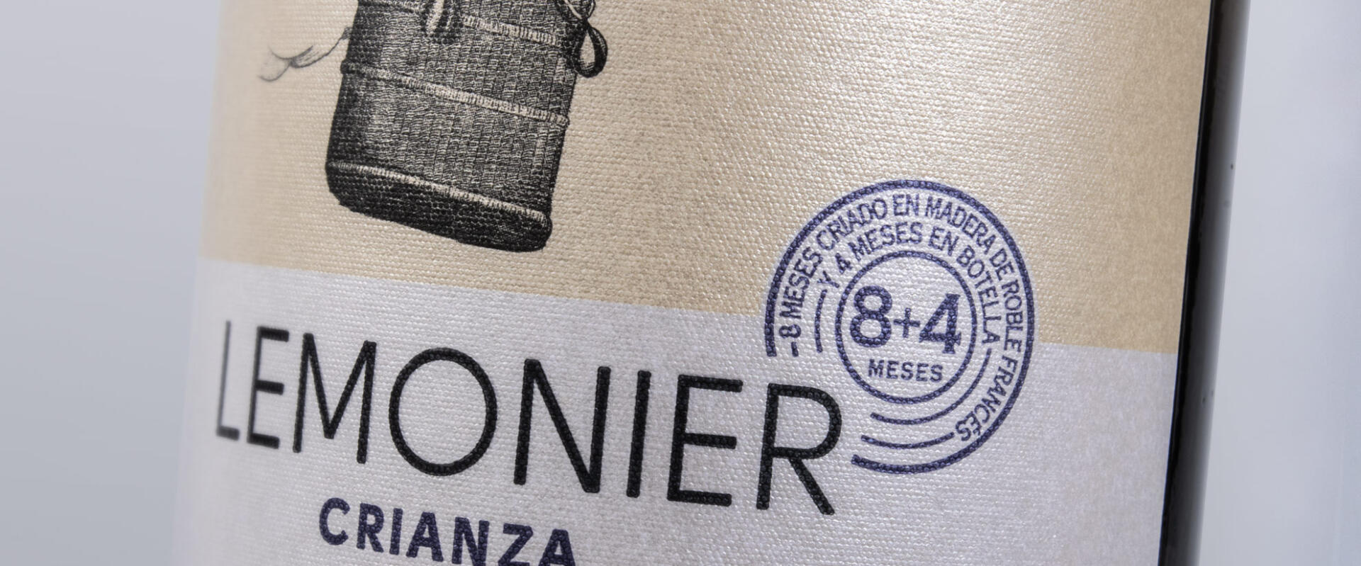
To do this, the illustration in engraved mode gives it a vintage but current air that makes the label unique and unrepeatable.
GIVING SOUL TO A RED WINE FROM CÓRDOBA
The wineries of Córdoba do not have a very extensive winemaking tradition of red wines. Bodegas Delgado, as a historic winery in the region, has some well-known fortified wines, with a wide baggage of awards and very remarkable successes.
The illustration represents the arrival in the town of Lemonier in a hot air balloon, showing it in a romantic way and as it could have been in the middle of the 19th century. With this artistic representation, we wanted to graphically show the importance of the “arrival” of this Frenchman in an area stagnant in time and that it boosted the economy and industry in the area thanks to this entrepreneur.
ELEGANCE AND DIFFERENCE IN WINE PACKAGING DESIGN
The illustration is framed in a label design in which we wanted to provide cleanliness and modernity, contrasting with the illustration in the form of an engraving. The sans-serif and rounded typefaces together with the off-center position of the winery brand emphasize the distinctive aspect of the label, which can be summed up as a modernized classic design with contemporary touches.
The label has been printed on Constellation Jade Raster paper from Manter (Fedrigoni). It is a special oenological paper with an iridescent effect that gives it a sophisticated air, as well as a very subtle texture that gives it the quality to the touch that this wine needed.
Chromatically, importance has been given to a purple tone that contrasts with a cream background and the black of the illustration, all of this thought from the beginning to expand the range and have a clear differentiation in the different red wines that the winery will have.