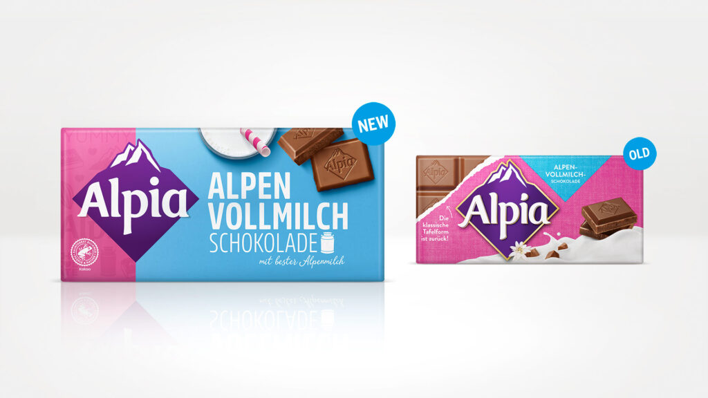
For almost 120 years, Alpia has stood for chocolate enjoyment in an unmistakable pink wrapper. A comprehensive brand and packaging relaunch was planned to rejuvenate and enhance this iconic brand.
While pink stands for the Alpia brand, we have significantly reduced the amount of this signature colour on-pack, combining it with the colour of each variety. On the left-hand side, the pink stripe incorporates an individual branded pattern, ensuring recognition by maintaining this characteristic colour element associated with Alpia.
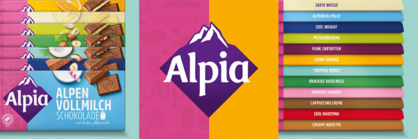
We started by tidying up the overall design and replacing the background cotton effect and the milk in the foreground with a clear structure. Instead of the Alpia pink, the colours of the varieties now play the main role, giving the chocolate bars a colourful look and helping consumers find their favourite products within the large range.
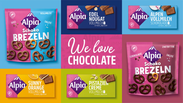
The contents and ingredients of both the bars and the Alpia snacks are now staged in a contemporary way. Bold, confident typography is key to how our team has succeeded in creating a young, unconventional and fresh redesign.