The art of the Japanese line.
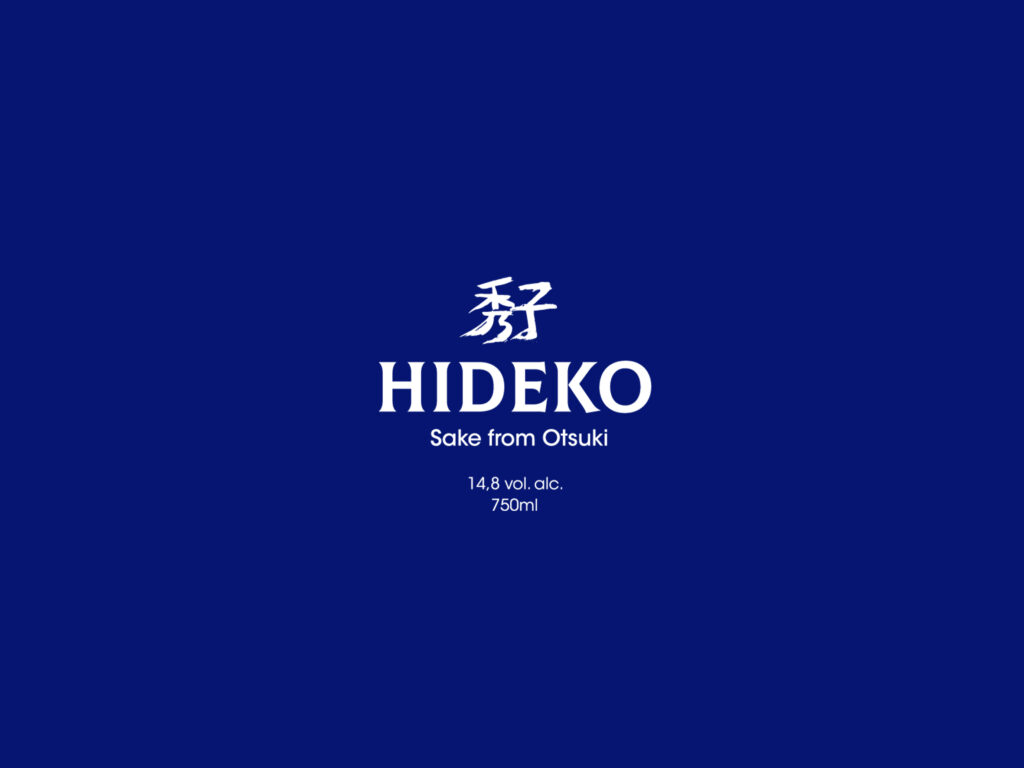
Global design concept for a Japanese sake bottle for the HIDEKO brand including the creation and graphics of two labels and the design of the sake bottle.
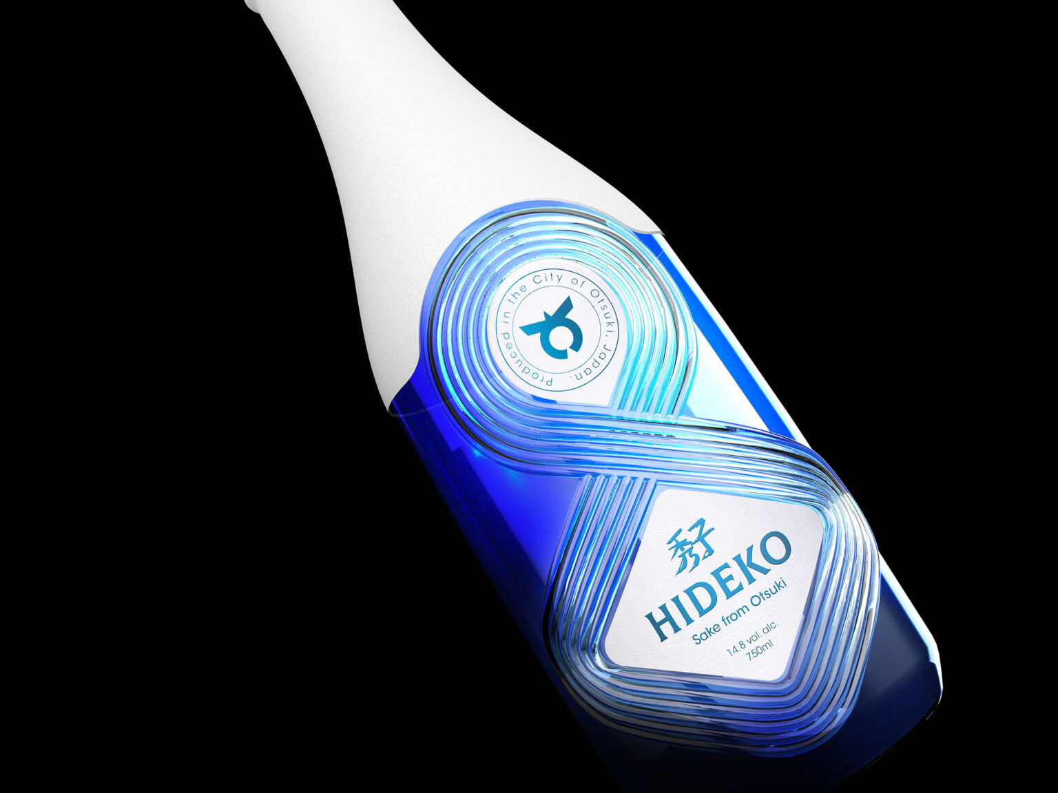
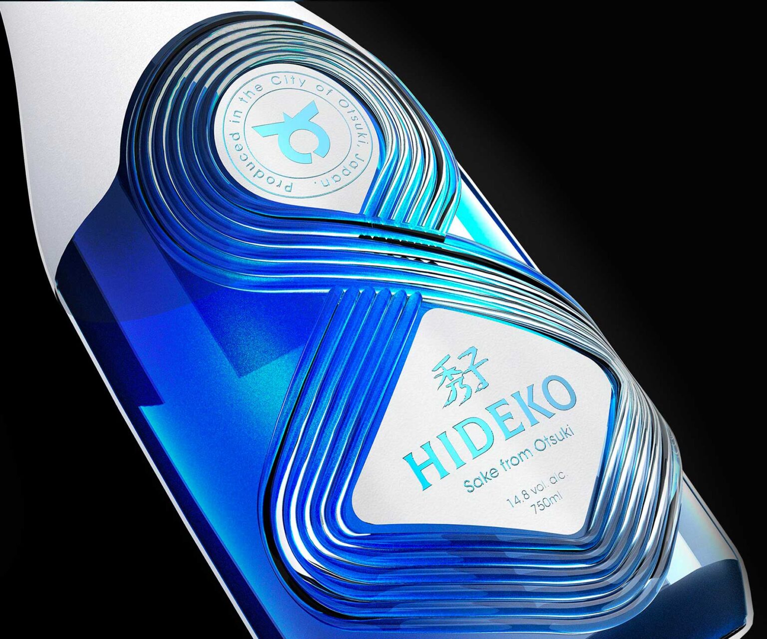
The project is for a uniquely designed, custom-made bottle made of blue-tinted glass. The design reproduces the exterior silhouette of a traditional Japanese sake bottle. Its center design refers to Japanese sand gardens, with graphic lines inspired by those made by rakes in the sand.
These large intertwining furrows traverse the bottle and form the sign of infinity, a true symbol of eternal renewal: the rhythm of the seasons, the rice harvest and the production of sake.
This permanent relationship between man and the land reminds us of a dance made up of a perpetual cycle of alternating approaching and distancing. It guides the shape of the motif, making it a distinctive signifier of both the design and manufacturing of the bottle.
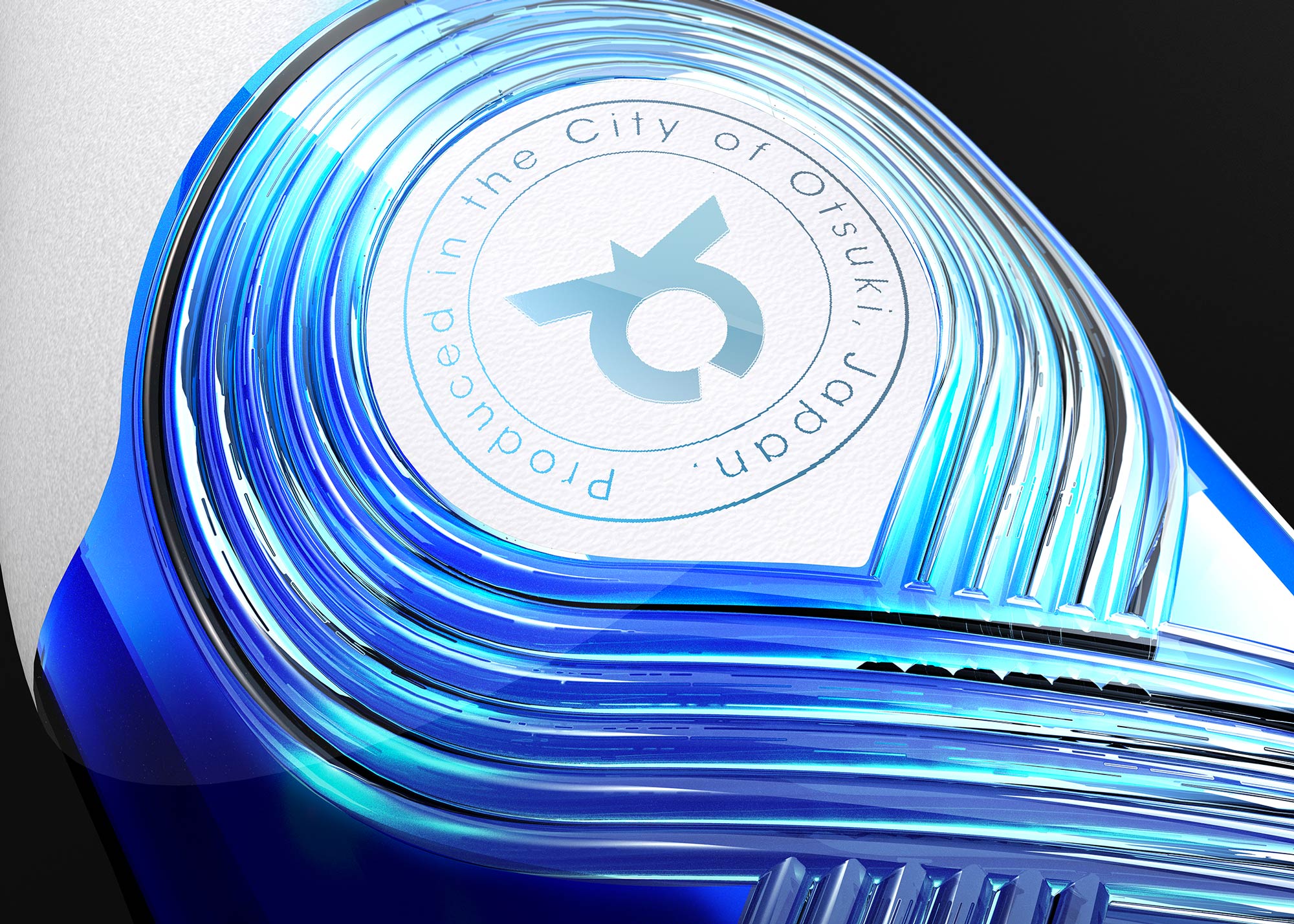
The graphic work on the label was undertaken in two phases. The free spaces left by the undulating shapes of movement over the glass express the desire to bring together the distinctive coat of arms of the city of Otsuki, in the upper section, with the attributes of the Hideko brand in the lower section.
The graphical motif revolves around a blue monochrome coat of arms of the city, adopting the singular color of the glass of the bottle. The coat of arms of the city of Otsuki is reproduced as a bold logotype, placed in a similar manner to escutcheons often found on bottles of wine from Pays de la Loire region of France. It illustrates the brand’s wish to project both distinction and respectability and is accompanied by an explanatory blazon.
In addition to the geographical information of the circular blazon, the lower of the two labels is dedicated to the brand. HIDEKO, written using a very structured and simple custom uppercase typography, is completed by its Kanji, hand-drawn by our teams using a refined and impactful composition.
To create a dialogue between these two essential influences in the development of a product that is rich in history, and the highlighting of the place of production and the valuing of a region dear to the consumer, we have chosen a white cotton paper that is close to the physical characteristics of traditional Japanese paper. This thick and flexible paper is ideal for receiving hot foil graphic and typographic embossing, guaranteeing a strong and elegant brand statement.
The Studio Boam proposed a global design process exploiting the full range of available codes linked to the brand throughout this project. Highlighting a specific history as well as a tactile design imbued with various references was a guideline for this project, combining artistic tradition and a graphic treatment linked to the Japanese garden aesthetic.