CUDO
Challenge:
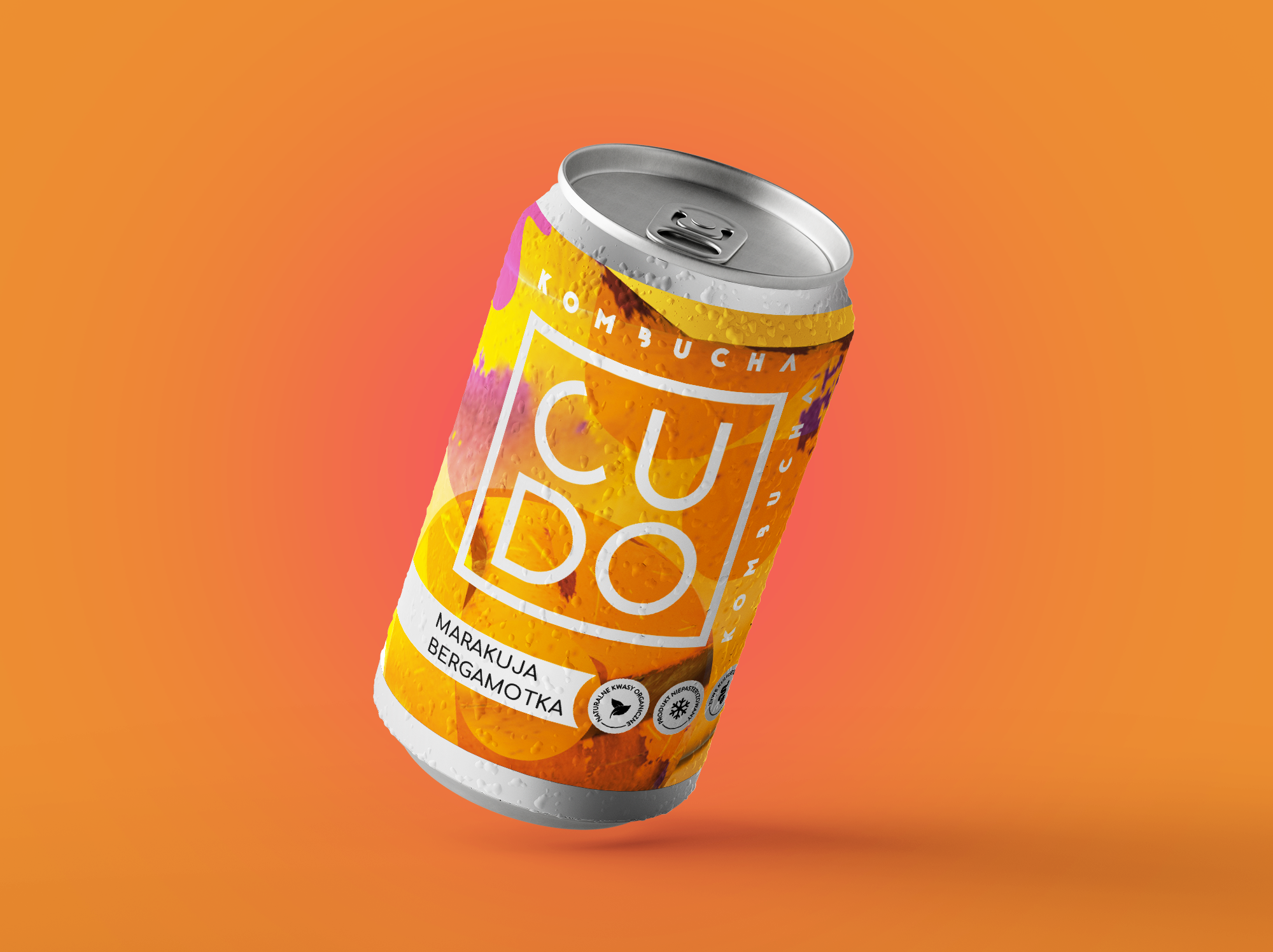
A major challenge was transitioning from very clean, minimalist communication in the area of glass packaging, where essentially only the geometric logo was visible, towards solutions for cans. Here, we have a different shape and new strategic tasks for the brand related to the desire to expand the target audience and increase exposure. Our search was primarily directed inwards, drawing inspiration from the flavor and structure of kombucha itself, which led us towards organic abstraction. We added silver to enhance quality, and the asymmetry of the spots adds a lively character to it.
Approach:
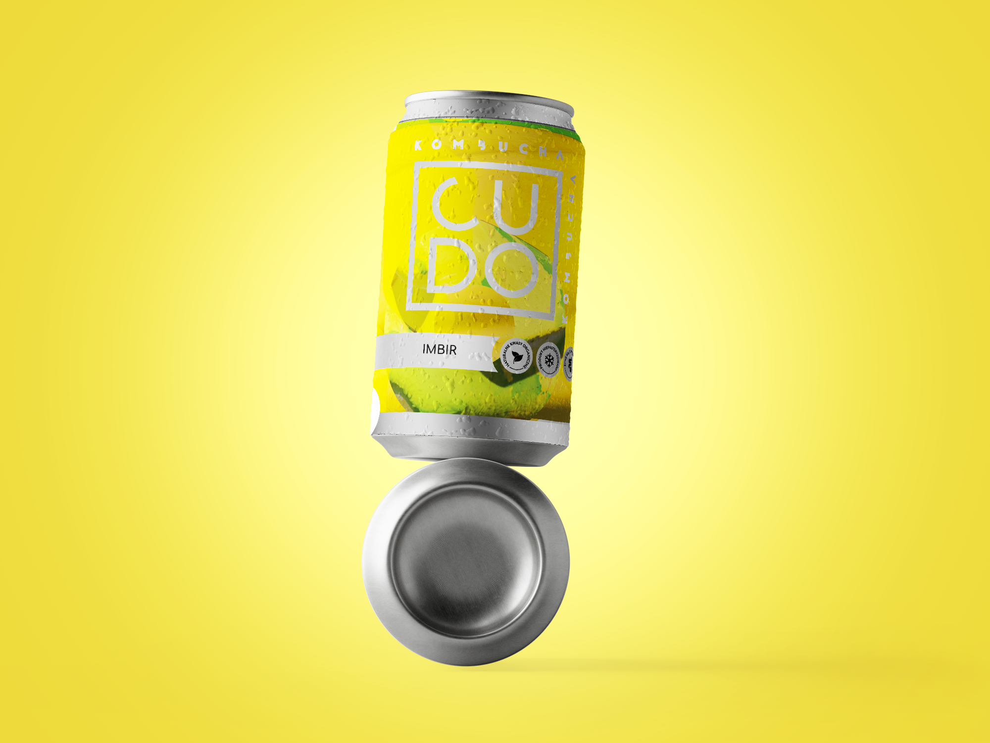
Our aim was to create an inspiring and contemporary brand design. Drawing inspiration from the characteristic texture of kombucha mushrooms and the simplicity of the drink’s composition, we created bright, minimalist labels.
Solution:
Our solution accurately captures the essence of the brand, attracting customers with its originality and modern aesthetics. This project represents a significant milestone in the development of the CUDO Kombucha brand, paving the way for broader consumer interest and market presence.