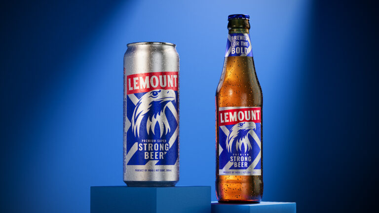
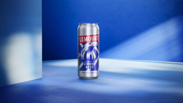
The new packaging design for Lemount Beer is a bold testament to creativity and meticulous craftsmanship. We embraced vibrant colors and sharp lines to create a design that reflects the dynamic and daring spirit of the beer. The bold eagle logo and the powerful tagline “Brewed for the Bold” capture the essence of adventure and strength, appealing to the modern, adventurous consumer.
Our creative team coined the tagline “Brewed for the Bold,” which perfectly encapsulates the fearless spirit of today’s beer enthusiasts. The new visual identity is designed to be both eye-catching and memorable, ensuring that Lemount Beer stands out in a competitive market. The use of metallic silver and deep blue, along with red accents, gives the packaging a premium and energetic feel.
This revamp is not just a cosmetic change; it is a strategic move to align the brand with its core values of boldness and excellence. The sleek can and bottle designs are tailored to convey a sense of quality and innovation, making Lemount Beer a preferred choice for those seeking a strong, premium beer.
We are immensely proud of this transformation and believe that the new Lemount Beer packaging will resonate with consumers and enhance brand loyalty. Here’s to bold beginnings and innovative creations that not only meet but exceed expectations. Cheers to the bold and the brave with Lemount Premium Strong Beer!


