Dorset’s Liquid Legacy: Eldridge Pope & Co.’s Comeback
The Backstory
Eldridge Pope & Co. isn’t just another name in the drinks world, it’s a Dorset institution with roots that run back to the 19th century. For generations, they ruled Dorset’s brewing scene, with their iconic name stamped across great buildings, pint glasses and pub signs, brewing beer that defined Dorchester’s social life, until the brewery closed its doors in the early 2000s. Two decades later, the legendary family-owned brand was ripe for revival, this time, not in barrels of ale, but in bottles of premium gin and liqueurs. Our job was to channel 150+ years of brewing swagger into a spirits range that feels heritage-rich and future-ready all at once.
The Concept
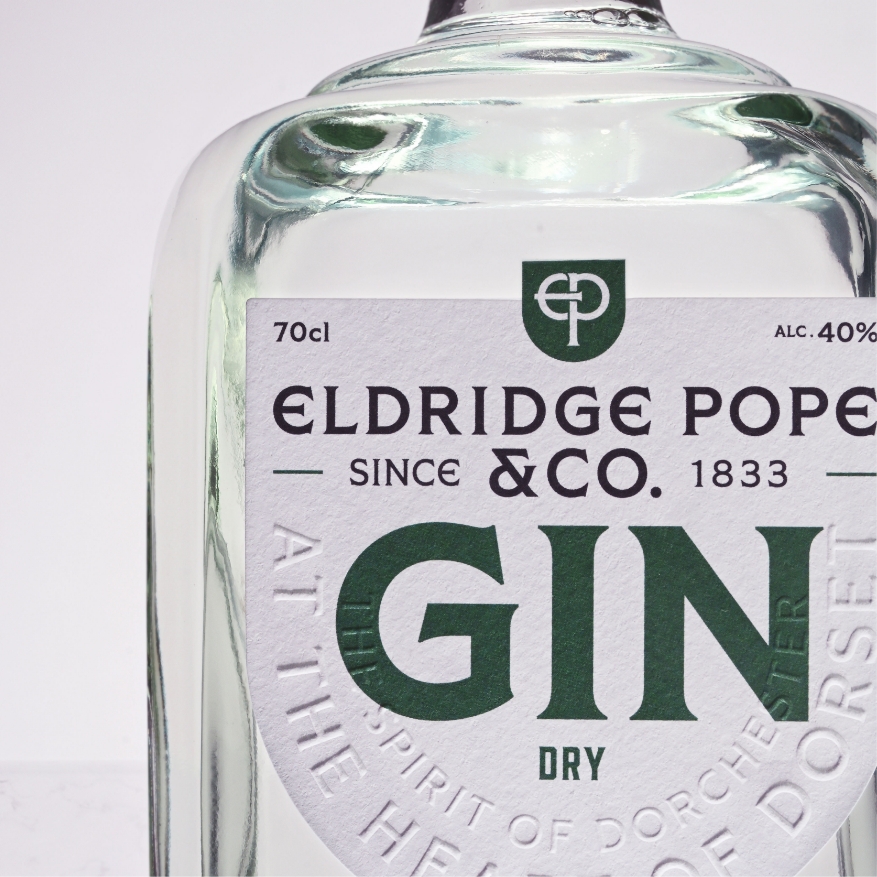
We dug deep into the visual language of Dorchester, pulling inspiration from Edwardian arches, vintage gothic typefaces, and the iconic Huntsman trademark from 1921. At the same time, we knew this couldn’t become a museum piece, it had to work as a living brand. So, we paired those heritage cues with strong Romanesque typography, smooth, modernised curves that echo both the liquid inside the bottles and the town’s architectural forms, and a colour story that leans confidently on copper and bold red, two hues central to Eldridge Pope & Co.’s legacy.
The Design
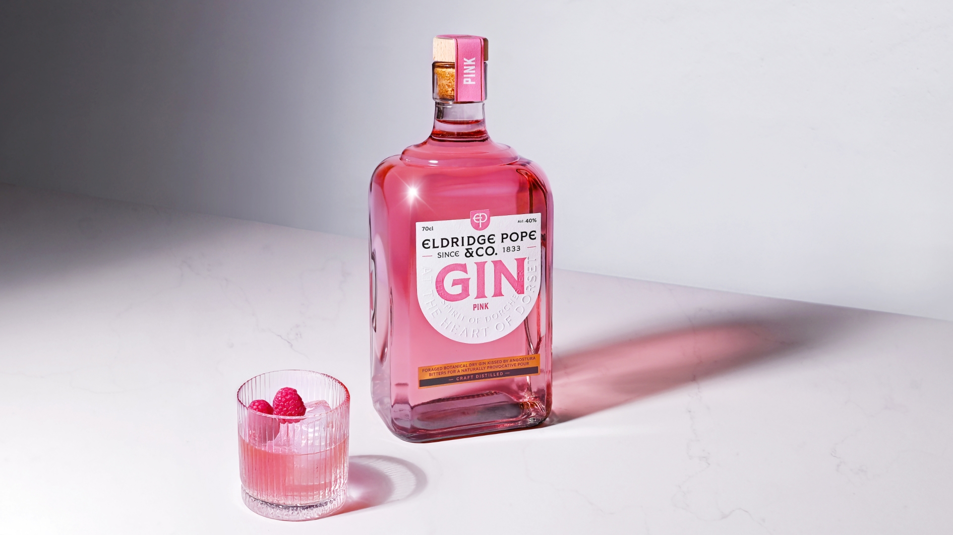
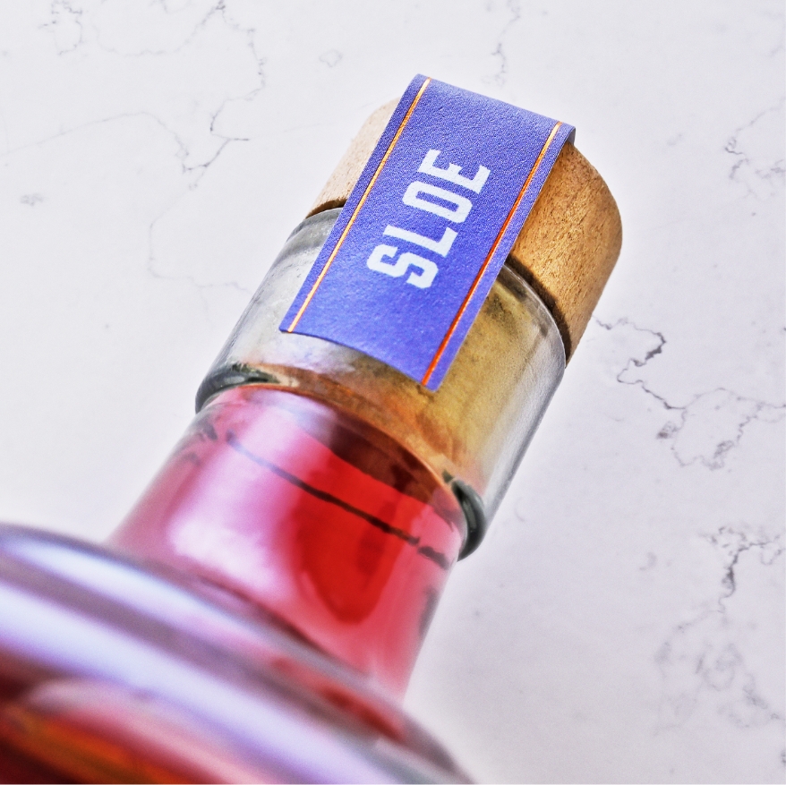
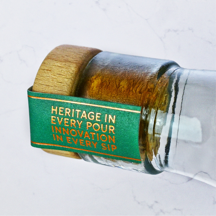
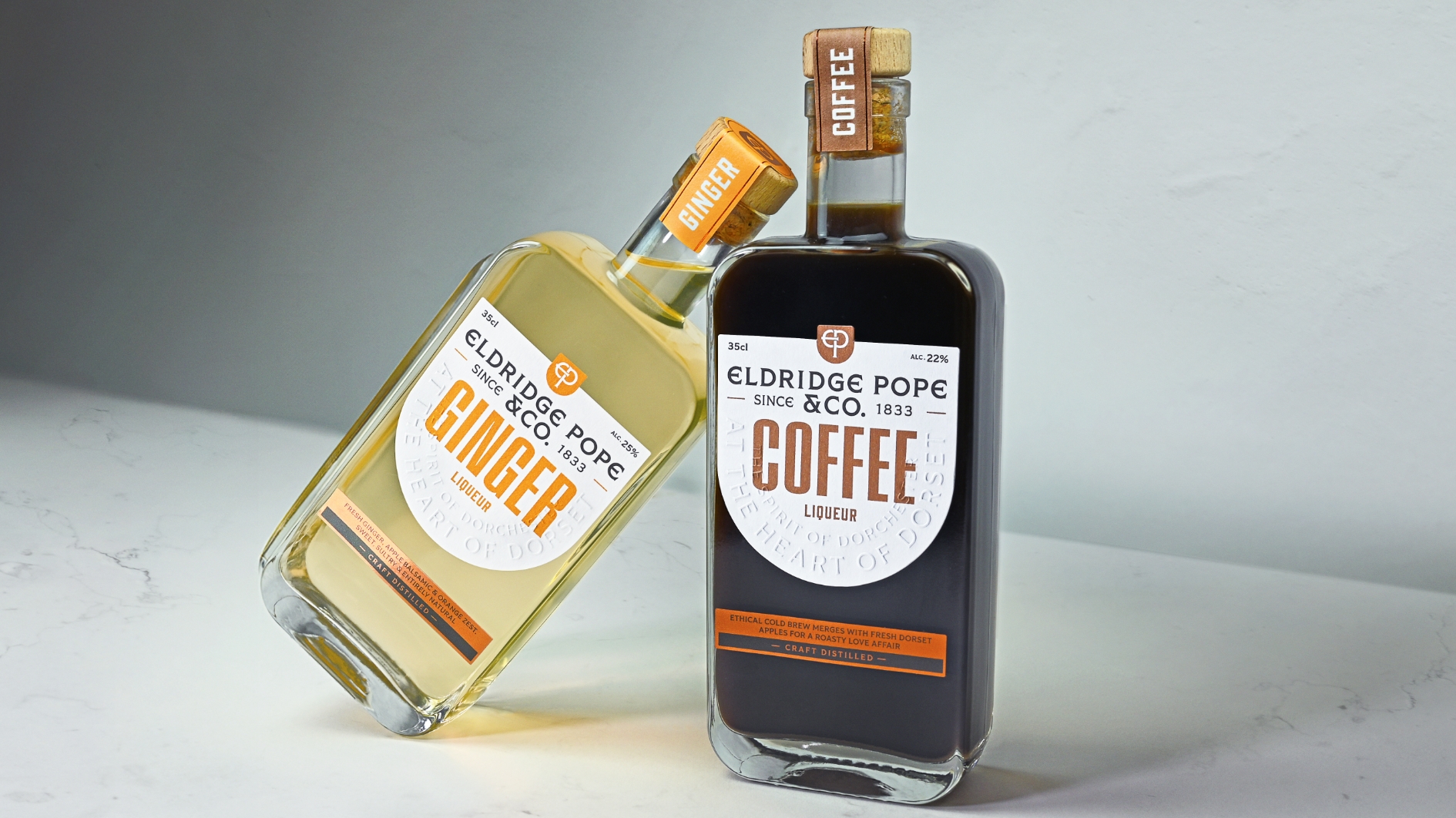
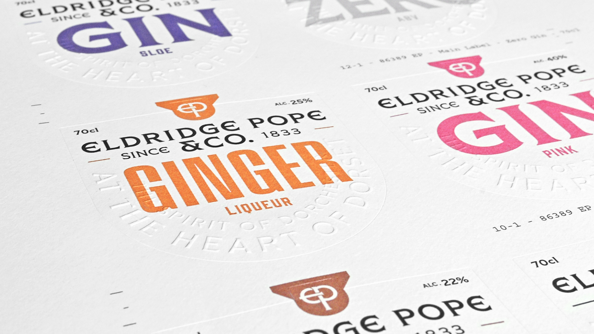
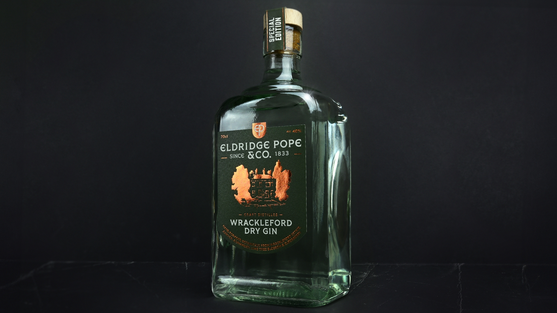
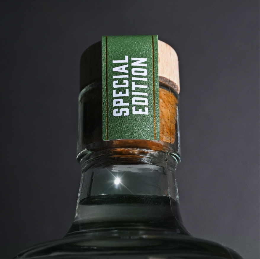
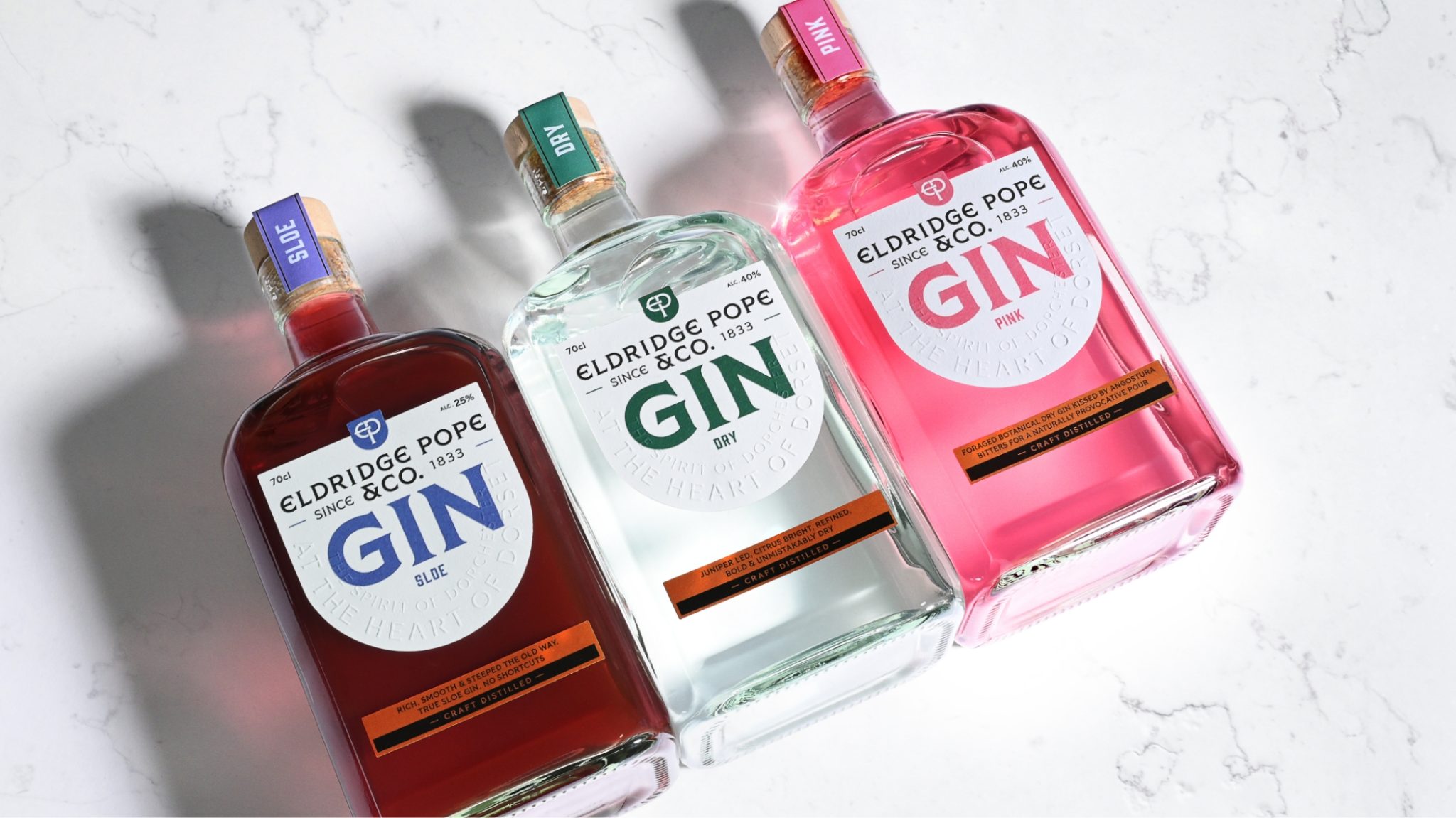
The drinks range spans three gins, two liqueurs, a non-alcoholic gin, and a special edition dry gin. Each bottle carries its own personality while remaining tied together under one unified master brand identity. We reshaped the family crest to feel softer and more elegant, redrew the ‘EP’ monogram for clarity, and created a typographic system that balances gothic heritage with modern precision. Premium finishes play a starring role: foiling in copper, embossing on straplines, and layered print textures that reward touch as much as sight.
The Language
This wasn’t just about graphics. Every spirit needs a story, and Eldridge Pope & Co.’s comeback demanded a voice that was memorable, confident and authentic. That meant distilling nearly two centuries of heritage into a narrative that felt authentic yet ambitious. Once the story was in place, the words followed naturally: we wrote straplines that sparked excitement, label copy that invited intrigue, and brand narratives that spoke directly to modern-day drinkers, then built a full language system to guide everything from packaging to communications. It’s a toolkit designed not only for today’s launch but for every future product to come, ensuring their voice is as distinctive as their spirits. It is a toolkit designed not only for today’s launch, but for every future project to come, ensuring their voice is as distinctive as their spirits.
The Distinction
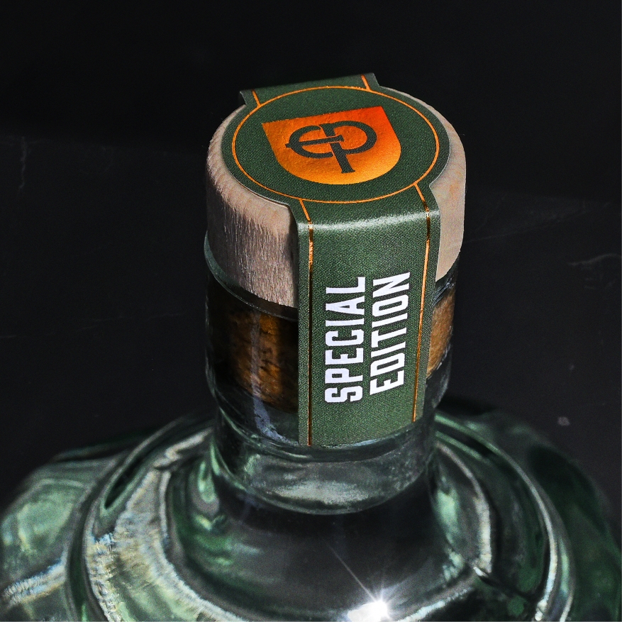
Premium print finishes did the heavy lifting: copper foiling honoured the brewery’s historic copper fermentation tanks, tactile embossing on straplines begged to be touched, and carefully considered neck labels doubled as story space and tamper seals. Every detail works hard, because in a crowded gin aisle, shelf presence is survival.
What makes this design different is the way it reconciles two worlds. It honours a brewing dynasty that once helped shape Dorchester itself, while setting the stage for a contemporary spirits brand that belongs on the global stage. The balance of heritage and innovation is what gives the range its distinctive edge; it feels familiar, but also completely new.
The Outcome
The new range doesn’t whisper quietly from the shelf; it stands tall, gleaming with copper accents and wrapped in a story impossible to ignore. This was more than a rebrand; it was a repositioning. Eldridge Pope & Co. now sits firmly in the premium spirits space, with packaging that commands attention, storytelling that resonates, and a bold brand identity that builds recognition across the entire range. By distilling 150 years of legacy into a system built to scale, we’ve armed the brand with the confidence to go the distance, and to go down smooth with today’s drinkers. More importantly, it gives a legendary Dorset name the stage it deserves once again.