
Cultor Wines. When a Limitation Becomes the Core Idea.
In the wine industry, many brands are built around a family name, a renowned winemaker, or a legacy that already exists.
This project started in the exact opposite direction.
People behind the project had a clear vision: to create a collection of wines sourced from exceptional terroirs, each expressing a unique origin and personality. However, there was one major constraint. The winemaker’s name could not be used as the foundation of the brand.
What initially seemed like a limitation became the project’s greatest opportunity.
Instead of celebrating an individual, the brand would celebrate the people whose dedication makes great wine possible. Vineyard workers, growers, viticulturists, winemakers, and every person who cultivates the land with patience, knowledge, and respect.
This idea gave birth to the name Cultor.
Derived from the Latin concept of “one who cultivates”, Cultor is a tribute to those who transform nature into culture. More than a wine brand, it is an acknowledgment of the human role behind every great vineyard and every exceptional bottle.
The visual identity was designed to reinforce this concept of cultivation, origin, and transformation.
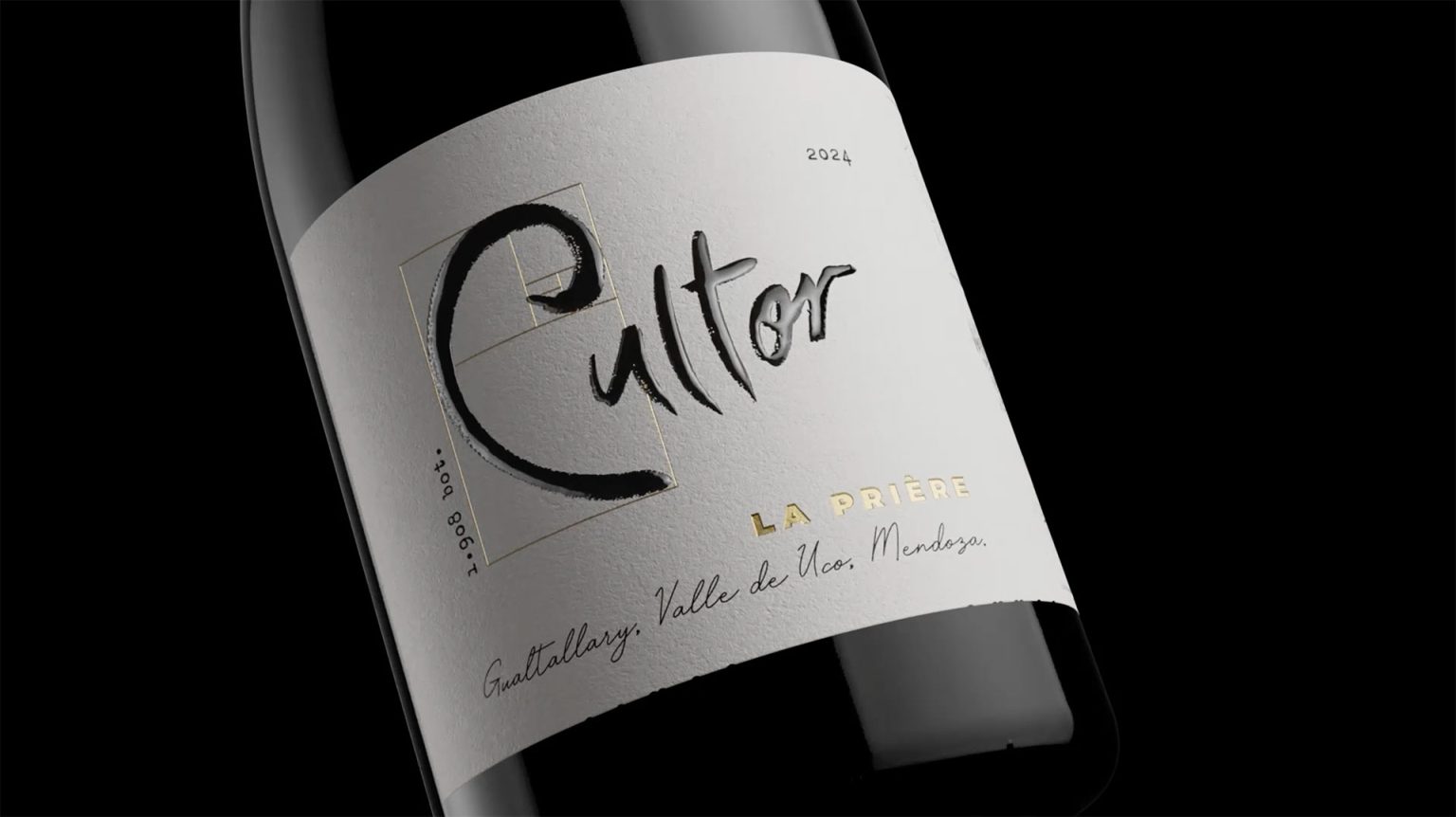
At the heart of the logo lies the letter C, carefully constructed within the proportions of the Golden Rectangle. This timeless geometric principle, found repeatedly throughout nature, has long been associated with harmony, balance, and organic growth. By embedding the Golden Ratio into the brand’s core symbol, the identity establishes a subtle connection between human cultivation and the natural order from which great wines emerge.
The symbol becomes a visual representation of the dialogue between nature and human intervention — the essence of viticulture itself.
For the packaging, the objective was to move beyond conventional luxury wine aesthetics and create a contemporary premium language capable of expressing both sophistication and authenticity.
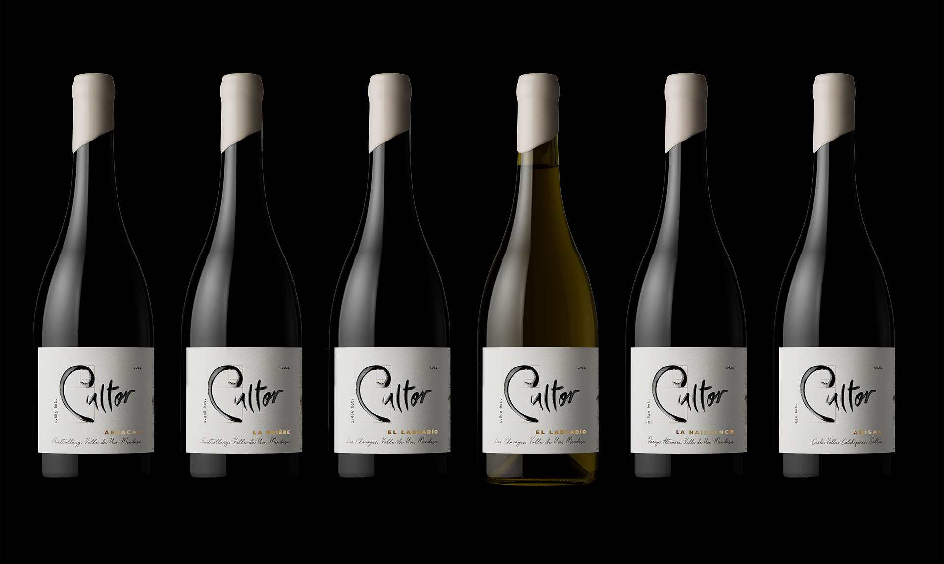
The label architecture is intentionally restrained and elegant, allowing the concept to take center stage. Typography, composition, textures, and premium finishing techniques create a refined visual hierarchy while preserving a strong sense of character and origin.
Each wine within the collection receives its own narrative identity connected to a specific expression of terroir. Names such as La Naissance, Abisal, La Prière, and El Labradío become chapters within a larger story about land, transformation, and human dedication.
A central element of the packaging system is the series of bespoke illustrations created for each wine. Rather than serving a purely decorative purpose, every illustration was developed from the wine’s own sensory universe. The creative process began with detailed terroir descriptions, tasting notes, and the unique attributes that define each vineyard and vintage. These insights were translated into symbolic visual narratives that express the essence of the place, the character of the wine, and the emotional experience it evokes.
The result is a collection in which every label tells a different story while remaining part of a cohesive visual language. Together, the naming, illustrations, and packaging create a storytelling system that celebrates the diversity of origins while remaining faithful to the central philosophy of Cultor.
Rather than relying on traditional luxury codes, the design system focuses on symbolism, precision, and meaning. Every detail was conceived to communicate respect for the vineyard, admiration for those who cultivate it, and the belief that extraordinary wines are born from a profound relationship between people and place.
Cultor demonstrates how a strategic constraint can become the foundation of a stronger brand idea. By shifting the focus from an individual to the collective act of cultivation, the project creates a distinctive identity that honors the true protagonists behind every great wine.
Agency: Argency
Services: Brand Strategy, Naming, Visual Identity, Packaging Design
Client: Cultor Wines
Location: Mendoza, Argentina
Curator’s Insight
The back label is where this project earns extra attention. Mixing typewriter-set text with handwritten annotation and botanical illustration on a single label is a difficult balance to pull off without it feeling cluttered or theatrical, but the layout holds together because the hierarchy is genuinely clear. The vine, leaf, and grape cluster illustrations are placed with enough breathing room that they function as anchors rather than decoration. It reads like documentation of a place, which aligns precisely with what the brand is trying to say.


 softmachine
 monther al omari
 alchimistestudioParis
 airobtq
 Buzz & Co.
 Ruby
Ruby themythographer
 IDNB Inc.
 viktorflr
 Zenpack
 Wessam Hussien
 samarabdelmonem
 StudioMordius
 Polaris Designs
 Atiq Alam
 duha mohamed
 HassanEtman22
 agarcia studio
 Wynand88
 Eva Chistyakova
 Maria Bukhtilova